Wednesday, May 21, 2008

Final Exploration


http://www.phong.com/
This website is easy to navigate and it has a rollover effect as you move the mouse from subject to subject. It has links to all different kinds of media, photography and atricles. I liked the amount of content available. There is a wide variety of sites, artwork and tutorials to look through.

http://www.deviantart.com/
has always been a favorite site of mine. It hosts artwork from all over the world and can be sorted by favorite, type and style. I thought it would be appropriate to contribute it to this blog because it has been a huge influence in my views on design.


http://www.bbc.co.uk/bloom/flash.shtml
BBC features a site to encourage a healthier environment. I enjoyed the theme of this site as well as the smaller suddle animations that bring the page alive. The load time isn't too bad and there are small text animations to read as you wait for content to load. It encourages users to make small life changes and pledges that will in turn affect the environment.Within each section there are hints as to what is interactive and where to navigate your way around the site. It allows you to sift through categories and narrow in on the topic you want to know more about. I liked the little shadow host theme guiding you through each section, it was a nice touch to the theme. Nice use of scroll and rollover buttons to include extra titles and information as well.

New media Exploration

I am going to introduse high technology cell phone, it is called "Wallet Cell phone". It is made by SONY. We can just use the cell phone like a wallet. For example, we can buy some soda from the vending machine just by scanning the cell phone. You can use it not only at the vending machines, but also at the glossary store. It also has your personal information so you can use it as a ID card, and you can also enjoy online shopping by using the cell phone.
It is spreading all around the world, especially in Japan. You can also use this phone at the airport or train station when you pass the ticket gate, so you don't have to stop to buy the ticket.
We can chose the system is prepaid or no. And it is really getting popular because you don't have to bring your wallet when you go visit your friends house or go walk with your dog, and you don't have to have a lot of have a lot of stuffs with you. We can use this cell phone and enjoy shopping a lot of place, but it is ture that there are alot of places where we can't use it. However, we are sure that it will be spread more all around the world in near future.

Tuesday, May 20, 2008

The power of Media

In the last couple of months, we have seen what could be called the definitive level of media that is now in demand by the public. What could not have been imagined has now been brought to a scale of such amazing depth that pure understanding seems impossible. Gentlemen and ladies, I would like to bring your attention to the CGI giant that flew across the theater screens, Speed Racer.
I don't really know what to call this, so I guess I'm going to call this an exploration, considering that I'm about to explore how the amazing amounts of CGI that was put into these movies is done. Let's go with the flashy and over-stylized re-make, Speed Racer. First up, and what we notice right away, is the the entire movie is based in CGI. Not just a scene or two, but the entire movie, from start to finish, is built entirely out of nonexistence. What's also noticeable is the fact that every surface in the movie, no matter how fictional, responds to force or light or some kind of external factor. I've heard recently that over 300 cars were analyzed in order to create this kind off stunning CGI. The fact that media can be used to this level is astounding; the environments that are made to literally showcase the CGI are nothing short of astounding, not to mention how the designers seamlessely integrated the environmental effects on the vehicles and surrounding objects. I'm sorry if this sounds like an ad, but the effects produced by modern technology and programming are nothing short of astounding.
So, short story; if you're interested in pursuing a media career in the future, perhaps one in video, CGI, or something related to that category, you have to go observe this; it definitely shows off the power of modern media.
Once again, I'm really sorry if this sounds like a recommendation for you to go see the movie.

But it is.

Exploration Blog - Melissa O'Brien

My last blog is on a french architectural firm. The best thing about this page is that everything is on this first page and just pops up from the menu bar below. All the info is stored in that expandable menu and you can never lose your place from there.

Photobucket

It's a great way to navigate but still keep the cohesive idea that the frame wants to present, which I think is squares.

Exploration Blog - Melissa O'Brien

Below is a screenshot of an Adidas homepage that shows their catalog of new designs for women as a person's daily walk through the city. New York City I believe.

Photobucket

The best thing is interacting with this person's day and seeing her inspiration of the world around her and that interpretation into a shoe design. The site isn't very big and is simple but you are able to go down in layers into this collection which makes it more fun.

Monday, May 19, 2008

Design Exploration-Garth Sturdevan

Be Kind Rewind Movie Web Site

This very interesting and fun site was designed by Tequila. It's seriously funny and clever and done in Flash. The theme of the movie is apparent in the website. The movie is directed by Michel Gondry and follows the plight of two video shop workers forced to re-film their library of classic flicks. Jack Black's character apparently becomes electrically charged and inadvertently wipes all the VHS tapes in his vicinity, and by the looks of this site he's gone and wrecked the web too. The official site is from Australian agency Tequila and it pokes fun at one of the internet's biggest brands. We see shots of the cast flying about as the site is 'wiped' from existence as funny Flash error dialogs pop into view before a reconstructed Google searcher is pieced together from penicl sketches and plasticine. You can even 'Swede yourself' into a movie (sweding is re-making something from scratch using whatever you can get your hands on." Reload the homepage and different images will appear too! This is a very clever and well done site that successfully interprets the film.

Studio Exploration-Garth Sturdevan-

Working @ South Park Studios is No Walk in the Park

I chose to do my second exploration on South Park studios because I did a South Park style animation for my second project. They use Mac computers so the link above is to an article done by Apple and Final Cut Studio on South Park. It is a very hectic and chaotic environment because "We have very complex stuff that needs to be done very fast and we need to know that we can trust the machines to handle whatever we throw at them without crumbling." South Park has one of the most manic production schedules of any animated series on television-probably ever. "We work between 100 and 120 hours in a seven-day week to deliver the episodes," says Frank Agnone, supervising producer at South Park Studios in Los Angeles. "We're moving unbelievably fast right out of the gate." It is not unusual for South Park staff to work for nearly 24 hours straight to turn out a show because no shows are produced ahead of time. Every new episode is delivered the day it airs. The creators want to adhere to such a hectic production schedule because it wouldn't be as funny or as remarkable if it wasn't timely. It's interesting to know how much work goes into the creation of a single South Park episode because the animation itself is crude and unique which gives it that South Park animation style. Although that unique style looks 'bad' compared to Anime it takes a lot of talent, work, and people to make it look that 'bad'!

South Park Studios

The above link is to the South Park Studios homepage. Here you can few episode clips, episode guide, full episodes, fan favorites, news, etc. When you have a moment take some time to browse the sight to check out some hilarious and crazy clips!

Design Exploration

Jeff Kaczmar

This was a website designed for Nike Air by Big Spaceship. This is a unique experience where the user is directly interactive with the website. It has a futuristic surreal feel and trance like music in the background. The section that I was most impressed with was the running on air. You can click on a couple choices, ball on air or run on air. A movie clip then takes place and you are focused in on the character as they leave society and start running on air. Immediately some rhythmic music plays and you can control the scene of what is going on by hitting different buttons on your keyboard. Various designs and effects come flashing in and out of the stage with each hit of your button. You become apart of the action that is taking place. The music also effects the overall feel of the site. This site has one many awards from the Flash Film Festival, New York Festivals, Future Marketing awards, Pixel Awards, and Favorite Website Awards.

Design Exploration

Link
http://moma.org/exhibitions/2004/tallbuildings/index_f.html
I found two great examples that are fully flash based. One of them is very interactive it allows you to view the architecture of some of the tallest buildings in the world. This website was design in New York City by what it looks like a variety of designers putting all their ideas together to design it. The interface for this site is very easy to navigate from the home page, It allows you to role the invisible buttons on the bottom of the page in it displays all the different kinds of buildings from smallest to tallest. Besides these buttons it only has one other button in the menu navigation bar which is a drop down menu with four other links. Overall the site should be fairly easy to navigate the way it’s constructed.

The objective of this site is to present and focus on 25 contemporary skyscrapers and all of their main aspects such as the technology, urbanism, and program. It also consist the fundamentals of the project construction for certain skyscrapers along with comparison to others. The website is clearly designs to focus on architecture and it very evident throughout the interface. Also making it easy to navigate with one on button drop down menu and the rollovers in the architecture.

When it comes to the cleanliness of the interface it’s very easy to read nothing is too cluttered or overwhelming to the eye. The only thing I would say it’s too much is the different diagrams that explain the different type of architecture in certain building because they are not that easy to read. But for the most part everything is the site is easy to read and for the most part it explains its purpose.

Saturday, May 17, 2008

New Media Exploration


The conventional ways of displaying digital images in 2D format may see a change in the near future. For several years now, there have been developments toward creating holographic videos, which would have a huge affect within the technology realm, including advertising, home entertainment, and even within business applications. Although holograms are extremely complex in nature and have until now been high in cost, they continue to be a compelling alternative to traditional 2D images. Holograms, such as the one in Star Wars where Princess Leia pleads, “Help me Obi-Wan Kenobi,” may not be so far fetched after all. Within some of the articles that have touched on this topic, there has been speculation that this will be the future of technology. According to NPR, for example, scientists have come one step closer with a new holographic display. Another group of researchers at the University of Cambridge is making strides on holographic technology that will power a new generation of pocket-sized digital video projectors. There have even been attempts to create holograms for advertisements on billboards, too. This sort of technological advancement could establish a very promising mode of communication.

Studio exploration: StrawberryFrog

Studio exploration:

For my second exploration, I choose StrawberryFrog.
They are a very unique and fresh advertising company that has an impressive list of well-known clients. Their ideas and vision are truly creative and bursting with unfettered energy; which can be seen and felt from their different projects. They seem to be a humble company also for they still compared themselves as a small red frog that is competing with the big "dinosaurs". From the list of high profile clients such as: Sony Ericsson, MTV, Xerox, etc and the awards that they won , (including FWA awards), it seems that the creative juices will never stop flowing. They have a broad portfolio (websites, prints, TV, etc). I like a project that they did for Sony Ericsson to promote their T300 phones to teenagers in UK. They used the concept of drooling for the new phone is cool.
I recommend to check out their work if you are interested in getting into creative multimedia advertising. They know what works and they are good at getting to the target market. I do not mind working for a company like that, besides they are in the list one of 25 Best Managed company.

Wednesday, May 14, 2008

Studio Exploration: Chie


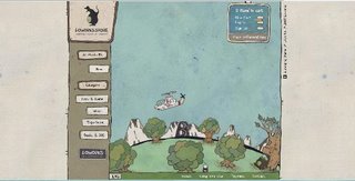
The works of LOWORKS are just CUTE & FUN!! I saw an article about this design studio in a magazine from UK, and then I found out it was in Tokyo, yeah! I've been looking for interesting Flash content from my country to introduce in this blog, so I am happy now.

As you explore in the interface, you'll see many hidden function buttons that make something noise or move a character; something is happening all the time and make us (at least me) smile. Ex: a bus without tires but a giraffe which is inside and moves it instead of a motor. Check out their Broadcast and SHOP . The shop's background illustration (the earth) rotates every once in a while, so let it open if you want to see different things happen.

When we make a Flash content, we tend to be focus on the techniques since we are on the process of learning a new skill. But as a prospective designer, we should not forget what our audiences want to see the first. Even things we create are small so far, let's make people happy. Let's make things better. Let's make meaning!! That I thought with this web site.


Tuesday, May 13, 2008

Studio Exploration


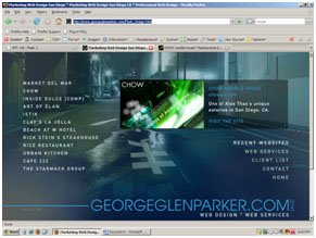
For my Studio Exploration I wanted to pick a company local to San Diego. They specialize in business websites and a lot of their clients are fine dining restaurants, so hopefully you eaten at some of these places already  Of all their sites, I really dig the one done for Chowsd. Just because I think the navigation is simple but effective. The photo work is really well done and compliments to the type of restaurant it is, which is a sort of a high class noodle house. When you navigate to their portfolio I love that page to. The flash done with the fog looks cool.
On the main site for Georgeglenparker they use a lot of movie clips as the back ground. This is done a lot for Chowsd also, which adds to a nice effect for the website. Overall their websites are effective, easy to navigate and while not content heavy, I think its content rich. A lot of scripting must go into their sites to get the FX they have on their web development. I encourage you to check their portfolio out and eat at some of the nice restaurants they’ve worked for.

Monday, May 12, 2008

Studio/Artist exploration

7 Designers

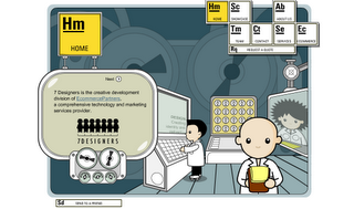
7 Designers looked like the typical Small Business information web site.  The layout was very balanced, animated and cartoon like. I showed off the site to friends explaining the movie clip concept.  Not realizing that the site was interactive, I started to see motion hints. The home page just gathered information about the client.  In the Showcase and began to see the interactivity. I was able to grab the vials that a figure was holding and move them to another location. This created a to featured sites the team has worked on. I then explored the about us page. This page explained how they were a creative development division of ecommerce partners. When you clicked on the diver he eventually was eaten by a whale. I then clicked ont he team button and discovered that the team has a role in all the animation. In fact the team have been animated into cartoon like characters. When i clicked on the characters they displayed in a offset box (some in more interesting ways then others). As i made my way to services the site begain to make me wounder what was next...... Services talked about Marketing, Creative, Strategy, and Technology. 

The e-commerce side of the site was one of the most interactive "movie clip" files.... I started filling a box and from there we packed it up and shipped it out... I enjoyed this site, it was fun and intresting. at first glance you could use it for information on the company and still like it because of the layout. One you discover the interactivity then it becomes even cooler..
Some of the Sites they have Created:


Design Exploration

Famous Stars and Straps

Caution Links may contain clips with Vulgar language.
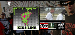
I picked this modern apparel web site for my Design Exploration. Travis Barker (Meet the Barkers, Blink 182) came up with this unique clothing company called Famous. He describes the clothing as a lifestyle brand (connects with every lifestyle).  As a drummer he expressed himself through music and as a clothing designer he brings us to his world though his website and clothing. When i entered the site i was impressed by the scrolling images that moved faster with the mouse moves. Then i noticed they were interactive and they seem to have a flip over affect on release. 

The e-commerce side of the site was very impressive with rich colored graphics.  Again there were mouse effects that really caught my attention. The clothing almost appeared to look 3D at times and had a unique presentation.  The site also had myspace links to sponcerd professionals.  I noticed that this website showcased Apparel, Music, Talent and Wonderful web building skills. The Famous Designs seem to work because i see them everywhere!

Tuesday, May 06, 2008

Multimedia Tools


From data projectors and digital video to interactive whiteboards, educators today have a wide array of multimedia presentation tools at their disposal to enhance visual instruction—allowing them to share ideas, information, charts, images, animations, audio, and video more effectively.

Over the last few years, projectors have improved significantly—with upgrades in quality, brightness, features, and ease of use. Today’s projectors are now light enough to be carried easily from room to room; many are bright enough to run without lowering the lights and can be controlled wirelessly from anywhere in the classroom; and, on higher-end models, administrators can control networked projectors remotely to save energy and extend bulb life. In addition, new affordable filter free projectors are now available which enable administrators to lower maintenance costs and reduce the risk of premature lamp failure.

The cost of digital projectors has dropped significantly as well, with good projectors now available for between $500 and $700.

DIESEL
http://www.diesel.com/


Diesel is a pretty intuitive business which has a site that reflects that very well via flash. With subtle rollovers, the site maintains a very uniform and professional look. However, the menu does change according to the menu you select. For instance, the animation on the DIESEL DENIM GALLERY the intro is animated very well, and the rollovers for the sub-menu highlight themselves by animated cross-hatch shading.

On the FRAGRANCES page the whole layout animates in in a completely different way, that is still congruent with the DIESEL image, just obviously for a different demographic.


RESPECT
drum&bass

http://www.respectdrumandbass.com/


RESPECT DRUM & BASS has some more simple element that really highlight the artwork for their drum&bass flyers more than the site. The flash elements present, instead, create a more solid and sleek image for the company. For instance, the bug in the "hot spot" (or top-right) has a sharp feel to it that features the beat being visible on a global scale. The rollovers further emphasize music with little "scrubbers" going back and forth over the highlighted tab in the menu. Music and sounds are of course used to present this site properly. The only downfall, is there is no control of this.
The CONTACT section has a really vivid intro with a very simple and easy to read content. LINKS has on the flip-side, way more information; however, it is just as impressive. The GALLERY section is the section that this page is all about, and what I'm honestly impressed with. These flyers really pop in a professional way that still keeps the images of the industry. One last problem with the site is that the months that aren't used are dead-ends.
To leave off on a good note, the site does contain itself in one page and protects the artwork better from "content pirates".

Design Exploration


The first site I chose for my design exploration is for 2929 Productions. I like the way that the interface unfolds and changes, as you jump around the site. I really like the way that the movie page loads and interacts. I think that this site is one of the cleanest sites that I have seen and it is also very easy to navigate. They have a very impressive portfolio that includes “We Own The Night”, which I think is a great movie =0).


The second site that I chose is for Fifty Eight 3D. I really like the work that they do. The way that the Disney Channel Film Package is done is completely awesome. “Night of the Sultans” is awesome as well. As a mater of fact, everything this company does is awesome. I was blown away with how the buttons interact on rollover, check them out, you’ll see what I mean. I hope that you take some time to explore this site especially, it just shows you that the possibilities are limit less.

Studio/Artist Exploration


I have a friend that works at ADD in Los Angeles. They do allot of different types of design. They do print, packaging, interactive media, identity, and broadcast. They have an impressive client list. Everyone from DreamWorks, ESPN, Levi’s, Toyota to MTV, Paramount, Nike, and Sony. They have also done work for every major record label out there. They voice over that they have in the beginning is the same as the message you get if you call there and they can’t get to the phone in time.
I like the way that the site is designed. You can move your mouse left and right and the page scrolls that direction. I also like the zoom in effect when you click on the links. I found that I like using the menu bar that unfolds from the bottom right side better than the right and left scrolling pages. Overall I feel that this site is a cool representation of what good flash design is all about. It gets the message across and also looks really cool. You can take a look at their work in the portfolio section of this site. It being flash I don't think that there is any way to directly link to the portfolio. Enjoy!!!

Monday, May 05, 2008

Design Exploration

http://bridge.thegluenetwork.com/
The Glue Network hosts a flash based website that is dedicated to opening awareness and potencial benefit towards a multitude of worldwide issues such as world hunger, poverty, aids awareness and so much more. I was initially drawn to this site because of it's consistency and dedication to it's cause of social awareness. They feature a long running mural, a donation link, a store, charity news and ways to get involved and they host give-aways. I was very impressed with it's overall usability.


I liked the design of scrollable flip-tiles in it's design, each which convey's it's cause and it doesn't take an aukward amount of time to load. Each of it's seperate lengths of mile are displayed quickly as it's pages are relatively "light." I enjoyed the design layout because it displays it's message clearly and it draws the visitor into it's purpose.


I found it's mural style layout both visually interesting and effective. It appears clean and simple to navigate. It hosts a playlist of interchangeable music to enjoy while viewing the site. The site's main interface shell appears adaptable to constantly update itself as people add miles towards it's cause. Overall it's usability is very easy to navigate.

For my second exploration I have chosen http://mrdoob.com/blog/
It is a site featuring games, layouts, logos and tutorials using flash. The site itself hosts an artist portfolio, actionscripting experiments, textures and lighting ideas, liknks to demos, tips, pointers and blogs about the artists work and ideas for implementing 3d into flash. It also shows games and projects along with the source files used to create them.


Monday, April 28, 2008

New Media Exploration - The Nouse


While searching for new media designs I came across reports about the progress of voice and facial recognition technology. While most of us have seen the new voice activated stereo and GPS systems in cars, this technology will be greatly supportive for many people with disabilities.

Virtually every facial feature has been mined for its interactive capabilities. Researchers have attached electrodes to eyes, eyebrows and temples allowing users to engage with the world via their computers with winks and sideways glances.

One of the inventions is the "Nouse" a computer mouse that allows users to move a cursor around the screen with gentle movements of their nose. Blinking the left or right eye replaces the customary left- or right-mouse click.
The Nouse, used in combination with perceptual vision technology tools like Blink Detection and Facial Memorization and Recognition, offers a new vision-based and hands-free interaction with computers. A camera mounted on the top of a computer takes a picture of the user's nose, then uses that picture to track the movement of the user's nose – to make the cursor move.

Although most of the voice and face recognition technology is still in its prototype stage, the experts predict it to be fully functional within the next 10 years.

Wednesday, April 16, 2008

new media exploration

I chose to do my new media exploration on the Film project "LUCID DREAM" which I presented in class. This is a project mostly created in After Effects and photoshop. You can see that photoshop was used to clip out different sections of the photos and knock out backgrounds. After Effects was used to do all the animation of the pictures including the zooming, panning, motion tweening etc. It is a snowboard film that is put together with all still photography images by Ian Ruhter. It is has a unique style that allows the images to come alive. The whole idea of the project came to Ian in a dream. He always pictured his photography images were moving. To keep prices down on the project they sought after design students and interns to help put together this overall film. This is a great short film, go find yourself a copy.

Tuesday, April 15, 2008

Design Exploration

The websites I chose to critique for the design exploration are for artists Aaron Jasinski and Matthew Mahon. Aaron Jasinski's portfolio is displayed in a unique fashion, using both timeline and circular navigation. His paintings and music are cleverly archived in these forms respectively. You will notice that the simplicity of the website, bright colors with carefully chosen fonts on white background, make this interface appealing and inviting. When you click on the "Paintings" header, your interest is immediately drawn to the array of colored bars that are numerically arranged. It doesn't take long to realize that the intent is to display his art in the same manner you would find posters at a store - neatly filed away. Click on any bar, and a full color depiction of the painting is unveiled. At the top you'll find that the artworks are even categorized,and that the bars under the "Sketch Book" portion are no longer in color but in grey scale. This attention to detail makes it enjoyable to continue perusing this site.

The look and feel of this website carries over to the"Music" page of Aaron's website. This section neatly organizes the music he has composed by genre. The user is granted control over each excerpt. Each segment provides you the ability to pause the music,or increase and decrease the volume.

The only aspect that detracts from this site are the Google Ads at the bottom of each page. From a design standpoint, this takes away from the elements that make this site so creative and unique. In other words, the Google Ads make the site seem more ordinary and commonplace. Oftentimes, I personally associate this with websites that have little or no direction in design.

Navigating this site is not only user-friendly, but very smooth. The upload time is quick, and thus makes you want to continue looking through his pieces. Overall, this website has a harmonic and almost soothing balance one might associate with in places such as a gallery. The website is clearly well thought out and nicely put together.

The second website I visited was for photographer Matthew Mason. This website is very similar in style to that of Leo Burnett. Navigating Matthew's portfolio is fun and user friendly. Simply click on any one of the photos, and it's as if the camera zooms in on it. One of the nice attributes that this particular site offers is the very brief hint to"click outside the photo to zoom out" when your mouse lingers in the white space for a few moments. This allows the user who may not be familiar with this type of interactive interface the ease of moving from picture to picture. Pictures are not the only focal point of Matthew's site. He also carefully places creatively designed information on his dashboard, such as a 1983 drivers license that has been modified to read "Future Photographer." The clean visual appearance, sense of balance in design, and smooth transitions make this website captivating. The webmaster made a good choice in selecting a solid off-white color for the blank space. The negative space compliments the portfolio by not taking away from what is most important - the art itself.

Tuesday, April 08, 2008

British Flash!

--Warning! Some of the content on the following sites may be offensive and NSFW---

One Flash animator I'd like to share is Joel Veitch, whom many people know through his recognizable animations in certain television advertisements. His website is

http://www.rathergood.com

which has several of his animations, many of which are set to the music of his own band, the quality of which is for you to decide. However, also on the website are various other animations, showcasing his usage of Flash. Many of these feature cut images that move together in a way that shows their having been cut apart, rather than the smooth animated motions many people might expect. Despite this, the animations work rather well, and often quite amusingly. The first animation of his I came across was this one:

A Frightened Boy

Also leading me to the discovery of Ivan Rebroff.

Another British website that Veitch has had a lot of interaction with is:

B3ta

Which is a user-interactive board with heavy flash content. The site also features weekly challenges for the users to create .gif images based upon the challenge. Be warned, the content is on the level of high school humor...or regular Hollywood fare. Still, some of the creativity in the images is amusing:

Challenges

And besides, who can resist the Sleepy Kitten Song?!

New Media Exploration - Modular Cellphones

For my blog on new technology I'd like to introduce the class to modular cellphones. Dov Moran originally created a usb thumb drive company, which he later sold to sandisk for 1.5billion dollars.
Sometime later he hooked up with an Israeli startup company Modu and together they've created the worlds smallest cellphone.
The really neat thing about this device is thats it's not just a cellphone. The actual phone is smaller then a credit card, but the really neat thing about it is that it installs into other devices. Specifically "jackets". So with the cpu of the modu cellphone it can slide into jackets that are car stereos, gps systems, mp3 players, etc. The nice thing about this is the price of the jackets is some what cheap. While the phone is expected to be around $200-$300 retail the jackets should be $20-$80.
Having sold cellphones for sometime I can see how this product will really take off. Unlike the iphone and other devices that try to fit as many gadgets(often not well) into one device as possible, this gives people the chance to custom make their own. Jackets are also simple to make and will be picked up by many 3rd party companies, so not only will they be cheap but unique. Also every few years people change contracts and now you won;t need to change your phone every time also or so people are expecting.
This product is expected to be out sometime next year and will be available in Russia at the end of the year. Here is a teaser - V


Modu


Wednesday, April 02, 2008

Artist Exploration

For my second blog, I’m going to introduce Anteprima’s website. I like their work because they use a lot of techniques that we learned in the class, and I could recognize that we will be able to create like this design with these techniques.

http://www.anteprima.com/archive/2007ss/

This is the website which is related to fashion. It is really easy to look for the clothes, bags and everything by clicking on the items. They used the technique of scrolling through the items by clicking the next item as we had learned in class. It makes the image bigger, and we can see a lot of pretty stuff.  Every time when I move the cursor over to the button, the text is flashed elegantly. I didn’t see any prices on this website, but I can tell that the bags and clothes are expensive, because this studio made those items look really gorgeous. I like their website because it is organized nicely. We can see so many beautiful pictures on the website, and this is easy to navigate through.
I found some websites which were also created by same studio.

http://www.anteprima.com/archive/2006fw/

http://www.anteprima.com/fw07/
Customers would enjoy shopping on this website because of their techniques!

Tuesday, April 01, 2008

Design Exploration


2 Advanced Studios http://www.2advanced.com/#portfolio/bytype/demos
is an interactive design firm based in Aliso Viejo, California whose current website design appeared in August of 2006. 2 Advanced has always been known for their stylish neo-ancient homepage design, but their latest redesign takes that to a whole new level with a background mural that is truly inspiring.
This company takes a bold and unique approach to flash animation and design. They were voted one of the top design firms in 2008. They use background mural that are very different than what most design firms have used in the past. The company spends a considerable amount of time designing the background illustrations and utilizes visual appealing graphics based on visual artistry and integrates sound, ease of use, and certain uniqueness to their work. The designers have taken into account changes in technology software. They incorporate illustrator into their work and use a variety of software platforms to help illustrate, draw, design and implement their clients work. Their client listing is very impressive from Ford, Bacardi to Lexus and Oakley sunglasses. One of the challenges that the company seems to overcome is the constant changes in style, design and creative approaches that their clients may want. 2advanced.com has design a template that a client uses in helping the design team design the content, style and overall goals and objectives of companies such as Ford and Lexus. This company seems to incorporate every facet of flash graphics and animation, from font styles, shadowing and color swatches to delivering high end visual appealing graphics and animation. A major challenges facing the company is keeping up with changes in technology and trying to create cutting end flash graphics and animation. Overall, 2advanced studios is a step ahead of its competition.

http://www.agencynet.com is an agency that specializes in Website development, Viral marketing campaigns, video production, visual effects 3-d and other technology based applications. Their client list is very impressive with such companies as HBO, BBC, golf Channel, Budweiser and others. All of their production takes place under one roof where they can keep their cost in check, they immerse themselves in branding and know as much as they can about their clients and to create award winning work. They were voted one of the top design companies in 2008 for their visually appealing flash graphics and creative design work. The company uses a variety of techniques such as motion tweening, video editing, Photoshop, illustrator and visual appealing interactive work. I am sure it very challenging for the design to to implement different interactive media to help illustrate their clients goals. However the company seems to overcome these challenges and create visual stunning design work.


Friday, March 28, 2008

Design Exploration

For my first design exploration I choose the Van Cleef & Arples web site http://www.vancleef-arpels.com/. This site was designed by the Company Avenue a Razorfish.


The website is compiled of regular scripting with javascript and flash components. The flash part mostly happens in the content table. Some of the navigation is not that easy since it has hidden buttons but it has some cool rollover effects with loading of other galleries inside galleries.

Having more the contemporary taste, I love the cleanness of the design together with outstanding photography that is creating a very beautiful visual experience. The color combination is very well thought through. The more exciting pages are http://www.vancleef-arpels.com/en/van-cleef.html#/between/

The page has a video movie clip of how it's designed, made and fabricated:

http://www.vancleef-arpels.com/en/van-cleef.html#/savoir/

This website has the right balance between being artistic and still be informative. Although I love the website I think it would drive me crazy to look for something particular. Great design, great visual presentation and photography.


The second design exploration is going to be a site created by juxtinteractive. http://clients.juxtinteractive.com/direcTV/titanium/rc5/titanium.html

The site was built for Direct TV and combines Flash with a real person in a video about a new feature- subscription that is called Titanium. The setup is made to look like a studio in some skyscraper. Navigation is very clear and easy to find. The website mostly informs potential customers of the products and subscription details.

Through scroll buttons you are able to find all the different links. The cool thing about this page is the videos in the detail pages that are places at the sidewall of the studio all in perspective.
Again, love the simplicity of the design.

Tuesday, March 25, 2008

New Media Exploration - Technology


For my post, I went and skimmed the net for technology that may impact the future of data interaction and interpretation, and I located this. The Emotiv"Mind-Reading" headset is set to come out late 2009. The headset is not actually there to "read" minds; it's job is to interpret the electric signals transmitted
by your brain. At the moment, Emotiv has the headset geared toward gamers, using it as a faux-controller. While the technology will undoubtedly need some fine tuning, the application behinds such technology are immense and are going to undoubtedly make the designers very, very rich in the future.
The reason this technology is so important is that usually, devices such as these generally sit in the range of thousands of dollars. The technology will be continually evolving as well, since Emotiv is preparing to link up with IBM to expand the possibilities of the helmet with gaming. Who knows-maybe you'll be driving your car with your mind one day?
Another technological marvel that will be of a great deal of help to anyone who uses a laptop and knows the terrible, terrible cost of running high powered programs off batteries. Even newer laptops can only run more powerful and demanding programs for a scant two hours, at most. However, a research team as Stanford University, is designing batteries that may hold up to ten times the charge of your current battery. The secret? Silicon.

These are just a couple of technological assets that I found useful, and will probably be picking them up when they become available for commercial use. Both assets still have a lot of tuning to be made, but the possible future applications are as deep as they are promising.

John Olgeirsson -=Design Exploration=-


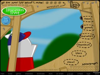
You may or may not remember this one, but back when I was in about 8th grade www.homestarrunner.com (created by Mike and Matt Chapman) provided me with my weekly fix of flash-animated funny. Now that was some 4-5 years ago, so as far as flash goes, it's not exactly state-of-the-art, but I chose it because it exhibits most of the kinds of things we've learned thus far in terms of interface button design and so forth. The opening interface is colorful, and every button triggers some animation to play in the background. All the animations and on-rollovers come with audio as well, further adding to the experience.

Beyond the interface, this site is jam-packed with animated shorts (including an animated viewer e-mail response that has weekly installments), flash games, downloads, character bios, merch, and so forth. All the content follows the exploits of an amorphous creature in a baseball cap named Home Star, and his associates. For those looking for a quick laugh via some surreal humor spiked with 80's and 90's pop culture references, I would recommend stopping in, although the site is so full of content, that a 'quick viewing' can easily turn into an hours-long gigglefest!

Friday, March 21, 2008

Design Exploration


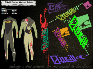
While searching the web for an interesting and effective website designed in flash I came upon Oneill’s website. They are a surf company specializing in making wetsuits. The splash page or intro page grabs your attention through the use of animations. Additionally the way that the navigation is built into the design creates a cool yet easy to navigate site. I believe that this site is designed with its potential users in mind. The surf industry has become a very fashion oriented and is utilizing much more graphic elements in their designs, whatever the product may be. This holds true for the websites as well, as you can see in the custom wetsuit design created with flash. It has an elaborate collection of graphics and colors that one can use to design their very own custom wetsuit. I think that the way it has been put together allows for an intuitive and effective way of designing a custom wetsuit through the internet. Beyond the custom wetsuit design element of this page I also found several other elements to be well designed. Some of the other elements that I like is the subtle animations when you first enter the site, as well as simple yet effective separation of elements within a page. Overall I think that whomever designed this site did a very good job in creating a very functional yet very creatively designed website.

Tuesday, March 11, 2008

Ms.Dewey.com - A Step In The Positive Direction?


Ms.Dewey.com is a flash based search engine that I came across awhile ago and found amusing to say the least. Though its a legitimate functioning search engine, I'm still trying to figure out if the creators of the site were seriously going for the next big thing in site searching or just making a facetious joke.

Despite the annoying chick and her cheesy lines, I'd have to say it is a pretty cool idea. The layout is fairly simplistic and straight forward and the visuals design ain't to bad on the eyes. The dark colors can make me feel slightly claustrophobic though and being trapped in a space with Ms. Dewey isn't something I personally enjoy. Especially since she incessantly keeps speaking to you as long as the window stays open. Luckily! There's a mute feature in the bottom right corner of the screen!

I'd say other than Ms. Dewey herself, the biggest downfall of the site is loading time and the fact you have to wait for her to finish saying something asinine before the results pop up. Not cool dude.

On the good side, Ms.Dewey.com does make web browsing a "special" type of experience. In the future, who knows? With faster loading time and a few more kinks worked out, this kind of web searching might catch on. Ms. Dewey definitely needs to find another job though. Just my opinion.

Monday, March 10, 2008

Studio Exploration - Melissa O'Brien

My first design studio that I discovered was Whitevoid. Based in Berlin, Germany they have clients as small as local museums and as big as The BMW Group. They essentially caught my eye because the very clean user friendly "file in drawer" design that their website hosts. When a new subject is selected it is opened like a filing cabinet drawer and all new subjects are pulled out like a file from inside the cabinet. When you choose a selected "file" to explore it is laid open with photos, videos and a small blurb about the project and intended audience.

This design studio creates truly advanced interactive installations from a touchscreen interface bigger than a grown man, a gun shaped fully functionional DJ device, to the super forward thinking fog screen display which lets you walk through your intended content.

Whitevoid

My second exploration is on Goodby & Silverstein. It was their philosophy that states "the best client relationships are based on telling the truth to each other, even when it's hard" that got my attention from this studio. Goodby & Silverstein treat their audience with a certain level of respect by presuming their audience has a "certain level of intelligence, discrimination and humor". In doing so they believe they will be awarded a better form of interest and engagement with that audience.

This design studio is advertisement based but I agree with their morals as well as their challenge to get their audience to think about a product instead of consuming what the masses suggest.

GoodbySilverstein_SS

Personally I envy a business that can get their message across and maintain a Eco-minded company that has a heart. Goodby & Silverstein have worked with many notable companies like Anheiser-Busch, California Milk Processors Association and Adobe but my favorite campaigns are their pro-bono works for Keep America Beautiful and the California Coastal Commission.

The last exploration I found was purely by accident. I stumbled upon the NDesign Studio when looking for tips for InDesign. This site was really a great find for me because there is a section that details the design programs needed as well as the assets they gathered to create the final product. For the beginner Adobe or Flash creator it was a great tool to see what goes into the design of their site. It was nice to see a studio who is secure enough in their skills to show the behind the scenes of their design ideas especially in this digital age.

Tuesday, March 04, 2008

Artist Exploration-Kigh Sturdevan-

www.iridethelines.com

My first exploration is with a Slovenian industrial student, Bostjan Cadez, who wrote Line Rider on a whim. "It was more an accident (than) anything else," says 'Bosh,' as he prefers to be called. In class he would doodle and construct elaborate hills and jumps on his sketchpad, then trace the path of an imaginary rider ("The Dude") sliding and flipping down the page. "Then it hit me. If it was fun to just imagine, how fun would it be to watch it live?" So he coded up a virtual sketchpad in Flash. He created "Line Rider" and thought of it as a mix between a comic, a cartoon, and a game. By October '06 Line Rider was an Internet phenomenon with 10,000 people getting the game on any given day. People post their best tracks as videos on YouTube. The success of this little Flash experiment has led Bosh to design a new game for Nintendo's Wii and DS consoles which will take the simple idea far beyond the Flash toy you can play on the web by adding levels, puzzles, challenges, and a storyline that reveal why the little Dude is on the sled in the first place. Make your own story with "The Dude"at iridethelines.com Here are examples of cool rides on YouTube:
"Discarded" by Tech Dawg (The Dude has a bad day)
http://www.youtube.com/watch?v=cW44BpXpjYw

"Super Mario" by shadon1nja (Super Mario Bros. World 1-1. Down to every bush and cloud. Awesome!)
http://www.youtube.com/watch?v=rn8ULJGboOE

"One Eyed Giant" by skate2skamusic (The Dude narrowly escapes being eaten by a Cyclops on his dinner table)
http://www.youtube.com/watch?v=Rb-wOlo9neM

www.wktokyolab.com

Please excuse the loading time on this site. I have no idea why it takes so long to load. It is worth the wait through! This is a company I would love to work for! They create a visual element that accompanies music. They use a lot of motion graphic and Flash work (as well as Final Cut all with Macs). Here is a link to a video profile of the company:
http://www.apple.com/pro/profiles/wk/
They make extremely creative video content for famous Japanese musicians.

Design Exploration

For my design exploration, I'm going to introduce two different kinds of pretty websites from Japanese studious.

This is my first favorite website. I like this one so much because this is really cute and makes me relax.

http://www.stompstamp.com/

This website is about apparel for kids.

This website is created with so many colorful dots which has children's pictures on it. The dots also create simple, cute pictures like fish, the shape of a heart, house, and so on. Therefore we can understand that this is about kids. By clicking one of the dots, you can see the specific kid's picture, video, and profile. At the beginning, I thought that it was the advertisement for a kindergarten. However, we can see the information of their clothes, and also can recognize the shop information which is on the upper right screen.

This website is really easy to see and understand. It doesn't have that many options so we don't get lost using it. In addition, this has lots of colorful dots but also has a lot of white space. Therefore, it is not clutter and at the same time, takes my eyes to the pictures and we can enjoy them. It doesn't take time to load it either.

I think that is a really cool website to know the trend for children, and what the kids are wearing, so mothers would love this website!


For my second favorite website, I'm going to introduce this interesting one.

http://www.yomiko.co.jp/bushido/

This website is the advertisement of the advertisement company. They replace the time of Japan with an earlier time, and used the story of famous Japanese wars to explain how they skillfuly won the war and business from the other advertisement companies in this website in a funny way.

This is like a movie and a game, and the audience will choose what they are going to do as the advertisement company. Then they will see what is going to happen after they choose.

They don't use that much color in the website, but the way they paint is comfortable to see it for an audience. It is not too complicated to watch; also, it definitely leads us to know that they are great advertisement company since we will see their triumph at the end of the website. It doesn't have that much movement of the animation, instead of this, we read dialog. It helps us to understand what the website is about too.

As I mentioned it before, this website is for the advertisement company; therefore as it has been expected, this website will be wonderful advertisement for the business community.

Monday, March 03, 2008

Studio/Artist exploration

This is an advertising agency. Leo Burnett. It is flash oriented and is the most creative advertising agency site that I have ever seen. The site begins with just the name written in cursive with a pencil lying down as part of the design. As soon as you drag over the name it explodes and your mouse becomes the pencil which you continuosly draw with the whole time viewing the site. The lettes which are scattared become your navigation choices. There is an organized navigation bar in the bottom right hand corner for those who like more structure. The site is very interactive. Each feature is creatively designed and executed. Along with clicking the different features that travel through out the letters of Leo Burnett's name, there are 4 red apples that help you you eyes travel through the site. Each apple has a famous quote by Burnett. It is also important to point out the apples are red where the type at the home page is all in black and grey. This adds interest to the design and variation which pleases the eye and lets you travel through the whole piece. While navigating through the site you never have to use the back and forward arrows. All you do is click on a blank portion of the canvas and you begin to move back where you started. This is an overall great site with top notch creativity and execution of ideas. The site is a clean design and it feels unified as a piece of art. Check it out. www.leoburnett.com

Wednesday, February 27, 2008

Artist Exploration

I've chosen a site called "The World Is My Canvas"


Check it out at

http://www.theworldismycanvas.com/


I found this site to be very interesting and entertaining. To be completely honest I wasn't sure what it was at first. After exploring for quite sometime I found that it is a clever plug by Nokia to market their products GPS devices.

The site introduces an interesting and comical host 'Stavros' as he explains the concept of "position art through GPS." The site itself includes a nice navigational system bar that's clean and easy manipulate. It interaction is simple and maneuverable. It includes fun little movie clips and intros to explain GPS tracking tools and how to make funny art. It even includes a contest for people to actually use the concept. In a separate section it allows screen saver and desktop downloads of the miniature comedian. I think it has an awesome promotional aspect because it's hilarious.

A few other interesting flash based sites that I found by Nokia are as follows

http://www.nokia.com/

This is a direct link to Nokia's main website. Here you can access area support, find and purchase various products and explore features of their company.

http://ovi.nokia.com/ovi/app/ovi/flash/
This site links to info, pictures and music options within Nokia.

These sites are equally well designed, clean and easy to navigate. Their page layout is interesting because it presents a picture slideshow that is shown over multiple turning screens (each that is seperately cued with the user mouse.) It's a nice touch to the site's interactivity..

Tuesday, February 26, 2008

Artist Exploration


http://nikefootball.nike.com/nikefootball/siteshell/index.jsp#,en,0;choose

This website has always caught my attention by all the different interaction it offers and it’s to my interest. It wasn’t until I started taking this class that I realized this website was a flash based website. I’m not exactly sure who are the creators of this flash based website are I just know it’s created by Nike and they reserved all rights.

I could honestly say that this website was obviously created to target soccer fanatics and to sale products of course!! In this case being Nike soccer products. One of the ways they do this is by making this website very easy to navigate and allowing you to see video clips relating to the subject matter.

This web site allows you to see what is going to on in the world of football or as we like to call it soccer. They do this by combining the products Nike has to offer with along with all the players it sponsors. It’s another form of marketing and another way to gain interest.

Throughout the whole first Interface in this website, with the use of flash it use a lot of rollovers to address the subject or the merchandise Nike is offering. Or whatever is they are trying to get thru to you. This make is very effective because you know right away that subject has some form of interaction another thing that comes into affect it’s the use of bright colors it uses.

One of the things that I really enjoyed was the NikeID that Nike has to offer in this website. If you click on this it allows you into the Nike Store and with some form of flash it allows you to choose from any kind of soccer shoe and make it any color with any designs that you want.

http://nikeid.nike.com/nikeid/index.jhtml?ref=http://nikefootball.com&sitesrc=eufootball#category,soccer

Another thing that I found very interesting and fun in this website was that it allows uploading your own soccer video and adding it the chain of videos it has from other users all over the world, then it plays it as one clip.


http://nikefootball.nike.com/nikefootball/siteshell/index.jsp#,en,0;shootinggallery,

Monday, February 25, 2008

Artist Exploration


Whitneybiennial.com was conceived by Miltos Manetas and Peter Lunenfeld in a clever effort to challenge the opening of the Whitney Biennial show. This website is a collaborative piece that uses the talents of over one hundred individuals to display their animated pieces integrated into a clean interactive web design.

The website allows you to stroll through an art museum like space, perusing computer generated works. By moving the mouse along a map situated at the bottom of the page, you simultaneously walk through the exhibition spaces, creating a virtual art viewing experience.

Soft background melodies enhance the airy, contemporary atmosphere. The website successfully mimics contemporary art curation and installation practices while adding an inclusive interactive element allowing the greater public to be the artist and the viewer.

The website uses Flash to create a user friendly and visually appealing experience while delivering a clever commentary on the pretentiousness of said art fair by allowing viewers to manipulate the pieces, many of which are similar to that of famous contemporary artists. The theme and layout used in this website ties the design and concept together successfully.

One of the drawbacks about this website is that it seems like a few of the artworks do not upload correctly. This may be due to the type of software that was used to create it. Also, at times, the map or guide doesn’t navigate as smoothly as it could.

Overall I think the website is a unique and creative way to mirror an environment while at the same time critiquing it.

Saturday, February 23, 2008

Artist Exploration


The studio that caught my attention was the Juxt Interactive Studio. It's an interactive marketing and design company based out of Newport Beach. I love their website because it's not too busy and not cluttered. The navigation is very clear and the "jeans-style" background gives the hole page kind of an urban feel to it. http://www.juxtinteractive.com/

The studio uses combined flash animation with game imagery for some of their projects (see http://www.lucasarts.com/games/thrillvilleofftherails/). The home page lead your into an interactive themepark with different interactive buttons with minigames, Souvenir-stand etc. and to build your own theme park.

Some of their impressive work was made for Target, Cherry Coke and their newest project Fizzix Gogurt that is an interactive web page catering to a very specific target group (boys 8-13). This project leads you into an interactive "Laboratory" world with funny feautures like flavor tasting and the "burp-interactive sound machine" etc. http://www.gogurtfizzix.com/

The BMW learn to drive integrates Video with Flash with great humor. The beginning leads you to a page where you can choose how your parents treated you when you were learning to drive and it goes from there. Very funny. http://www.relearntodrive.com/

The use of color in their project is very thought through and is used all throughout the whole page. The overall simplicity or better contemporary style of the studio is what makes it work for me. The studio has won several wards for their web pages including best of show, bronce in the 2008 Service Industry Advertising Awards etc.


Wednesday, February 20, 2008

New Media Exploration? - by Chie

As Karl and Veesh introduced web based programs in the last class, such as word processor or game which utilize Flash to provide rich and light content, I’d like to introduce an online photo editing program Picnik.com.

Picnik allows users to edit their photos online. They just need a web browser, but never need Photoshop with Picnik.com (if they are not demanding)! Some web sites or web photo albums have had online editing function but Picnik is definitely advanced and high-speed processing. Once they upload their photos from own PC or Mac, even from ANY web site, they are able to edit the photos in the web browser and then save them in their computers. Not only basic editing, such as rotate, crop, resize, color, sharpen, red-eyes, but also it has filters, text, and shapes so on.

Of c
ause it doesn’t have high editing ability as much as Photoshop does, and if you want to use advanced filters, shapes and fonts, you have to subscribe "Premium" for $24.95 for a year. Advanced users must be better to buy Photoshop, but I think free functions are enough for just regular users and even price of Premium is not too expensive.

New Technologies have cleared our limits one by one. For example, Photographers used to edit photos in a dark room. They needed different filters, chemicals, exposed time, amount of light, time and skills to create high quality arts. Since digital cameras have invented, they do not need the dark room anymore. But still, a high performance computer and enough money to buy Photoshop or so are required. Now, Flash allows all users who are online to work on creative photos whenever they are.

Actually, I was amazed its speed to upload, edit, save photos and the variety what I can do. It says "Picnik itself is a lightweight and 'download-less' experience. But it does require Flash 9 to be installed in order to have the rich, full-featured experience of photo-editing within a browser."

I guess I'm going to learn the mechanism how Flash works for those web based programs from now. It is so exciting to think what we can do with this amazing tool which could get over some obstacles we have had. We probably will have more variety of online tools like Picnik.com. Someday in the future, I might be able to work on a corporate project with my friend, a web designer in Japan, simultaneously on the Internet.

Tuesday, February 19, 2008

Design Exploration - by Chie

I show you two examples of successful design with Flash contents. Both website could be very ordinary one which just introduce information, but Flash contents make the web sites so attractive.

Michelin's web site is a great example of integrating interactive media function into ordinary web structure. The structure of the web site is very basic and simple: 4 global menu and 3 to 6 local menu on each global menu. Those local menu link to contents such as texts, graphics and movies. Instead of usual navigation by buttons and links, it navigates the audiences with interactive animation to each level of hierarchy very successfully. I analyzed what are the keys of the success. If you could, it'll be easier to understand what I say after you cruise the web site little.

  1. Hierarchy

If you notice, it has some links outside of center screen which the animation is on, such as Dealer Locator, Tire Selector, Web Shopping. Those are very important links to relate their sales directory, but they focus on a main purpose of this web site: promote the company. Links that outside of the main space is in same color scheme with background and simple and small text; They keep sales function but make them low-key. It helps the audience to focus on the main idea.

  1. Consistent

In the animation, they use same pattern from the main to reach the end level. It has many hidden button in the animation but it’s very easy to find because they use same symbol as hidden buttons in any pages. A “Back” button is always in same position in the frames and “Quick Guide” bar on the bottom tells the audience where you are now. Also each section has each theme color but main color “white” create a sense of unity through whole web site.

  1. Balance

The web site has good balance of positive and negative space. The animation has enough depth of field and proper space between each items, such as graphics or hidden buttons. It makes the web site looking simple and avoid the audience being overwhelmed.

  1. 3D Animation

It attracted me so much!! Experienced the 3D special migration, I also was wondering how they create the animation. It’s really COOL!!


I found another example of great design in Saturn. In same reasons as Michelin, I think this website is successful. Its’ clear and consistent navigation leads audiences’ eye movement and make easy to understand the hierarchy. Large, whitish negative space counterpoints the rectangular main space. Flash animation makes the website a lot more active and attractive. It’s been so exciting to learn Flash!!

For my first blog, I have two websites that use Flash in different ways.

The first website does not use Flash as its main format. Instead, it has found an interesting usage for Flash that I found to be of importance. The Website is the offical site of author Chuck Palahniuk, whom most people know through the film adaptation of his novel, Fight Club.

http://www.chuckpalahniuk.net/workshop/chucks-essays-2008-25

I would assume that most people in this class are familiar with Napster, and the RIAA's lawsuit against people downloading music for free. The Internet and the ease at which media of entertainment are available create hassles and conundrums for copyrights. The webmaster of ChuckPalahniuk.net, however, found an innovative way to ensure the copyright nature certain essays written by Palahniuk featured on the site.

By having the essay displayed in a Flash format, it secures the document. Highlighting and copying do not work. Saving the entire web page does not work. Trying to print the document will only print the small bit shown on screen. You are left to simply scroll through the Flash document, read the article, and not to maintain a copy for yourself.

The second Website I explored has its entire interface in Flash.

http://www.pandora.com

Pandora is an Internet Radio created by the Music Genome Project, which was founded by Tim Westergren. The Project seeks to catalogue all of the music in the world by its various attributes: rhythm, instrumentation, orchestration, arrangement, lyrics, singing style, syncopation, et al.

Pandora works by the User inputting the name of an Artist, Song or Composer into the search field. Pandora is then able to use that input as a basis for recommendations to the listener. Obviously, for these purposes, more popular artists are more easily found than, for example, Russian Pagan Metal or Speed Folk. However, the Project has been able to categorize an enormous selection of music, and Pandora Radio is an excellent tool to find new music. The Radio itself is free to use, with personalizations of your own select stations.

http://www.pandora.com/corporate/

Allow Pandora to speak for itself. I encourage you to explore the site, as it will undoubtedly lead you to new discoveries of musical artists and/or stylings.

Monday, February 18, 2008

Beta Testers - by Veesh

Hi Everyone!


For my two examples in flash design I chose two video game companies. I'm an avid gamer myself so in the picking, I have one thats a well established design studio with mutli-blockbusters out(Blizzard Entertainment), and the other is a fresh new face in the gaming community with a design entirely in flash (Artix Entertainment) and a very promising future. The game DragonFable (Artix) is currently past open beta and while its still currently free to play, you do have to create a login to check it out. For my presentation I'll log in to my account :) and give a short demo of actual game play!! The game itself is amazing, as far as what they were able to accomplish with a browser as the game platform. Aside from the artwork and smooth flash design there is a lot going on in the background, as far as scripting and databasing, but all well connected and well working with the flash in the foreground. Below is a flash movie made by the game creator as a promotional and a very good look in to the actual game design. The art work, movies and sound is similar to game play. DragonFable


My second studio study is the Blizzard Entertainment group. Having designed StarCraft and World of Warcraft(alone with 9 million+ members) they are definitely the leader of multi-player online games. First off, I just want to show one image - that has been "flashed" by the designers of "Blizz". This website is a perfect example of what a professional team is capable of in flash. If you don't happen to have flash the image loads like a normal picture. However, if you're flash enabled, you'll see an almost invisible flash loading bar above the picture and then ! the picture comes alive. I think this is amazing flash work and reminds me of the "moving picture frames" where there is a light behind a painting.
The above example is just one image. To fully understand what Blizzard is capable of; I recommend that you visit this website If you click on the link for the mini flash site it takes you into a world of its own! This website was created for the promotion of the first expansion for the World of Warcraft game. It was made to give potential customers a peek at the new addition to the game as well as a ton of information for it. For my presentation I will also give a small demo of this site. Stunning artwork, solid flash design, and seamless mini games built into the site; 9 million people paying $10 a month for just one of your games: this is what I would expect from a company like that!

Sunday, February 10, 2008

Interactive multimedia

Livengood/ Nowack are a full serve marketing company that has been in business for over 30 years. They specialize in branding, marketing strategy, media management and creative campaign development. They utilize media planning, print, TV and other forms of marketing disciplines to facilitate their business.

I really enjoyed their web site and other links designed by this company. I found the Get lucky in 2008 to be very funny. I also liked the page transitions, use of sound and visual graphics using flash. The company applies a lot of humor on their web site and I found this to be very refreshing. Another thing that I noticed was that some of their clients were involved with nutrition and heath, such as salmonsafe.org and organicvalley.coop. This made me think that they seem to generally care about the welfare of the clients and their marketing campaigns. Other clients consisted of wide variety of different companies in the Pacific Northwest. Overall, I liked their use of flash software, audio sound and effective rollover techniques.

Get Lucky in 2008
http://www.lngetlucky.com/

A humorous site with a great concept, clean design, and some entertaining videos. The page layout was very well done. The video offers a sneak preview into what one would expect from different cultures around the world on New Years Eve.

http://www.in-ads.com/ln.html

This is the company web site. They do a very nice job on roll-overs and very funny explanations of their business and service. By clicking on their work you will be able to view the different clientele list as well as different forms of design work that this company incorporates into its layouts.

Here is a list of the different web-sites designed by Livengood/Nowack company.

http://www.marquiscompanies.com/

http://www.salmonsafe.org/

http://www.fife.com/

http://www.organicvalley.coop/