I discovered that Disney.com has become quite an elaborate flash site

and I would like to compare it to agencynet.com (click anchor link and read just below 2nd picture), which also has an impressive video animated flash interface.
At first glance Disney seems a complicated website, overwhelming with lots of information. Discovering the site is meant to be an adventure, a reflection of the lay-out of Disney's themeparks. But instead, the main pages focus on the company's core businesses.
Looking at the source code, I learned that the website developers built a CSS site with Flash movies and flv's (Flash Video's) embedded in a Flash driven interface. They also used javascript to call the flash elements within the interface. The homepage source code is unexpectedly short, I assume because of the javascript code, that processes the webpage needs/call outs on Disney's webserver. Still so much to learn and understand and so little time: "...Mork calling Orson, come in Orson,... I need more life..." *Sigh ;)
Each web/Flashpage opens with a wonderfully beautiful background (hallmark of Disney's State of the Art animation capabilites), then the subwindows load. At the top of each page is a recurring horizontal control bar with navigation text buttons with a matching clickable icon above them that branch off to a new webpage. Some pages carry an Ad banner (Movies, TVshows, etc). The NavBar lists Disney's main lines of business: movies, TV, games, music, live events, travel, shopping, mobile, characters, and Disney XD (Xtreme Digital). On rollover, the buttons glow up and a trace of pixie dust shoots across, and the corresponding icons light up. Central on each theme page is a flash video... Disney's website tries to avoid being perceived as a commercial website. This is a place where dreams come true, a magical and happy place, pixie dust (cute) is all over the webpages and in the flash intros...
The visual center of any of Disney's webpages (except for the shopping pages, which tend to have a more commercial look and lay-out) is just slightly above and to the right of the actual (mathematical) center, and that's where the designers placed the Flash flv's. This tends to be the natural placement of visual focus, and is also sometimes referred to as museum height. The design recipy of the pages also respects the rule of thirds. Top 1/3 includes Adbanner, Horizontal NavBar, and windows with main flv panel. Middle 1/3 branch off to individual Disney characters. Bottom 1/3 contains legal footer. All 3 parts are embedded in a main Flash window. So what I'm trying to state is that the website consists of embedded, cascading style Flash based webpages. Cool!
The balance of the webpages are approximate horizontal symmetrical. Symmetrical balance occurs when the weight of a composition is evenly distributed around a central vertical or horizontal axis. The size of the whole website is really big, matching the clout of a Fortune 500 company. The cluttery look with windows left and right reflects the feel of the store fronts of Main Street in Disneyland. There is quite a lot to discover. Have fun!
For example: explore the fairy minigames at: fairies minigame: sundown. Aren't those fairies enchanting!
Another attractive Disney cartoon character I like is Kim Possible. Have you noticed "Erin Esurance" the auto insurance company's secret agent looks like Kim. Well yes, they have the same been created by artists from different companies: Alan Lau (who used to work for Disney) from ghostbot.com and Phil Robinson from W!ldbrain.com. The last two links: "Lau" and "Robinson", lead to QuickTime video versions of original Flash animations.
On to the next one:
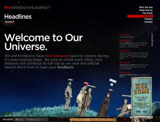
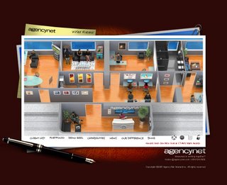
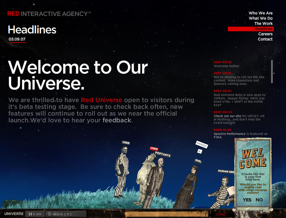
AgencyNet.com
Check out the website by clicking the picture here below:

The webdesign technology is similar to Disney's, but this company chose to display a professional & clear commercial corporate identity.
Website build is the same symmetrical center balance. A group of flv's are strung together and are in fact clickable button areas (they flash on rollover) with embedded Flash movies (swf's) that link to a deeper level in the site. The background murmur gives this an active office feel. I wonder how they shot the videos as base for the clickable buttons. Anyone have an idea?
Anyway, this website gives Agencynet.com an interesting and modern, corporate cool image!
Victor Sturm
4/16/07


 In this site, there are several examples of superb websites using flash. There is one about IKEA, which I found quite interesting. Check it out.
 The second site that I really likes was
