Design Exploration

If you want a compelling site to visit check out http://www.okaydave.com/
I think I spent about 45 minutes there checking everything out.
This is an award winning artist’s portfolio site. The design has very good consistency, in several arenas, throughout the site. He used contrast well on the home page. It has a collage of photos in black and white and when you roll over it elements pop out to click on in color. He uses a lot of black and white but it feels warm because of the dark background and brown tones. He also has a nice menu that is on every page at the bottom with a red pencil circle that highlights each choice as you rollover. Having this menu stay there makes you feel grounded and knowledgeable as to where you can go and are. When you first get to the homepage he has a pleasing video type effect with music that he replicates in the little videos that he has on his other pages.
Most pages are broken up nicely into 3 parts. The left side has video on top and sub-navigation for the information on the right side of the screen. The screen is split so that the right side has more room than the left which is visually appealing.
There is a nice combination of artsy, scratched words and hand-drawn loading images, yet there are nice, polished, professional projects and they end up being very cohesive. For instance on his logo page he has some simple stark and bold logos and you can move the mouse to see his design notes scrawled out.
The music is appropriate and not overwhelming. His videos explain each project in a visually stimulating way and are not too long. I would like it if he had a written synopsis but I guess that is where his process notes come in so it works. And I’m sure that is what he thought when he did it. It left me inspired.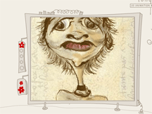
Another site that was nicely done, visually stimulating and fun exploring is http://www.longneck.ro/
posted by Erin Meister @ 4:53 PM
![]()

<< Home