Friday, March 28, 2008

Design Exploration

For my first design exploration I choose the Van Cleef & Arples web site http://www.vancleef-arpels.com/. This site was designed by the Company Avenue a Razorfish.


The website is compiled of regular scripting with javascript and flash components. The flash part mostly happens in the content table. Some of the navigation is not that easy since it has hidden buttons but it has some cool rollover effects with loading of other galleries inside galleries.

Having more the contemporary taste, I love the cleanness of the design together with outstanding photography that is creating a very beautiful visual experience. The color combination is very well thought through. The more exciting pages are http://www.vancleef-arpels.com/en/van-cleef.html#/between/

The page has a video movie clip of how it's designed, made and fabricated:

http://www.vancleef-arpels.com/en/van-cleef.html#/savoir/

This website has the right balance between being artistic and still be informative. Although I love the website I think it would drive me crazy to look for something particular. Great design, great visual presentation and photography.


The second design exploration is going to be a site created by juxtinteractive. http://clients.juxtinteractive.com/direcTV/titanium/rc5/titanium.html

The site was built for Direct TV and combines Flash with a real person in a video about a new feature- subscription that is called Titanium. The setup is made to look like a studio in some skyscraper. Navigation is very clear and easy to find. The website mostly informs potential customers of the products and subscription details.

Through scroll buttons you are able to find all the different links. The cool thing about this page is the videos in the detail pages that are places at the sidewall of the studio all in perspective.
Again, love the simplicity of the design.

Tuesday, March 25, 2008

New Media Exploration - Technology


For my post, I went and skimmed the net for technology that may impact the future of data interaction and interpretation, and I located this. The Emotiv"Mind-Reading" headset is set to come out late 2009. The headset is not actually there to "read" minds; it's job is to interpret the electric signals transmitted
by your brain. At the moment, Emotiv has the headset geared toward gamers, using it as a faux-controller. While the technology will undoubtedly need some fine tuning, the application behinds such technology are immense and are going to undoubtedly make the designers very, very rich in the future.
The reason this technology is so important is that usually, devices such as these generally sit in the range of thousands of dollars. The technology will be continually evolving as well, since Emotiv is preparing to link up with IBM to expand the possibilities of the helmet with gaming. Who knows-maybe you'll be driving your car with your mind one day?
Another technological marvel that will be of a great deal of help to anyone who uses a laptop and knows the terrible, terrible cost of running high powered programs off batteries. Even newer laptops can only run more powerful and demanding programs for a scant two hours, at most. However, a research team as Stanford University, is designing batteries that may hold up to ten times the charge of your current battery. The secret? Silicon.

These are just a couple of technological assets that I found useful, and will probably be picking them up when they become available for commercial use. Both assets still have a lot of tuning to be made, but the possible future applications are as deep as they are promising.

John Olgeirsson -=Design Exploration=-


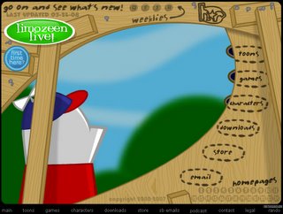
You may or may not remember this one, but back when I was in about 8th grade www.homestarrunner.com (created by Mike and Matt Chapman) provided me with my weekly fix of flash-animated funny. Now that was some 4-5 years ago, so as far as flash goes, it's not exactly state-of-the-art, but I chose it because it exhibits most of the kinds of things we've learned thus far in terms of interface button design and so forth. The opening interface is colorful, and every button triggers some animation to play in the background. All the animations and on-rollovers come with audio as well, further adding to the experience.

Beyond the interface, this site is jam-packed with animated shorts (including an animated viewer e-mail response that has weekly installments), flash games, downloads, character bios, merch, and so forth. All the content follows the exploits of an amorphous creature in a baseball cap named Home Star, and his associates. For those looking for a quick laugh via some surreal humor spiked with 80's and 90's pop culture references, I would recommend stopping in, although the site is so full of content, that a 'quick viewing' can easily turn into an hours-long gigglefest!

Friday, March 21, 2008

Design Exploration


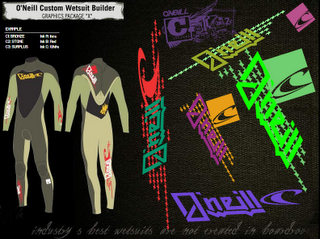
While searching the web for an interesting and effective website designed in flash I came upon Oneill’s website. They are a surf company specializing in making wetsuits. The splash page or intro page grabs your attention through the use of animations. Additionally the way that the navigation is built into the design creates a cool yet easy to navigate site. I believe that this site is designed with its potential users in mind. The surf industry has become a very fashion oriented and is utilizing much more graphic elements in their designs, whatever the product may be. This holds true for the websites as well, as you can see in the custom wetsuit design created with flash. It has an elaborate collection of graphics and colors that one can use to design their very own custom wetsuit. I think that the way it has been put together allows for an intuitive and effective way of designing a custom wetsuit through the internet. Beyond the custom wetsuit design element of this page I also found several other elements to be well designed. Some of the other elements that I like is the subtle animations when you first enter the site, as well as simple yet effective separation of elements within a page. Overall I think that whomever designed this site did a very good job in creating a very functional yet very creatively designed website.

Tuesday, March 11, 2008

Ms.Dewey.com - A Step In The Positive Direction?


Ms.Dewey.com is a flash based search engine that I came across awhile ago and found amusing to say the least. Though its a legitimate functioning search engine, I'm still trying to figure out if the creators of the site were seriously going for the next big thing in site searching or just making a facetious joke.

Despite the annoying chick and her cheesy lines, I'd have to say it is a pretty cool idea. The layout is fairly simplistic and straight forward and the visuals design ain't to bad on the eyes. The dark colors can make me feel slightly claustrophobic though and being trapped in a space with Ms. Dewey isn't something I personally enjoy. Especially since she incessantly keeps speaking to you as long as the window stays open. Luckily! There's a mute feature in the bottom right corner of the screen!

I'd say other than Ms. Dewey herself, the biggest downfall of the site is loading time and the fact you have to wait for her to finish saying something asinine before the results pop up. Not cool dude.

On the good side, Ms.Dewey.com does make web browsing a "special" type of experience. In the future, who knows? With faster loading time and a few more kinks worked out, this kind of web searching might catch on. Ms. Dewey definitely needs to find another job though. Just my opinion.

Monday, March 10, 2008

Studio Exploration - Melissa O'Brien

My first design studio that I discovered was Whitevoid. Based in Berlin, Germany they have clients as small as local museums and as big as The BMW Group. They essentially caught my eye because the very clean user friendly "file in drawer" design that their website hosts. When a new subject is selected it is opened like a filing cabinet drawer and all new subjects are pulled out like a file from inside the cabinet. When you choose a selected "file" to explore it is laid open with photos, videos and a small blurb about the project and intended audience.

This design studio creates truly advanced interactive installations from a touchscreen interface bigger than a grown man, a gun shaped fully functionional DJ device, to the super forward thinking fog screen display which lets you walk through your intended content.

Whitevoid

My second exploration is on Goodby & Silverstein. It was their philosophy that states "the best client relationships are based on telling the truth to each other, even when it's hard" that got my attention from this studio. Goodby & Silverstein treat their audience with a certain level of respect by presuming their audience has a "certain level of intelligence, discrimination and humor". In doing so they believe they will be awarded a better form of interest and engagement with that audience.

This design studio is advertisement based but I agree with their morals as well as their challenge to get their audience to think about a product instead of consuming what the masses suggest.

GoodbySilverstein_SS

Personally I envy a business that can get their message across and maintain a Eco-minded company that has a heart. Goodby & Silverstein have worked with many notable companies like Anheiser-Busch, California Milk Processors Association and Adobe but my favorite campaigns are their pro-bono works for Keep America Beautiful and the California Coastal Commission.

The last exploration I found was purely by accident. I stumbled upon the NDesign Studio when looking for tips for InDesign. This site was really a great find for me because there is a section that details the design programs needed as well as the assets they gathered to create the final product. For the beginner Adobe or Flash creator it was a great tool to see what goes into the design of their site. It was nice to see a studio who is secure enough in their skills to show the behind the scenes of their design ideas especially in this digital age.

Tuesday, March 04, 2008

Artist Exploration-Kigh Sturdevan-

www.iridethelines.com

My first exploration is with a Slovenian industrial student, Bostjan Cadez, who wrote Line Rider on a whim. "It was more an accident (than) anything else," says 'Bosh,' as he prefers to be called. In class he would doodle and construct elaborate hills and jumps on his sketchpad, then trace the path of an imaginary rider ("The Dude") sliding and flipping down the page. "Then it hit me. If it was fun to just imagine, how fun would it be to watch it live?" So he coded up a virtual sketchpad in Flash. He created "Line Rider" and thought of it as a mix between a comic, a cartoon, and a game. By October '06 Line Rider was an Internet phenomenon with 10,000 people getting the game on any given day. People post their best tracks as videos on YouTube. The success of this little Flash experiment has led Bosh to design a new game for Nintendo's Wii and DS consoles which will take the simple idea far beyond the Flash toy you can play on the web by adding levels, puzzles, challenges, and a storyline that reveal why the little Dude is on the sled in the first place. Make your own story with "The Dude"at iridethelines.com Here are examples of cool rides on YouTube:
"Discarded" by Tech Dawg (The Dude has a bad day)
http://www.youtube.com/watch?v=cW44BpXpjYw

"Super Mario" by shadon1nja (Super Mario Bros. World 1-1. Down to every bush and cloud. Awesome!)
http://www.youtube.com/watch?v=rn8ULJGboOE

"One Eyed Giant" by skate2skamusic (The Dude narrowly escapes being eaten by a Cyclops on his dinner table)
http://www.youtube.com/watch?v=Rb-wOlo9neM

www.wktokyolab.com

Please excuse the loading time on this site. I have no idea why it takes so long to load. It is worth the wait through! This is a company I would love to work for! They create a visual element that accompanies music. They use a lot of motion graphic and Flash work (as well as Final Cut all with Macs). Here is a link to a video profile of the company:
http://www.apple.com/pro/profiles/wk/
They make extremely creative video content for famous Japanese musicians.

Design Exploration

For my design exploration, I'm going to introduce two different kinds of pretty websites from Japanese studious.

This is my first favorite website. I like this one so much because this is really cute and makes me relax.

http://www.stompstamp.com/

This website is about apparel for kids.

This website is created with so many colorful dots which has children's pictures on it. The dots also create simple, cute pictures like fish, the shape of a heart, house, and so on. Therefore we can understand that this is about kids. By clicking one of the dots, you can see the specific kid's picture, video, and profile. At the beginning, I thought that it was the advertisement for a kindergarten. However, we can see the information of their clothes, and also can recognize the shop information which is on the upper right screen.

This website is really easy to see and understand. It doesn't have that many options so we don't get lost using it. In addition, this has lots of colorful dots but also has a lot of white space. Therefore, it is not clutter and at the same time, takes my eyes to the pictures and we can enjoy them. It doesn't take time to load it either.

I think that is a really cool website to know the trend for children, and what the kids are wearing, so mothers would love this website!


For my second favorite website, I'm going to introduce this interesting one.

http://www.yomiko.co.jp/bushido/

This website is the advertisement of the advertisement company. They replace the time of Japan with an earlier time, and used the story of famous Japanese wars to explain how they skillfuly won the war and business from the other advertisement companies in this website in a funny way.

This is like a movie and a game, and the audience will choose what they are going to do as the advertisement company. Then they will see what is going to happen after they choose.

They don't use that much color in the website, but the way they paint is comfortable to see it for an audience. It is not too complicated to watch; also, it definitely leads us to know that they are great advertisement company since we will see their triumph at the end of the website. It doesn't have that much movement of the animation, instead of this, we read dialog. It helps us to understand what the website is about too.

As I mentioned it before, this website is for the advertisement company; therefore as it has been expected, this website will be wonderful advertisement for the business community.

Monday, March 03, 2008

Studio/Artist exploration

This is an advertising agency. Leo Burnett. It is flash oriented and is the most creative advertising agency site that I have ever seen. The site begins with just the name written in cursive with a pencil lying down as part of the design. As soon as you drag over the name it explodes and your mouse becomes the pencil which you continuosly draw with the whole time viewing the site. The lettes which are scattared become your navigation choices. There is an organized navigation bar in the bottom right hand corner for those who like more structure. The site is very interactive. Each feature is creatively designed and executed. Along with clicking the different features that travel through out the letters of Leo Burnett's name, there are 4 red apples that help you you eyes travel through the site. Each apple has a famous quote by Burnett. It is also important to point out the apples are red where the type at the home page is all in black and grey. This adds interest to the design and variation which pleases the eye and lets you travel through the whole piece. While navigating through the site you never have to use the back and forward arrows. All you do is click on a blank portion of the canvas and you begin to move back where you started. This is an overall great site with top notch creativity and execution of ideas. The site is a clean design and it feels unified as a piece of art. Check it out. www.leoburnett.com