Skip to Navigation | Skip to Content

Class Blog

Monday, September 29, 2008

Studio Exploration: EVB

http://www.evb.com/


EVB is an advertising agency based out of San Francisco and founded in 2000 by Jason Zada and Daniel Stein. Over the past 8 years they have grown from a small interactive shop to a full service agency building a reputation for creative edgy Flash work with strong video integration. Through this digital media they are able to create persuasive and effective Ad campaigns, and websites.

Unlike most traditional advertising agencies EVA handles all creative production in-house. In addition to strategy and writing teams, it can shoot its own videos and build everything from websites to complex online applications.

In order to effectively reach their target audience the agency stays up to date with the current trends and culture. The designs are visually appealing with well-polished graphics and videos. The concepts are well executed through the professional and highly creative usage of flash and other digital medias allowing customers to engage with the brand.

Some of the eye-catching features include downloading songs, playing music and games, watching video footage and interactive buttons.

The client list includes: Good Year Tire, office Max, VO5 Chriss Angel, 2K sports, Adidas, Microsoft, Old spice and more.

Some examples:
Adidas: Dream MLS
http://www.adidas.com/us/campaigns/mls/content/default.asp
This site incorporates strong use of video imagery combined with vector images. The videos are used as buttons and movie clips.

Old Spice: When she’s hot
http://whensheshot.evb-archive.com/
This site uses an interactive video that allows customers to create their own video choosing the music and imagery. The Flash based video mixer has similar capabilities to that of Garage band.

Microsoft: Mrs. Dewey
http://www.msdewey.com/
Mrs. Dewey is a Search engine that plays prerecorded movie clips of a female actress to entertain you while searches are being performed.
New Media - Picnik

Picnik is Photo editing made fun. Picnik makes your photos fabulous with easy to use yet powerful editing tools. Tweak to your heart’s content, then get creative with oodles of effects, fonts, shapes, and frames.

There are two account options.
Free: Dozens and dozens of fonts, shapes, frames, all the effects and the touch-up tools are yours. Plus, all the Edit tools, the ability to undo everything you've ever done to your picture, and it remembers the history of the past five pictures you worked on!
Premium: You get ALL the effects, frames, fonts, shapes, plus NEW advanced editing tools Curves and Levels, which have all the power found in expensive software packages but with one-click defaults and the added shine that all things Picnik have. You also get Priority Help Support, new feature previews, professional FontShop fonts and other exclusive content, the ability to access all your favorite photo sites at the same time to use Picnik to transfer photos between them, unlimited Photo History, and a completely ad-free experience.


I found that Picnik to be the best free online photo editor because not only does it have the simple task for photo editing (exposure, crop, color, sharpen) it also boost several other options to allow several effects like that of Photoshop's filters, can add text, choose to add several shapes, allows for touch up tools such as whiten teeth and blemish removal, and add instant frames when your all done.

You also get to load images from several online image libraries such as Flickr, Photobucket, Myspace, and Facebook plus others.

Exploration: New Media and Social Sites: Pixton Comics Inc.

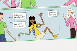
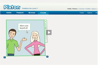
I stumbled upon Pixton Comics Inc. which is a social website that is fairly new. The website allows non-artists the ability to create comics with ease. It is very fast and very efficient.

Pixton Comics Inc. is located in Vancouver, Canada and has two creators Clive and Daina Goodinson. They used flash to create a comic book creator, that can create very individual characters that can be distinguished by age, gender, ethnic background, hair and body type. These characters are fully editable so you can add facial expressions or body movements to the character as the story progresses.


The idea is that people all over the world can join a community where they can create and share their comics amongst each other. They have contests occasionally where you can win prizes. You can publish your comic and it is instantly translated into over 20 different languages. Pixton is safe for kids as well. They have a language filter that censors offensive language and the users can vote and flag each others comics to be reviewed and removed if necessary.


I like how simple the design is for Pixton Comics Inc. It is very straight forward and I don't think many people will have trouble learning to use it. The learning curve seems fairly short. And is a fun way to express oneself. The website currently has only 7,531 members, but has been created this year.


For more info on how to use the site check out their trailer/tutorial at
http://pixton.com/trailer

If you want to learn more about their company and product visit
http://pixton.com/about

-Klarence OuYang

Studio Exploration: Avenue A/Razor Fish

Avenue A/Razor Fish is a marketing firm that specializes in creating interactive consumer experiences for its clients. Avenue A/Razor Fish works to create a way for companies to reach their customer base in all aspects of the digital world they life in today. They were founded in 1995 and are headquartered in Seattle; although, they have over 2000 employees and offices around the world in Australia, China, France, Germany, Japan, and the United Kingdom. They are a well known firm whose clients include Audi, Mercedes AMG and Honda F1 in the automotive sector alone. They have won numerous awards ranging from the work they have done on advertising campaigns to the work environment itself at Avenue A/Razor Fish.

Two of my favorite examples of their work are the work they did for Mercedes AMG and the work they did for Audi. Both are highly interactive and allow the user to experience the brand in a whole new way.

Audio Global Drives

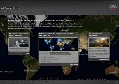
For Audi, Avenue A/Razor Fish created the Audi Global Drives site. Global Drives was a campaign by Audi where users could submit different routes from around the world to drive. Users could then vote on these routes and 5 winners were given a chance to drive their route in a new Audi A4. Along for the drive was a camera team so that “the world could ride shotgun” What really fascinated me about the work they did was how interactive it was and how subversively the Audi brand was marketed. Though there were logos and advertisements for Audi the site never gave you a feeling of pushing the product but as a place to share driving fantasies that could come true thanks to Audi.


Mercedes AMG

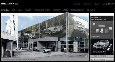
For Mercedes AMG, Avenue A/Razor Fish created an interactive gallery/display room/brand awareness center on the internet. What they did on the internet reminded me very much of how BMW built the BMW motor world and the BMW Museum in Munich. You are capable of creating your own Mercedes from scratch, adding all the different features you want to your personalized AMG. Not only does the site include current news and information but it also acts as a sort of Museum for the brand, detailing its history.

Design Exploration: The Official SAW site


With Halloween coming up, I thought I would find a Flash site related to horror:

The Official Saw site (http://www.officialsaw.com) is a site devoted to the extreme horror of the SAW movie franchise. The site opens up showing the name “SAW” filling up with “blood” as it loads the page. The intro to the site shows a video of grisly scenes from the movies to the home page. There you’ll see an industrial saw-like graphic where the center features updates for events relating to SAW; in this case a link to SAWMania coming up in November 2008 at Times Square in New York City and a link to the official SAW auction in Ebay.

On the right side of the “blade”, there are links to take you to each film of the 4-movie franchise. Each film features a synopsis of the movie, DVD features, video clips of each “trap” featured in that particular movie, a gallery of still shots from the movie, original soundtrack listing, and a link to the Official SAW store. On the left side, there are direct links to the Official SAW store, a fan site, and House of Jigsaw. As you navigate through the links, the same industrial creepy music plays. One of the links “House of Jigsaw” further explains the history of the killer. It also explains the traps and tells you who the victims are. There are also wallpaper downloads if you are interested in featuring these gruesome images on your desktop.

A separate House of Jigsaw site (http://www.houseofjigsaw.com) celebrates the dehumanizing graphic effects of the dangerous horror films. The main focus of this site and the sites linked throughout is to strongly assault the senses. What is it that the consumer likes about them, and what sick impulse forces them to continue to watch films that try to outdo one another with the brutality factor?

Upon opening the first page of the site, there is a grisly image of the Jigsaw Killer for which the words “Welcome to the House of Jigsaw” appears. The different types of fonts used to create this depict the sort of crazed demented look that is associated with the film. The audio that accompanies the page is grating and creepy. The quickness of the images flashing between each other is unnerving.

A preview of the upcoming film “Saw V” is shown. The growing appearance of a man who you eventually see has his head is in a clear, glass box surely traps the observer and forces them into the beginning of a puzzle whose only solution is unimaginable violence and brutality.

As you rollover the links to the other pages of the site, you’ll encounter sounds that seems as if they are coming from the depths of hell. As you click through each link, the same “tick, tock, and slide” sound effects stay with you. The slashed and grizzled looking words combined with the subtle and infrequent jerking of the words on screen add to the dark and dreary look of the site.

What I didn’t like was when you click “Enter”, the site takes you directly to the message boards; I guess I was hoping for something a little grisly. However, the design elements are distracting, conflicting, confusing; all to again assault your senses.

Design Exploration: Disney's The Little Mermaid

For my first one, I chose to look at something I've been in love with for a very long time. I am a huge Disney fan, and I have found that some of the most interactive websites I have been to have been designed by Disney. This time, I was looking at the new movie just released: The Little Mermaid: Ariel's Beginning.

When the page first opens, the world of Altantica is opened right away, and an introduction to major characters is started. The characters are interactive buttons, and when clicked on, a short character bio is brought up to be read, giving a quick look into some of the back story for this movie. The characters are ranged from most important, Ariel as the biggest, to not as important in the major plot, the band members as one of the smallest. Ranging the buttons by size lets the user subconsciously know that certain characters are more important to the plot and development of the movie vs. being secondary characters who help move things along.

The menu for the site is located at the bottom of the interactive area, allowing for easy access. The buttons have roll-over effects, and lighten up when the mouse is placed over them. This catches the user's attention, while still being subtle enough to not distract from the interaction above with the characters.

Disney has always been good at integrating mini games right into their websites, and this one is no exception. Already on the front page is a hunt for the seashells game. It isn't very noticeable, but it gets the user to notice it by flashing and extending an info bar when scrolled over. This game invites the user to go further into the site to find these other shells since they are not all located on the front page.

The website does have its drawbacks of course. The side bits seem a little crowded to me; however, it does get the point across that this is an ad for the new movie, not just a website to play around on. There is a photo of the movie and an order now button trying to entice people to buy the movie if they enjoyed the site. The ad however does not have much interaction, which is good as it doesn't lead the user to think that this goes into some other part of the website related to the Little Mermaid. This means that the user can concentrate on enjoying and exploring the website.

The theme of water is kept throughout the website, through its color scheme but also through the transitions between the pages. There is a wave effect placed on the background photo while the rest of the page is being loaded. The music placed throughout the site is also one that tends to lead to the thought of water when paired with the site. While this music also leads one to think of royalty, it is soothing to listen to, and doesn't distract from the overall feel of the site. The sound of bubbles popping when scrolling over a button also leads the user to a feel of water and being "under the sea". This also allows the user to know when a button is going to lead somewhere as it makes the popping sound when scrolled over.

Throughout this site, it is not forgotten that this is an ad for the movie itself. There is only just enough information supplied to entice the user into either looking for more, or making a purchase of the movie. It's a kid friendly site, which is good since kids do have an influence on parents, family, friends, etc if this movie is bought for them. Allowing the kids themselves to explore the city of Altantica is a way to market the movie to the people who are most likely to watch it.

All in all, this site is put together with very little animation in that things are moving everywhere, but with enough that it makes looking at the site fun. This helps in the selling of the movie, as well as just getting people onto the site and thus possibly other sites made and maintained by Disney.

Studio/Artist Exploration: Bigman


Bigman, Brazil, Sao Paulo - founded 2007.

A creative agency for traditional and new Medias.

Clients: Nestle, DEWALT, Toriba Hotels Brazil, Black & Decker


I was attracted to this particular website because I find it original and imaginative. As I am also a fan of typography, I enjoy very much the layouts, colors and sizes of all the words and sentences in this site. The idea of getting the visitor involved in a playful manner of looking for information is well received in that it is an easy task. By looking for information such as Client List, Contact, About Us etc. one stumbles on additional links to all kinds of different websites for a purely humorous mission.


The color choices are superb in a sense that they are hip and innovative and they are used effectively with a strong bold color such as black. The contrast of black, white and the hints of color splashes create a luminous effect within shimmering harmony.


This site offers bold elements in design & layouts and is visually appealing and interesting.
The concept of the design is a “big man” filled with words which lead to information about the company and links to all kinds of other websites.


The main theme of Bigman is carried throughout the site and thus it maintains its artistic elements from the beginning to the end and back.


With the use of flashing colors and moving text elements, they brilliantly created balance and structure within interesting chaos. The various text elements with vivid colors offer great contrast and add to the visual interest.


Even though the main element appears to be loaded with massive content, the website is not cluttered, but rather structured and organized. The few items on the navigation bar clearly appear on the main element with easily understood symbols and the process of finding information is straightforward.


A typography masterpiece.

Sunday, September 28, 2008

Artist Exploration: Adam Phillips

For my first blog, I selected to do my exploration on Adam Philips. Mr Philips is an Australian Independent Animator, multi-award winner. He is best known work on flash animation compositions are published on his website Bitey Castle and on the flash portal Newgrounds.


In 1993 was hired by Disney to work as a tweener in Sydney. He was promoted in 1995 to the position of character animator, and in 1998 to effects director, a role in which he worked on several sequels to well-known Disney films (Lion King 2, Bambi 2, Aladdin 2, The Three Musketeers, and Aladdin 3, Just to mention a few). In 2004 Mr. Phillips left Disney to follow his own interests.


Since his departure from Disney he has devoted his career on his award winning series Brackenwood (base on inhabitants in a tiny fictional planet), including Prowlies at the River, which won the TGSNT competition.


On my first visit to the website, after some clicking around, I began to understand why his creations sets him apart from other artist. Mr Phillips work with water effects, brilliant splashes, drops and reflections are amazing.


Awards:


• 2006—Flashforward (Austin '06): the Yuyu wins the Cartoon Category.
• 2007—Flashforward (Boston '07): 30 Shorts : 30 days wins People's Choice.

• 2008—Newgrounds: Waterlollies : NG Tank Award for Best Movie of 2007
.
• "Brackenwood" series Official Honoree in 2 separate categories at Webby Awards 2008.


Other Work:


• HitchHiker.
http://www.biteycastle.com/hitchHikerWindow.html
• LittleFoot - Part 1 of Brackenwood episode 4.
http://www.biteycastle.com/littleFoot.html

• The YuYu - Part 2 of Brackenwood episode 4.
http://www.biteycastle.com/theYuyu.html
• Waterlollies - Brackenwood episode 5 - Sponsored by Newgrounds and fan donations.
http://www.biteycastle.com/waterlollies.html


STUDiO 4℃-studio exploration-


Hello, everybody :-)
Today, I want to introduce you "STUDiO 4℃" .
You pronunce them "sutajio yon doshi-".

They are Japanese leading animation studio led by producer Eiko Tanaka who worked as a line for Hayao Miyazaki.

Studio 4℃ has created a wide port-folio of visual works including progressive music clips for artist such as very popular singer in Japan "Hikaru Utada".
They also collaborated with "nike" for their TV commercial in 2004.

Studio 4℃ was an early adopter of digital technology, and is now a brand name with global recognition for progressive hybrid visuals and funky cross-over creations.

Their latest movies such as "Tekkonkinkreet" and "Detroit Metal City" swept over the Japanese movie scene with their out standing talents and concepts.
Once you get into their web site, you will find it is so much fun to surf around.

The web site has different looks depends on the time you open it, either day or night time. The top page generates some lights grow at night.


I would say the most interesting part of this web site is their internet entertainment site "Beyond City".
This was created by one of the member of STUDiO 4℃.
We can explore an imaginary underground city by just clicking the mouse.
However, you have to figure out a lot of tricks.
The site entertains us and stimulates our imagination which exactlly what they are doing for their art works.


Just play around their web site, you will find so much fun!
Don't worry, they have an English site too (o^_^o)


Here is some of their works: check them out!

Youtube "Hikaru Utada" music clip


Youtube "amazing nuts!" animation music clip
http://jp.youtube.com/watch?v=8yMrOcaDZJM&feature=related

Studio Exploration - Left Brain Games, Inc.

Being a gamer myself I enjoy any type of interactive experience that provides sntertainment. The web is full of "advergaming" - see wikipedia definition http://en.wikipedia.org/wiki/Advergaming - Designed to provide just that, a quick "fix" in the hope of keeping the customer to spend more time on their web site. I came across one of such company left Brain Game, Inc which uses flash to develop these "Advergaming". Advergaming is a growing industry which is expected to reach $800 millions in 2009!


Left Brain Games, Inc., a privately held software and game development corporation, produces highly creative - and amazingly cost-effective - interactive games and activities for everyone from Fortune 100 firms to major Hollywood Movie Studios.

Using the latest Adobe Shockwave, Flash and Director platforms, they develop engaging content designed to attract attention to products in fun and interesting ways, customized to customer target audience.

Companies need tool to burst through the marketing clutter and bring customer message effectively to target. Left Brain Games, Inc. offers exciting and engaging way to grab customers' attention.

Their background includes more than 15 years experience developing highly effective, award-winning interactive games and activities for some of the largest and most demanding clients in the world, including McGraw Hill, Vivendi, Paramount, Pfizer, Nestle and Con Agra.

The advergaming marketplace is growing rapidly.

Lean, highly responsive and exclusively committed to the interactive game development market, Left Brain Games employs only experts in their field - ensuring their clients receive both high-touch service and high-quality results.

By expanding their team as needed and working closely with their partner they provide their clients with remarkable turn-around times - at remarkable prices.

In short, Left Brain Games, Inc. provides their clients with the single best combination of experience, cost-efficiency, content quality and marketing results available anywhere in the world.

Here is one of the game which you can try and is ready to put you in the Halloween spirit. of zombies and gobblins. http://leftbraingames.com/Games/loader_flash.php?movie=../Allen/zombie/zombastic.swf&swidth=800&sheight=600&name=undefined


Artist Exploration: Ill Will Press/Jonathan Ian Mathers

Click Picture to go to Website

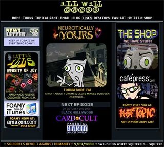
Jonathan Ian Mathers is the artist and founder of Ill Will Press, and produces an internet Flash cartoon titled Neurotically Yours, starring the foul-mouthed little squirrel Foamy and his goth owner Germaine.


Click Picture to view Cartoon (Flash plugin needed)

Foamy's exploits range from rants dieting schemes to computer tech support (hot-linked image above), and can leave you bursting into side-splitting laughter in no time at all. While the cartoons are very funny, they tend to also get very wordy as well (Explicit Content warning) and some of the subject matter is not suitable for everyone. Content aside, if you want a good laugh and you don't mind profanity, you need look no further than a Foamy cartoon.

Mr. Mathers uses Flash to effectively deliver his cartoons to his audience/fans of his work. Without Flash, it would be more difficult to deliver the media, likely forcing him to use something like Quicktime to deliver it, which could take quite awhile to load by comparison.

On loading one of the Flash cartoons, you'll notice a Loading Progress bar, a Play button, in more recent instances a content "Warning" page with a "Click Here To Play" button, and after the cartoon is finished there is a button to Play Again and links to associated websites. If Mr. Mathers is following any theme, I would suggest it is blunt humor. Of course, not everyone will find the cartoons Mr. Mathers produces to be funny, however most people may be able to relate to them in some way, in the least. After all, who has not had a bad experience with computer tech support?

Click Picture to go to The Vault

All told, Mr. Mathers has produced over 100 Neurotically Yours Flash cartoons starring Foamy. In addition to the new Flash cartoons posted to the main page, there is also the Neurotically Yours Vault, which contains a selection of Neurotically Yours Flash cartoons. Among them are Tech-Support, Coffee House Propaganda, and Amytiville Toaster.

Artist Exploration


Animator vs. Animation

Just recently while searching for new and talented artists, you can imagine my surprise when I stumbled upon just that. In 2006 a young Alan Becker (17 years old at the time) invested 3 long months creating a hit video Animator vs. Animation based on a stick figure who rebels against his animator. In Alan Becker’s own words, “An animator faces his own animation in deadly combat. The battlefield? The Flash interface itself. A stick figure is created by an animator with the intent to torture. The stick figure drawn by the animator will be using everything he can find - the brush tool, the eraser tool - to get back at his tormentor. It's resourcefulness versus power. Who will win? You can find out yourself.”

In 2007 this ingenious little dude created an Animator vs. Animation II. Taking him 5 long months this time, it ranked in the top 25 of the Ohio Governor's Show. This time, “The animator, looking for a challenge, decides to make the stick figure harder to beat. Little does he know exactly how much power he is giving to the little guy. Long live The Chosen One!”

After creating two hit videos based on a stick figure who rebels against his animator, Alan Becker took the next logical step -- he collaborated with game developer Charles Yeh to turn his concept into an interactive experience.

I’m excited to see what Alan Becker has in store for his rapidly increasing fan base in the future. While Alan Becker obviously excels in animation, his other hobbies involve drawing, sculpting, music, painting, photography and breakdancing. Alan was able to create these ever popular Flash videos after teaching himself this program, what do we have to look forward to next? I hope you enjoy Alan's work as much as I have.

Studio Exploration - Odopod

Odopod is a small design studio. They are based in San Francisco, and only have about thirty people. Their company was founded on the belief that a small group of talented people can pull off amazing things.
They design with a two headed approach, striving to bring together storytelling and utility. Its a blend of art and logic. Their work is filled with both emotion and usefullness.
Many big brands come to odopod for their interactive art. These brands include Starbucks, Nike, Target, MTV, Fox, Honda, Sony, and many more.
The site is fresh, fun, and useful. Just like they say they are. I was attracted to how the site looks artsy yet simple. I like their philosophy of tying together logic and emotion.

Design Exploration

#1)  www.girleffect.org:

In May 2008, the Nike Foundation and the NoVo Foundation collaborated on an idea called "the girl effect." The leaders of these entities believe that when adolescent girls in developing countries can get an education and are protected from violence and discrimination, the world benefits. Instead of being driven out of school early and into early marriage, childbirth and HIV infection, educated girls understand how to bring economic change to their families, communities and countries.

The visual represenation of that mission is the Web site, www.girleffect.org.
Replete with facts and figures on girls in poverty and how the viewer can help, the most imformative and emotionally powerful part of the Web site is a two-minute type-only animation.
The video, produced in Flash software by Wieden + Kennedy (www.wk.com), takes viewers on an unexpected journey with simple typography, whose frames are paired in perfect time to an urgent-sounding piano composition.

To get the viewer actively involved, the home page immediately asks the viewer to agree or disagree with whether "the world is a mess." One click on "agree" and the video begins.
The designer's minimalist choice of a film without photos or illustration and instead the use of black- and orange-only typography whose message alternately flashes and then rests for a while on the screen makes for a compelling experience. Black typography grounds the message and orange makes it urgent. The typeface itself is all in uppercase lettering and resembles an SOS (international distress) signal. The piano music, all in a minor key, crescendoes and decrescendoes with certain frames. As for the frames themselves, the designer skillfully takes the Girl Effect message and spells it out, mostly in large type, with one to three words taking up each frame. Again, the message here is urgent and the viewer can't miss it.

Once the video ends, the viewer can learn more by viewing videos of girls in developing countries who have tackled the barriers of war, hunger, violence and poverty and made a difference in their villages. The site also provides the tools for girls and women to learn and spread the word such as sending the URL to friends, downloading the logo, posters, stickers and even the html coding for the logo to pass on. Last but not least, the site shows viewers how to take action: Send a girl to school, help fight a legal case, give her a microloan. Small wonder it has already won a Favourite Website Award (www.thefwa.com).


It's a classic question: If you were a car, what kind would you be? The carmaker Saab takes that query further and asks you to take a Turbo Gene Test on its Web site for International users. "The choices you make define who you are," the site says, so off you go to answer whom you most identify with (Mother Teresa? John Lennon?), what kind of gloves you like, what magazine topics your prefer and more. The results match you with the Saab that suits your life and needs. 
Taking the Saab test is like getting in the driver's seat and steering your personality to the perfect Saab model. Each question has beautiful, sophisticated visuals and with each answer you zig-zag your way closer to the car of your dreams. Jazzy, mood music keeps you rolling along. The site, produced in Flash, has slick typography and lots of white space. The questions and answers have surprising visual rewards. For example, when you pick your favorite glove as a work glove, a wrench falls into it. When you choose your own magazine title, you see a mockup of the cover. This type of novelty is probably exemplary of what Saab drivers want.  A model for other Flash sites, it's logical to see why this site also won an FWA.

Saturday, September 27, 2008

Design Exploration


Hello Sour Sally (http://www.hellosoursally.com)

Hello Sour Sally is the home page for a frozen yogurt shop in Jakarta, Malaysia designed by a Singaporean company named Kinetic Singapore (http://www.kinetic.com.sg).

The product is the non-fat frozen yogurt with unusual toppings and flavors. The challenge of design is “what do your potential customers think when they see your logo or hear your name?” It has to be different from other frozen yogurt products. An identity should be recognized by consumers – perhaps with unique toppings or flavors, or by branding it as “something different but sweet.”

The animation is created with Flash. The cartoon character, Sally, initially starts floating around with a balloon, which you pop to make her land into various cups of yogurt that represent the site content. If you collect all the possible frozen yogurt ingredients, the game experience is completed with an additional “reward” content being unlocked. But if you’re not into the game-like navigation, you can still browse the site via menu tab.

The identity “different but sweet” captures the vision of the site’s design. A consistent message is conveyed across the board through a pen-and-ink art technique, the choice of music, game-style navigation, and an old-fashioned children’s storybook presentation. The color scheme, typeface and contrast of scale are all well planned as well. In my opinion, this piece of design is effective.


The Legend of Zelda (http://www.Zelda.com/gcn)

This promotional piece is for Nintendo’s Zelda video game series, with target consumer being kids and young teens. Visitors to this website are immediately introduced to the immersive nature of the game through a panoramic environment that simulates elements of the game. Visitors can also get the details of the storyline through a scrolling legend, meet the characters using a page-turning book, explore the arsenal, and get tips and hints about their gaming adventures.


The main character in the series is Link, who seeks exciting and challenging adventures among various islands in the Great Sea. Visitors can pan around an island scene, where day turns to night, fish leap out of the water, and sea gulls cry out as they fly by etc.

The features I find interesting in this design are:
  1. Guiding the Eye – The red Zelda logo grabs eye attention immediately. The image then directs the user’s eyes through a sequence of steps from movie clips, animation with audio, to navigation and sidebar.
  2. Good spacing – Space between lines/padding/white-space is easy to read.
  3. Clear Navigation and Orientation – Easy to find out where you can go and where you are now
  4. Typography – Font choices/font sizes/spacing/line length/color all are well coordinated.
  5. Clean alignment – Makes design more ordered, digestible and more polished.
“Second Story” (http://secondstory.com) is the creator of this site. It’s a Portland-based company starting business in 1994. It has developed over 200 interesting interactive multimedia projects.

STUDIO EXPLORATION

Fuel Industries - "Branded Entertainment Evolved"

Fuel Industries, http://www.fuelindustries.com, describes themselves as the "intersection of advertising and entertainment - where enjoyment meets solid business strategy". They incorporate strategists and creatives with an army of in house experts in the fields of animation, design, film and video production, sound design, music and online
programming.

Headquartered out of Ottawa, Canada, Fuel Industries creates entertaining experiences around client brands that resonate with the audience and create lasting impressions and consider themselves "branded entertainment evolved".

Created in 1999 by four creative and technical partners who saw the potential of the web for marketing, Fuel's client list has grown to include some of the world's largest brands. Some of their clients include Suburu, Microsoft, and Nokia. The company's portfolio has grown to include a full HD and film production division called Karbon Arc, and its sound design division, Fuel Sounds, all of them focused on evolving branded entertainment online and pushing the boundaries of the web to new limits.

The following are two examples of Fuel Industries work. You can view the case studies of these sites and many others at http://www.fuelindustries.com/casestudies/


http://www.the-passenger.com/


The Passenger uses Flash / video cut scenes to set the viewer in the murky ‘film noir’ world of night time Paris. Filmed using a car-mounted camera on location by Karbon Arc, Fuel’s film and post-production brother company, players look through the windshield at actual Parisian back-alleys during gameplay.

Scroll through the MP3s made in-house by FuelSounds to select the perfect driving track, answer calls to find out your next job, and use the GPS to navigate to your target.

This site was visually appealing, easy to navigate, had interesting and fun content, and was fun to play.


http://www.sexysubaru.ca/


The theme of the site would be a sexy sumo photo-shoot taking place in, on, and around a 2009 Forester. Users step into the shoes of a photographer and get behind the eyepiece of a camera for a hot photo session. The model? None other than the current and two-time world Sumo champion Byambajav Ulanbayar. The site would be video based, so in order to capture the assets needed, Fuel Films orchestrated a shoot of its own in an old airplane hangar. Their video team converted the space into a pin-up style automotive shoot.

With the video captured, they built a site allowing users to control the camera over-top of the footage. Upon arriving on the site, the user is briefed about the shoot and invited to select an area of the Forester on which to get started. Once the feature of the vehicle is selected, the site opens up, the model walks into the light and the shoot begins. Able to position the camera as they wish and zoom in and out with the mouse wheel, users snap as many photos as they like while the model continues to pose. Once each shoot is finished, users may review their photos on a light board and digitally alter the pics to create unique works of art.

Once happy with their shots, users can post the pictures for other visitors to see, or submit their favorites for a shot at a prize package including a Canon Digital SLR, a Macbook Air, and a copy of Photoshop CS3.

This site was visually appealing, easy to navigate, had interesting and fun content, and was fun to play.

S4 Studios

For my post I chose to do a studio exploration on S4 Studios.

Founded in 1999, S4 Studios is a creative design and animation production studio specializing in entertainment branding, content development, 3D animation, visual effects and live action production for television, web,feature films, commercials, trailers and home video.

Some of their clients include:NBC Universal,Flyer One Entertainment,Paramount,Cartoon Network,20th Century-Fox,Sony Computer Entertainment

Here is the link to their site where you will find some examples of their work as well as any additional information you seek.
S4 STUDIOS

Friday, September 26, 2008

Design Exploration of cb2.com

When addressed with the task of presenting a website and entering my blog, I was inspired to find a site that would push the envelope in complexity. The website that I’m presenting at www.cb2.com does exactly the opposite.

This retail website sells furniture and home accessories and you will find it successfully intriguing in its simplicity. When the site loads, the instant splash of color and product lets us know we have found the site we’re looking for. The use of bright colors paired with grey and black communicates the contemporary nature of the furniture and accessories. There are many products and categories on the site, but the clean organization and use of white space in the iconic product photography allows us to focus on where we want to go.

The type headings across the top of the website are paired with pictograms that further communicate the categories. The categories themselves, such as decorate, eat, and party, remind us not to take ourselves too seriously. Upon a choosing a category, a Flash sample immediately grabs our attention and presents a whimsical animation to our eyes. The animation quickly ends, and we are presented to the left with broad categories to choose from. Each of these broad categories is color coded with a new bright color that excites us invites us in for more fun.

I think the hierarchy in the layout of this website is structured in a logical way. It seamlessly takes you deeper into the site, and each layer quickly loads and presents more detailed information. Upon choosing one item, that product is cleanly presented and fully embraces the entire screen. We are then presented with even more options to view the object such as a table in not just one room setting, but actually different room settings. When you find a product you like, it seems to keep unfolding new information, anticipating the questions you may have.

Usually when a retail site gets to the boiler plate issues such as customer service or returns the fun and festivity quickly comes to an end. I invite you to click on careers, or gift cards and see that again, they have more Flash to dish up for us.

In conclusion, I think the complexity of this site is masked by its clear communication and consistency. The color palette and visual connections made this a stimulating site to navigate. The Flash animations enhanced the experience of the website rather than becoming an annoyance. One of the compelling reasons I wanted to showcase this site was because as a beginning Flash designer, it seemed beyond my current abilities but also seemed like it was something attainable.


Thursday, September 25, 2008

propoint graphics flash design company

the company i found is called propoint graphics (http://www.propointgraphics.com/). the companies uses flash to design presentations for there clients. here are some samples of there work. there is not much listed about there history. they have many clients they work with here a list. on there website there is lots of desgins, resores, and presentstions.

Wednesday, September 24, 2008

Studio Exploration - The Flawed Face of an Artist

What makes a good designer? There's his brilliant use of cutting edge technology, his limitless creativity, and of course the special techniques he developed working in the dungeons for others before furtively escaping to freedom - his piece de resistance - his very own online web presence. Then of course there's his witty repartee used to impart his personal philosophy about his unrivaled designs, which of course leads us to his client list (supposing he offers one) and finally his portfolio of perfection - each thumbnail linked perfectly to the full-scale masterpiece. Right?

OK - well maybe that's a little much. Regardless, those are in fact some of the elements we're looking for when we search for a designer. Sometimes, however, we find a designer that seems to be just what we want, yet as we progress page by page on their site we are struck by the notion they are not as "together" as they first seemed. At first glance they look good, and then the axe starts to fall as we realize there are some definite flaws in what seemed an otherwise pretty cool site. We wonder if the work they do for us will also contain these same errors; if we contact them to fix something will they hop to and do it immediately or let it linger ad infinitum since they never bothered fixing these errors on their own pages? Ultimately, we run screaming the other direction not wanting to hire the cool designer lacking the attention to detail and instead hire someone who seems dependable and responsible, even if their designs don't seem as awe-inspiring. A fatal flaw of designers finds them getting so into the design process and the works of art they might create for others they fail to recognize the flaws in their own site.

The following is a brief look at 4 different studios that appear acceptable on the surface but have definite flaws that might well drive away potential clients.

Tranquil Blue Studios

The Home Page loads and looks nice with no obvious major flaws. However, the minute you click on the About page "philosophy of Blue" grammatical mistakes start to appear. There are subtle flaws like this throughout the site, giving me unease in the thought of hiring them. Overall, the site is cohesive in appearance, but has some other flaws, such as the Web Hosting page being red when all other pages are some form of blue.

Level Ten Interactive

Considering their client list, their own site is fairly uninspired; there's no real feel for what they can do. The overall color scheme is fine and "fine" is the bored sort of feeling which I carry with me as I walk away. Their links are not always clear which is a definite problem - Portfolio links give you access to the work they've done, however, if you start with their client list, it gets confusing quickly. You can't access the sites they've designed in this section; similarly, if you're in the "Success Stories" area, and you want to see the success story's site (i.e. Monarch Air), by looking at the page you might think you can click on the rollover link at the top of each story to link out to it, however, all that happens is you get thrown into a shortened version of the success story, and clicking on Home takes you to Level Ten design's Home Page.

Flashlevel Digital Laboratories

This is a visually appealing site and grammatically sound. The music fits well with neutral/blue tones of the site. The constantly moving graphic in the top left corner ended up making me dizzy and mildly nauseous, however, so instead of demonstrating a cool piece of work, my impression of it was irritation for having to put up with it while I tried to find the information I wanted, such as a client list. They do not provide much information about themselves, and there is no client list as such. You have to click on each project individually, which contains no text, to see the mini-version and then click again to link out to the client site. It's definitely visually appealing, but in the end there's a lot of work for the potential client to do to simply try and gain some basic information.

One final thing to note is that the bottom right-hand corner of the page "Talk to Flashlevel" is a little misleading. It looks like you ought to be able to click on it instead of having to glance further down to choose the email button, the contact button etc. Finally, their Recent Events section is not all that recent, which almost suggests they don't update their own site all that often or they have no recent events. My thought? It's better to leave a section like that out altogether than put only a thing or two in. Expand the areas that are your strong areas and minimize the focus on areas you are not currently proliferating.


ALL MEDIA STUDIOS


My favorite site of the 20-30 I viewed was this one. The intro page suggests some of the talent they possess, it's well unified and cohesive in structure, color and feel. The music is well chosen and also speaks to their talents since one of the 4 "Corporate Members" wrote it.

Right off the bat, however, they've got a problem because the 2 links in the upper right corner on the Home Page do not work. The affiliate links do not all work either, though by rolling over them they all act the same so the assumption is they shouold all work.

The Portfolio, on the other hand, opens well and immediately gives you a Client List although you can't click on any of the clients to link to their sites. If you click into each of the sub-fields, however, such as websites, you can view a bit about each and click on the link to go to the site itself.

They provide enough info about their company and each of the 4 main partners to let you know who they are in a nutshell and to have an idea of their talents and who the driving force is between each.

Bottom line? It's your bottom line as a designer not to mention your reputation that can be severely affected by errors such as those mentioned above. It is drilled into us all the way through school "Attention to detail is everything!" so why would we ever think of building our own site, our online "face" as anything less than perfect?

There are actually entire companies that focus on helping web designers "proofread" their sites, from the coding to the actual text. Following is a list of some of these online resources:

http://bestfoot.com/
http://www.alphabetix.net/
http://www.shellyrosenberg.com/editing-proofreading-for-website-designers.htm

Monday, September 22, 2008

test

Sunday, September 21, 2008

Studio Exploration - 2Advanced Studios


2Advanced Studios is the studio I chose to explore. They offer a wide variety of media capabilities and product services.


Vision:
As the rich media landscape is forever evolving, the demand for high-impact
experiences rises to new levels, as we constantly strive to achieve lasting
impressions for our clients. Since 1999, 2Advanced Studios has been
regimented to this principle through our notion of “Progressive Design
Technology”; which simply reminds us that within each and every client
engagement there exists and opportunity to explore new creative potential.
It is this vision that drives our commitment to push the boundaries of design
and technology and to deliver the best next generation solutions. At
2Advanced Studios, we harness our insight, dedication and expertise to
challenge the boundaries of creativity and deliver on tomorrow’s
capabilities.

Approach:
At the helm of our vision lies an unparalleled team of veterans, each with
several years of industry experience and a diverse foundation of skills and
knowledge. In actuality, our experts are the decisive difference in the
ongoing search for quality, as our studio constantly challenges every
individual to fully harness their creative and technical potential. Our team of
seasoned designers, developers and project managers has been instilled
with the confidence and trust to consistently deliver high-impact client
solutions on-time and within budget. Every member of our team holds an
obsession for detail and a passion for perfection in their work efforts; this is
the fuel that makes the difference.

Process:
Since our inception and throughout 2Advanced Studio’s history it has
invariably been observed that no two projects have ever been the same.
Often, we have witnessed first-hand as other agencies overwhelm their staff
and resources through their burning desire to develop a single universal
methodology. As a result, top-tier service providers are frequently more
costly and less capable of working against a stringent deadline. For
2Advanced Studios the added expense that comes from a particularly
burdensome process is simply unacceptable; we pride ourselves on our
ability to effectively “turn on a dime”, as we believe that a flexible process is
central to meeting our client’s needs while maintaining efficiency. At
2Advanced Studios, we leverage our proven methodologies and expertise
to create practical, rewarding relationships with our clients while delivering
solutions that reach beyond their expectations.

They have been recognized by Applied Arts Magazine, Computer Arts Magazine, Create Magazine, Create Online Magazine, Design Graphics Magazine, and many many more.

On October 2, 2002 they were awarded by Flash Film Festival as a finalist in Self-Recognition.

They are Partners with Adobe, The Art Institute, Microsoft and a few other well known companies.

They specialize in:
- 3D animation
- design
- development
- video
- rich media
- audio
- branding
- photography
- promotion
- print

http://v4.2a-archive.com/flashindex.htm - V4 Prophecy (Archived Flash-based Website)
http://www.oneill.com/mens-surf-wetsuit-builder.php Oneill Wetsuit Builder

Studio Exploration - Chermayeff & Geismar


The studio that I chose to explore is Chermayeff&Geismar. The partnership was formed in the 1950s, and through the years has grown into a large and versatile design studio. The studio’s website describes the firm as a “graphic design firm specializing in the design of trademarks, exhibitions, print and motion graphics and art in architecture.” Currently the studio is bridging the gap between the virtual world and the real world. As a result of the studios cutting-edge explorations the studio has an impressive list of awards and accolades for work it has produced through the years.

I found the studio appealing because of the deceptive simplicity of their designs. The simplicity resonates throughout the site. The studio has an impressive client list that they could have exploited to impress and recruit future clients. However, the studio instead choose to layer the work so that the user could unfold the site, view the portfolio and not feel overwhelmed by the body of work. Some of the more well known names that the studio has worked with are Nation Geographic, Mobil, Smithsonian and the Rockefeller Center.

The firm believes that “visual communications are based on ideas that are appropriate to the subject and presented in clear, lively manner without additional confusing elements.” This philosophy is one that speaks to me and the type of designer that I aspire to become.

Some examples of the studios work on the web can be found at:

www.press.princeton.edu
www.brennancenter.org
www.guggenheimadvisors.com

The studio also has built exhibitions that consider all aspects of the subject, including space and time and how the affect the visitor. They use all there experience to create a memorable and moving experience for the visitor. Some of the exhibits the studio has been part of are listed below.

The D-Day Museum
Ellis Island
Jefferson Library
Truman Library

Wednesday, September 17, 2008

Line Rider as Artist Exploration


Line Rider was originally created in September 2006 by Boštjan Čadež, a Slovenian university student, as a part of his Masters thesis. Originally appearing on DeviantArt on September 23, 2006, Line Rider quickly became an Internet phenomenon. Visit http://linerider.com/play-line-rider-online, and use the Beta 2 version if you have Flash installed. If you have Silverlight installed you can launch the game from the home page.

The basic concept is to draw one or more lines with the mouse on which a character (sometimes referred to as "dude") on a sled can ride after the player presses the "Play" button. The game includes simulated physics, which means the track must be sufficiently smooth to prevent the character from falling off the sled. The creator, Boštjan Čadež, refers to Line Rider as a toy rather than a game, since there is no goal to accomplish, nor does it require an ending.

The basic tools for creating the sled track include a pencil, a line, and an eraser. You can also create different types of lines. They include regular, acceleration, and scenery. The regular, and acceleration lines are used to create the sled track, while the scenery lines do not interact with the sled.

Line rider was originally created using Flash, but has since opened up to other formats that include console games for Nintendo DS, and Wii. On December 19, 2006, it was announced that InXile Entertainment had gained console rights for the game. In July of 2008 a new internet version was launched using Microsoft’s Silverlight that will enable layers, colors, and new line types.

Line Rider can be saved as a video and many have been shared on You Tube. Here's a link to see one of the more popular Line Rider videos. Versions have been created for mobile devices, like cell phones, and iPod Touches.

Wednesday, September 10, 2008

Magic Socket flash design company

Magic Socket co-founded in 2005 by Marco Corti and Mario Ballard is a company focused on interactive experiences based upon flash. They develop rich media campaigns, media banners, and games. They have knowledge of different computing environments such as, Dart Motif and Atlas. Also, they can code they design to add functionality.

Works:
UPS Widget:
http://www.widget.ups.com/en-gb/index.html

The UPS widget has a kewl design and a fun personality to go with it. The site has a clear clean design. I had no trouble finding my way around, and learning how fun shipping can really be. This design incorporates the integration of “real life” because the Widget has a MySpace page. Oh it is not an it, it is male and 100 years old. Check it out and may be you may want to be his friend.
http://www.myspace.com/upswidgetuk

Adobe Creative Mind:
http://www.unit9.com/creativemind/

This site begins with an easy, clean user interface having only three options. It has a “just be creative” and “anything is possible” with Adobe theme. The different worlds are fun, interactive, and filled with clickable objects that wiggle or move in order to draw your attention toward them. Once clicked the most unexpected things occur. Try it for yourself!

Send in the Elf:
http://unit9.com/sendanelf/

The Elf is fun and interactive. He has a personality and can even eat your mouse. He is clean and easy to use.

All in all I think Magic Sockets design’s are clean, user-friendly, and fun. They take the boredom out of a simple website site and create a fun user experience that will keep you talking about it for days.

Other designs:
http://www.unit9.com/cs/clinic/clinicgame.swf
http://www.unit9.com/hpchristmas/
http://www.magicsocket.com/santagangsta/
http://www.marinapenno.com/v1/index.html

Takes care, and thanks for reading!

Labels:

Exploration - New Media & Advertising


The Impact of New Media on Communications and Advertising

New Media technologies have had a dramatic effect on business communications and advertising. An excellent example is the “Get the Glass” advertising campaign undertaken in 2007 by the California Milk Processor Board (CMPB), who previously brought us the very successful "Got Milk?" advertising campaign.

“Get the Glass” was conceived by CMPB’s San Francisco advertising firm, Goodby, Silverstein & Partners, as a game or competition revolving around the imaginary Adachi family, a family of criminals who scheme to steal the only remaining glass of milk available in the community. Goodby, Silverstein contracted with Sweden-based creative design firm North Kingdom to develop the idea and produce the digital components of the advertising campaign. North Kingdom designed and developed http://www.gettheglass.com/, an online “ad-game” that features 3D animation, flash, multilayered soundtracks, arcade style “minigames” and a cast of characters whose personalities (and related milk deficits) contribute to the game play. The full advertising campaign consisted of TV ads which introduced the online game and drove traffic to the website, the Get the Glass website itself, plus print and outdoor advertising.


The Communications Objective

Naturally, the objective of the Get the Glass campaign was to extend brand awareness and create demand for the product – a glass of milk. The campaign was directed towards families with children and young adults who would be enticed to engage in the Get the Glass game and competition. The first 8000 players who successfully completed the game would receive a milk glass with the “Get the Glass” logo.


The Game’s Development, Design and Technology

The game’s producer directed North Kingdom to develop an online game with a 1950s board game style and appeal. Character profiles for the Adachi family, including physical handicaps caused by their milk deficit, were developed and can be explored by players in the Adachi crime files. Players navigate through a dark and stormy 3D environment and engage in interactive challenges to help the Adachi’s overcome their physical handicaps and break into Fort Fridge where they can steal the glass of milk. A seemingly sinister police force is in constant pursuit and the player inevitably lands in jail – specifically, in “Milkatraz” – where more games challenges lead to escape or the player can choose to contact a friend via email to aid escape by joining the game, a clever viral marketing idea.

Because the producer wanted to create a 3D environment where players would feel immersed in the action, North Kingdom began development with an actual scale model of the game environment. Once the physical model was built, a special HD camera shot video to create a “green screen” of the landscape. The video was then digitally rendered into a 3D animation which was further enhanced with layers of motion and animation for the sky and water surrounding the island using Adobe After Effects. For the user, this treatment created a cinematic camera effect, allowing the user to “hover” above the environment. Adobe Illustrator and Photoshop were used to create elements such as game cards. Multi-layered sound effects bring the environment to life with music, voice, sirens, helicopters, squealing tires, car doors and the sound of rolling dice. Adobe Flash was the enabling technology used to compress the huge 3D video files and allow progressively downloaded files. Developers used the Flash Action Script to organize and synchronize playback of animation, text, graphics and sound so that the rich, animated environment was a reasonably sized download.

Results
The Get the Glass campaign resulted in ten million more gallons of milk sold in a three month period when compared to the previous year. The website had 6 million visits and 650,000 players actually finished the game.

More information
For more details on the development process, you can visit these websites:
(1) for a video presentation by the producer (skip up to 13 minutes to get to the meat of it), visit http://labs.boulevart.be/index.php/2007/11/24/gettheglasscom-the-making-by-jorge-calleja/;
(2) for a blog with pictures from the cofounders of North Kingdom, visit http://dchpl.blogspot.com/2007/04/making-of-get-glass.html;
(3) for information on the video shoot of the scale model, visit http://www.dreamfield.se/index.php?option=com_content&task=view&id=133&Itemid=133;
(4) for a technical case study by Adobe, visit http://www.adobe.com/showcase/casestudies/gettheglass/casestudy.pdf; and
(5) to get an idea of the size of the team involved in this caliber of projects, see http://www.dandad.org/awards08/entry.asp?entry_id=18858.
-Lori Travers


Monday, September 08, 2008

Design Exploration: Gangs of New York

Talk the site. Make sure that I include links