Skip to Navigation | Skip to Content

Class Blog

Saturday, May 17, 2008

Studio exploration: StrawberryFrog

Studio exploration:

For my second exploration, I choose StrawberryFrog.
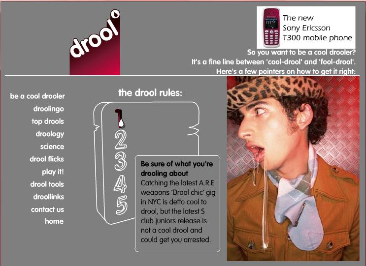
They are a very unique and fresh advertising company that has an impressive list of well-known clients. Their ideas and vision are truly creative and bursting with unfettered energy; which can be seen and felt from their different projects. They seem to be a humble company also for they still compared themselves as a small red frog that is competing with the big "dinosaurs". From the list of high profile clients such as: Sony Ericsson, MTV, Xerox, etc and the awards that they won , (including FWA awards), it seems that the creative juices will never stop flowing. They have a broad portfolio (websites, prints, TV, etc). I like a project that they did for Sony Ericsson to promote their T300 phones to teenagers in UK. They used the concept of drooling for the new phone is cool.
I recommend to check out their work if you are interested in getting into creative multimedia advertising. They know what works and they are good at getting to the target market. I do not mind working for a company like that, besides they are in the list one of 25 Best Managed company.

Wednesday, May 14, 2008

Studio Exploration: Chie


The works of LOWORKS are just CUTE & FUN!! I saw an article about this design studio in a magazine from UK, and then I found out it was in Tokyo, yeah! I've been looking for interesting Flash content from my country to introduce in this blog, so I am happy now.

As you explore in the interface, you'll see many hidden function buttons that make something noise or move a character; something is happening all the time and make us (at least me) smile. Ex: a bus without tires but a giraffe which is inside and moves it instead of a motor. Check out their Broadcast and SHOP . The shop's background illustration (the earth) rotates every once in a while, so let it open if you want to see different things happen.

When we make a Flash content, we tend to be focus on the techniques since we are on the process of learning a new skill. But as a prospective designer, we should not forget what our audiences want to see the first. Even things we create are small so far, let's make people happy. Let's make things better. Let's make meaning!! That I thought with this web site.


Tuesday, May 13, 2008

Studio Exploration


For my Studio Exploration I wanted to pick a company local to San Diego. They specialize in business websites and a lot of their clients are fine dining restaurants, so hopefully you eaten at some of these places already  Of all their sites, I really dig the one done for Chowsd. Just because I think the navigation is simple but effective. The photo work is really well done and compliments to the type of restaurant it is, which is a sort of a high class noodle house. When you navigate to their portfolio I love that page to. The flash done with the fog looks cool.
On the main site for Georgeglenparker they use a lot of movie clips as the back ground. This is done a lot for Chowsd also, which adds to a nice effect for the website. Overall their websites are effective, easy to navigate and while not content heavy, I think its content rich. A lot of scripting must go into their sites to get the FX they have on their web development. I encourage you to check their portfolio out and eat at some of the nice restaurants they’ve worked for.

Monday, May 12, 2008

Studio/Artist exploration

7 Designers
www.7designers.com

7 Designers looked like the typical Small Business information web site.  The layout was very balanced, animated and cartoon like. I showed off the site to friends explaining the movie clip concept.  Not realizing that the site was interactive, I started to see motion hints. The home page just gathered information about the client.  In the Showcase and began to see the interactivity. I was able to grab the vials that a figure was holding and move them to another location. This created a to featured sites the team has worked on. I then explored the about us page. This page explained how they were a creative development division of ecommerce partners. When you clicked on the diver he eventually was eaten by a whale. I then clicked ont he team button and discovered that the team has a role in all the animation. In fact the team have been animated into cartoon like characters. When i clicked on the characters they displayed in a offset box (some in more interesting ways then others). As i made my way to services the site begain to make me wounder what was next...... Services talked about Marketing, Creative, Strategy, and Technology. 

The e-commerce side of the site was one of the most interactive "movie clip" files.... I started filling a box and from there we packed it up and shipped it out... I enjoyed this site, it was fun and intresting. at first glance you could use it for information on the company and still like it because of the layout. One you discover the interactivity then it becomes even cooler..
Some of the Sites they have Created:

Jagermeister

Pod Gallery


Design Exploration

Famous Stars and Straps
www.famoussas.com

Caution Links may contain clips with Vulgar language.
I picked this modern apparel web site for my Design Exploration. Travis Barker (Meet the Barkers, Blink 182) came up with this unique clothing company called Famous. He describes the clothing as a lifestyle brand (connects with every lifestyle).  As a drummer he expressed himself through music and as a clothing designer he brings us to his world though his website and clothing. When i entered the site i was impressed by the scrolling images that moved faster with the mouse moves. Then i noticed they were interactive and they seem to have a flip over affect on release. 

The e-commerce side of the site was very impressive with rich colored graphics.  Again there were mouse effects that really caught my attention. The clothing almost appeared to look 3D at times and had a unique presentation.  The site also had myspace links to sponcerd professionals.  I noticed that this website showcased Apparel, Music, Talent and Wonderful web building skills. The Famous Designs seem to work because i see them everywhere!

Tuesday, May 06, 2008

Multimedia Tools


From data projectors and digital video to interactive whiteboards, educators today have a wide array of multimedia presentation tools at their disposal to enhance visual instruction—allowing them to share ideas, information, charts, images, animations, audio, and video more effectively.

Over the last few years, projectors have improved significantly—with upgrades in quality, brightness, features, and ease of use. Today’s projectors are now light enough to be carried easily from room to room; many are bright enough to run without lowering the lights and can be controlled wirelessly from anywhere in the classroom; and, on higher-end models, administrators can control networked projectors remotely to save energy and extend bulb life. In addition, new affordable filter free projectors are now available which enable administrators to lower maintenance costs and reduce the risk of premature lamp failure.

The cost of digital projectors has dropped significantly as well, with good projectors now available for between $500 and $700.

DIESEL
http://www.diesel.com/


Diesel is a pretty intuitive business which has a site that reflects that very well via flash. With subtle rollovers, the site maintains a very uniform and professional look. However, the menu does change according to the menu you select. For instance, the animation on the DIESEL DENIM GALLERY the intro is animated very well, and the rollovers for the sub-menu highlight themselves by animated cross-hatch shading.

On the FRAGRANCES page the whole layout animates in in a completely different way, that is still congruent with the DIESEL image, just obviously for a different demographic.


RESPECT
drum&bass

http://www.respectdrumandbass.com/


RESPECT DRUM & BASS has some more simple element that really highlight the artwork for their drum&bass flyers more than the site. The flash elements present, instead, create a more solid and sleek image for the company. For instance, the bug in the "hot spot" (or top-right) has a sharp feel to it that features the beat being visible on a global scale. The rollovers further emphasize music with little "scrubbers" going back and forth over the highlighted tab in the menu. Music and sounds are of course used to present this site properly. The only downfall, is there is no control of this.
The CONTACT section has a really vivid intro with a very simple and easy to read content. LINKS has on the flip-side, way more information; however, it is just as impressive. The GALLERY section is the section that this page is all about, and what I'm honestly impressed with. These flyers really pop in a professional way that still keeps the images of the industry. One last problem with the site is that the months that aren't used are dead-ends.
To leave off on a good note, the site does contain itself in one page and protects the artwork better from "content pirates".

Design Exploration

http://www.2929productions.com

The first site I chose for my design exploration is for 2929 Productions. I like the way that the interface unfolds and changes, as you jump around the site. I really like the way that the movie page loads and interacts. I think that this site is one of the cleanest sites that I have seen and it is also very easy to navigate. They have a very impressive portfolio that includes “We Own The Night”, which I think is a great movie =0).


http://www.fiftyeight.com

The second site that I chose is for Fifty Eight 3D. I really like the work that they do. The way that the Disney Channel Film Package is done is completely awesome. “Night of the Sultans” is awesome as well. As a mater of fact, everything this company does is awesome. I was blown away with how the buttons interact on rollover, check them out, you’ll see what I mean. I hope that you take some time to explore this site especially, it just shows you that the possibilities are limit less.

Studio/Artist Exploration

http://www.add1.com


I have a friend that works at ADD in Los Angeles. They do allot of different types of design. They do print, packaging, interactive media, identity, and broadcast. They have an impressive client list. Everyone from DreamWorks, ESPN, Levi’s, Toyota to MTV, Paramount, Nike, and Sony. They have also done work for every major record label out there. They voice over that they have in the beginning is the same as the message you get if you call there and they can’t get to the phone in time.
I like the way that the site is designed. You can move your mouse left and right and the page scrolls that direction. I also like the zoom in effect when you click on the links. I found that I like using the menu bar that unfolds from the bottom right side better than the right and left scrolling pages. Overall I feel that this site is a cool representation of what good flash design is all about. It gets the message across and also looks really cool. You can take a look at their work in the portfolio section of this site. It being flash I don't think that there is any way to directly link to the portfolio. Enjoy!!!

Monday, May 05, 2008

Design Exploration

http://bridge.thegluenetwork.com/
The Glue Network hosts a flash based website that is dedicated to opening awareness and potencial benefit towards a multitude of worldwide issues such as world hunger, poverty, aids awareness and so much more. I was initially drawn to this site because of it's consistency and dedication to it's cause of social awareness. They feature a long running mural, a donation link, a store, charity news and ways to get involved and they host give-aways. I was very impressed with it's overall usability.


I liked the design of scrollable flip-tiles in it's design, each which convey's it's cause and it doesn't take an aukward amount of time to load. Each of it's seperate lengths of mile are displayed quickly as it's pages are relatively "light." I enjoyed the design layout because it displays it's message clearly and it draws the visitor into it's purpose.


I found it's mural style layout both visually interesting and effective. It appears clean and simple to navigate. It hosts a playlist of interchangeable music to enjoy while viewing the site. The site's main interface shell appears adaptable to constantly update itself as people add miles towards it's cause. Overall it's usability is very easy to navigate.

For my second exploration I have chosen http://mrdoob.com/blog/
It is a site featuring games, layouts, logos and tutorials using flash. The site itself hosts an artist portfolio, actionscripting experiments, textures and lighting ideas, liknks to demos, tips, pointers and blogs about the artists work and ideas for implementing 3d into flash. It also shows games and projects along with the source files used to create them.