Skip to Navigation | Skip to Content

Class Blog

Friday, December 19, 2008

3rd studio exploration


My last studio exploration is about
"Desi
gn The World a Coke".

They are a company "coca-cola", obviously, and this is their site where people can create their own coke bottle design.
I tried to make one just for a giggle, and found that is so fun and easy to use all tools. So people who don't have any experience on designing can easily create their own favorite coke bottle.

There are a hundreds of combination of backgrounds, shapes, and effects. You can scale, rotate, duplicate, scatter, change the color and change the transparency very easily from the bottom menu.
Very neat thing about this designing process is that you can immediately check your design in 3D scale. once you add any element, the 3D bottle starts rolling and shows exac
tly those elements you add going to look on a bottle.
I thought that is a very cool effect.


If you make an account and save your work, you can actually upload your bottle design and the world can see your bottle, even rate your design.

One another cool thing on this site is that you can "mash up" your design to the others.
so it could get even better and fun to lo
ok.
It seems people all around the world collaborating their designs each other.


I believe some good designs are going to be an actual coke bottle.
Why don't you create your own cool design coke bottle??

Here are some of my favorite designs.

Wednesday, December 17, 2008

New Media Exploration Blog


Shirley Stevenson
New Media Exploration Blog
http://www.cycling74.com

My new Media Exloration is about MAX/MSP/Jitter. Max is a graphical development environment for music and multimedia developed and maintained by a San Francisco-based software company Cycling ‘74. It has been used for over fifteen years by composers, performers, software designers, researchers and artists interested in creating interactive software.


The Max program itself is highly modular, with most routines existing in the form of shared libraries. An API allows third-party development of new routines (called "external objects"). As a result, Max has a large userbase of programmers not affiliated with Cycling '74 who enhance the software with commercial and non-commercial extensions to the program. Because of its extensible design and graphical interface, Max is widely regarded as the lingua franca for developing interactive music performance software.


MAX has been in use for over twenty years by performers, composers, artists, scientists, teachers, and students. The newest version is MAX 5 is a dramatic transformation of Max that begins a new chapter in the program's history. The new features in MAX 5 is Patching and Workflow, Debugging, Integrated Documentation, Searching and Finding, & Timing.

To learn more about the company that developed Max Cycling ’74, you can visit: http://www.cycling74.com/. When you visit the cycling74.com site there is an interesting interview with Dana Karwas. Dana’s work uses high-end technology such as Max/MSP to explore social interaction and levels of identity within public space. Dana has a Masters degree in Interactive Telecommunications Program (ITP) from NYU. To Learn more about the new MAX 5 products you can visit: http://www.cycling74.com/products/max5.

Saturday, December 13, 2008

Design Exploration - Harajuku Lovers Fragrance

For my last blog post I decided to go with another Design Exploration. As I am surfing the web in the hope of finding the new best gift for this holiday season, I came across an interesting website.


WWW.HLfragrance.com

Harajuku Lovers Fragrance is a website designed to promote the latest fragrance inspired by Gwen Stephani.

What I like about the website is its funny interactivity as well as the nice cartoon-like animation. Some of the animation appears to be done in 3-D so I will assume that they might have been using CS4 rather tan CS3.

There is also a fun video karaoke built in where you can record your own video trying to sing alongside the music.

Friday, December 12, 2008

Design Exploration


www.mtl12.com

This site is an exploration and documentation of urban life in Montreal. It is an immersive experience based on twelve popular locations. The site offers the visitor three ways to navigate the site; learn, watch and participate. The site shows more that just the tourist experience by going behind the scenes of ordinary places that go unnoticed. It shows the discovery of ordinary people doing extraordinary things. The site is highly visual; it uses imported video and lots of possible interactivity.


www.trydrugs.net

www.trydrugs.net is an effective website intended for Internet using teens and pre teens. The site conveys a loss of control that accompanies being under the influence of drugs. It allows visitors to virtually experience the effects drugs have on your motor senses, by interactively controlling the sound, mouse speed and visuals. The visitor is asked to make decisions while drug use is simulated further enhancing the effectiveness of the site allowing them to see through the eyes of the drug user.

Wednesday, December 10, 2008

Design Exploration - flasharcade.com


http://www.flasharcade.com/

This exploration is a Flash website called flasharcade.com. This is a gaming site that has a lot of fun games to play. This is a good site to explore if you have exta time on your hands and want to play some of their games, and also check out how the deleopers create their games in Flash.

Flash Arcade has a variety of games: Action, Adventure, Arcade, Casino, downloadable, fun, puzzle, racing, shooting, skill and sports online games. These ganes are free. They also have a membership that you can join for more games than just their free games. Flash Arcade puts out new games weekly. Their games range from small child age to adult action games.

I played one game called the Nutty Gomba Game. It was a squirrel game called Gomba and he collects nuts while avoiding dangerous, hungry predators in the jungle. Evertime you collect nuts your goes higher and when Gomba dies he goes to heaven. Gomba has a lot of lives though. It's actually a cute little kids game. I played this for about 15 minutes, you have to be careful though because I think you can get caught up on this site wasting time playing games all of the time.

It was pretty entertaining exloring this site and seeing all the great games that can be created in Flash, it makes me look forward to the next Flash 2 class being offered at Miracosta. I think being able to create games like these would be a fun job.

Monday, December 08, 2008

New Media Technology: DivX Connected


Normal 0 false false false EN-US X-NONE X-NONE MicrosoftInternetExplorer4 DivX Connected is a new technology being developed by DivX, Inc. to bring about the total incorporation of computers and video in the home entertainment center. DivX Connected has the same starting point as Apple TV, bringing video on the computer to the living room TV. Unlike Apple TV though Connected in only the hardware to bring what is on your computer to the TV. Everything is run off of the home computer instead of having to transfer files from the computer to another media box like for Apple TV. Connected brings all the movies, music, and photos that are on your home computer to the TV in the living room. The Connected hardware is only really a decoder. When the Connected box accesses a server that is running on a computer all the work of decoding, encoding, compression and interpretation of files is done by the computer that the files are on, the Connected box only takes that data which is sent to it and displays it on the TV.


Because all the heavy lifting of Video decoding is done by a home computer, the connected box can play full HD video unlike similar products produced by other companies. Also, because DivX is not owned by apple or other video and music retailers the Connected box is not restricted to products bought from iTunes or the like. The Connected box can play any video file type that the computer the server is set up on can play. And because the Connected box only acts as a transcoder it can bring the internet right to the living room. The box can call up internet video sites like Youtube and play videos right on the living room TV. In the end the Connected box acts like a remote desktop of your computer for your TV without having to have an expensive dedicated media center PC.

Sunday, December 07, 2008

Designer exploration:

National Television is a California based design company that has representation all over the US and in the UK. I actually couldn’t find much information about them and couldn't get a screen shot, but oh well, that’s not the point. On their website, it appears, they seem to do a lot of advertising, but they also have a few music videos on their list.
What I like about their work are the various styles they use, everything from classic hand drawn animation, computer-based illustrations to live footage and even play dough. All though specializing in one area might make a company a good choice when you know exactly what you want, for a customer that’s willing to explore many possibilities this kind of company with versatile skills might be a better choice.
Some examples of the variety: in ‘Projects’ American Express “Play Doh”, Showtime “Californiacaion”, and Hyundai “Imagine” and in ‘Library’ Barclay’s “Fair and Square”, Scissor Sister “Thousand Words” (music video), and Virgin Digital “Music Muscle”.
A cool extra feature is a play list function where you can add the songs you liked to a play list and find out the song names and artists.
From a design point of view, I like the simple but effective font that stays the same throughout the pages, only changing colors, which are also very simple. I also like the rollover effects in the menu items and the pictures of the projects on the main page, as well as asking a little visitor intelligence to rollover the picture of a project on the pages with black background to get the play and close options and names of the projects, all of which, I believe, are done in Flash. More things I like are on the same black-backgrounded pages: the colors of the play and close options etc correspond with the color of the information box underneath the picture. Also, it’s nice to be able to navigate between the lists of projects without being taken a way from a project you’re currently watching, although going back to the main pages will do that.
A few minuses on the design of the website: a lot of the font on their main site if barely visible, and the visitor has to kind of lean in on an angle or move the monitor to be able to get the right kind of glare on the screen and read the text, especially the lower the text is on the screen (maybe this is a part of the required intelligence..). There is actually some information at the very bottom of the main page, which I accidentally saw as I did just the above: leaned in on a different/strange angle toward the screen.
This brings me to another minus: the pages don’t seem to scale to the size of the screen. At least when I’m on a MacBook (like right now), I can’t see all the information at the very bottom, which means I can’t be more specific on that “invisible” information on the front page I mentioned above. This would be mildly irritating if I had to scroll down, since there’s really not that much text on the pages to begin with, but there is no scrolling opportunity. I’m more than mildly irritated now.
But overall, I simply liked their versatile approach in designing for each customer. In the news section they have all kinds of interesting things, such as concept art for their Californiacation add, and a link to the British Design & Art Direction (D & AD) Awards site, where one can spend hours and hours of reviewing awarded works in numerous artistic fields.

Thursday, December 04, 2008

New Media Exploration - HULU

Hulu was founded in March 2007 by NBC Universal and News Corp and is operated independently by a dedicated management team with offices in Los Angeles, New York, and Beijing. Hulu closed a $100 million investment from private equity firm Providence Equity Partners in October 2007.

Hulu is focused on quality and convenience and strives to create the best possible online video experience.
  • Hulu gives users the ability to customize their viewing experience online.
  • Hulu allows users to watch favorites or discover new shows anytime — at home or on the road.
  • Hulu's search feature helps users find any premium video online even if it is not directly available on Hulu.com.
Hulu was created just over a year ago so I believe it is still a new media. It is flash based as you can tell and produces the user to be able to view movies via flash. I believe it is a great idea because it allows people to view movies or tv shows from wherever they may be, or even to just see short clips of movies or something of the sort.

Laptop magazine said about Hulu, "As the collection grows and more partners hopefully sign on, services like Hulu won’t just replicate TV—they will be TV."

Wednesday, December 03, 2008

Yanim Studio Animation

Yanim Studio's site is very clean and easy to navigate. The first two buttons, 'about' and 'awards', reveal all with merely a rollover. 'News' will link the visitor straight to the artist's personal blog. The following buttons are not self-explanatory, but include subtle animations that goad the viewer into interacting. An arrow above emphasizes the need for interaction. The button with the off little creature will lead the viewer to a new page with a demo reel; a video featuring highlights of the animator's work.
The moon button will lead guests to an alternate site devoted entirely to the artist's animation 'i lived on the moon' (http://www.yanim.net/ilotm/ilotm.avi).

The odd looking button on the end also leads guests to another site: this one focuses on an animation entitled 'krapooyo'. The stage is set in flash... cleverly crafted buttons take visitors either to the animation itself or the guestbook. Or... to one last site. Clicking on the small button in the lower right hand corner will take the visitor to one more page in which interactivity is key. It takes clicking and dragging one of the objects over another to unlock a new layer of the site to interact with.


The flash work seems to vary almost to the point of inconsistency, but all of the experimenting that must take place in order to get a feel for the site makes for an interesting journey. I found this site to be a good example of how funky flash might get... (and a source of some beautiful animations as well) ;)

Tuesday, December 02, 2008

New Media Exploration – Live Mobile TV

FLO TV delivers live broadcast television with near HD quality to your cell phone! This is NOT just clips or highlights of pre-recorded material. FLO TV provides full-length shows, including live events like breaking news, concerts, and sports.

FLO TV is a service of MediaFLO, a division of Qualcomm. The MediaFLO broadcast system is Qualcomm's new technology to broadcast data to portable devices such as cell phones and PDAs. With this new technology the television experience is no longer tied to the living room. FLO TV was developed to deliver full-bandwidth television to the mobile user without the current restraints of the stops and starts of current streaming methods. The question was how can rich content be delivered to millions of mobile users, and how can mobile operators deliver a compelling number of TV feeds without over-burdening their networks. MediaFLO technology was specifically designed to overcome these challenges.

With use of mobile phones on the rise, nearly doubling to 4.9 billion users by the year 2012, the broadcast industry saw an opportunity to extend its offerings to the mobile environment. The problem was that broadcast TV and the mobile phone industry rely on divergent technologies to deliver content. MediaFLO bridges that gap.

The transformation of video content from media outlets to mobile devices is the job of the MediaFLO System. The MediaFLO System consists of the network operations center (see Figure below) and transmitter sites, both of which include a number of components that perform many sophisticated functions.

The network operations center’s primary responsibilities are to ingest video content from satellite feeds and/or fiber optics and to reformat the video in preparation for broadcast. The formatted video is then distributed to multiple regional transmitter sites that broadcast the video to MediaFLO-enabled mobile devices within range of the broadcast towers.

FLO TV–enabled phones are designed with mobility in mind. Turn mobile TV on, turn it off, answer a call, or send it to voicemail – all with one button functionality. And, an easy–to–use program guide makes finding and selecting programs easy. Switching channels takes less than two seconds. Scroll up. Scroll down. There are no complicated menus or commands here. Now, watching TV on the go is as easy as watching TV at home.

The FLO TV service is delivered over a dedicated multicast network rather than a cellular one. What does that mean? It means you don’t have to worry about a reduction in voice or data quality. It also means you have a nearly instant, seamless transmission of TV, without any buffering or lag time.

On a personal note, I’m not sure this is a technology I would be interested in right now, but I can see the advantage of such a service, especially the live content, for many people. Having access to live information in today’s world is a necessity for many business people, and others who require real-time information.

#3 Design Exploration


The site that I chose for the design exploration was www.einstienbros.com. The site was done in flash and is rich in content. I found the attention to detail placed on the background imagery was very well done. The site displays a consistent design flow throughout the site, with well chosen rich coffee colors.

The idea behind the site is to provide potential customers information about the stores offerings. The site provides all the basics a customer would need to make a decision about purchasing a product since the site contains menus and nutritional information. The site has detailed visuals making the food look appealing, which is a good quality in a site for a restaurant.
Einstien Bros also manages to keep the site fun and lively and not at all pretentious. The site makes an effort to appeal to the feeling of familiarity with headers like “Darn Good Food” and “Darn Good Coffee”.

If the site has a flaw I would have to say that it is sluggish when it loads for the first time.

Overall, I think the site is successful in its mission to create a friendly image that appeals to a broad and diverse market.

#2 New Media Exploration Process

While looking for a site to blog about I came across the Pixar site which had detailed information regarding the companies process. The site has a seemingly simple structure, loading content on demand. The navigation is extremely user friendly, preventing the user from experiencing information overload. The part of the site that I focused on for this blog was the design process.
The site uses an interesting metaphor to display its design process. The site uses an old school view finder to display the process. The use of the view finder coincides with the simplification of a complex process that is broken down into four essential parts: development, pre-production, production, and post-production. During the development phase many ideas our pitched, fleshed out, then developed into storyboards, with the best pitched to the director. The next phase is pre-production, which involves the assembling of assets. The key element of pre-production, at Pixar, stays with the Disney tradition of developing a strong story. The pre-production phase is very involved as it requires a great deal of preparation of the parts. The actual production phase is time consuming in that it requires the artists and computer to meld together flawlessly all aspects of the assets. Once in the post-production phase the final touches are added creating a flawless film.
It would seem that the bulk of the work is down in the pre-production phase, however, without the final touches the films would not have the lasting impact that they currently display. The attention to detail is evident in all aspects of the process. In researching other process structures for varying media outlets the process appeared to be similar. The common thread was a heavy focus on the pre-production phase. Reinforcing the idea that, when a project is properly planned it seems to flow much smoother through the design process. A solid design process ensures that quality is maintained across the board on all the design aspects.

Monday, December 01, 2008

New Media Exploration

I have been researching various websites displaying High Definition Video for several months now and RamChallenge.com seems to have successfully achieved High Quality / High Resolution Streaming Video the best.  In my previous Blog I studied the Twix.com website which was very unique and had many great ideas but did not have fast loading times for their video.  I also found the Twix site to be very buggy with many issues of freezing or double play back.  The Dodge site sits apart from anything else that I have researched due to the fact that they have very good design and high amounts of interactivity that invite the users to spend a lot of time researching the various areas of interest.  I felt that there was no confusion of navigation, and I remained intrigued as the High Definition Videos downloaded very quickly.  I am guessing that a lot of money was invested to the whole project / ad campaign.  I was watching TV when I saw the Dodge Ram Advertisement where they directed me to visit the website for complete footage of the Ram Challenge.  I knew that it was going to be very rich in media and information about how tough their trucks really are. 

Design Exploration: Punisher: WarZone and Mirror's Edge

Punisher: Warzone

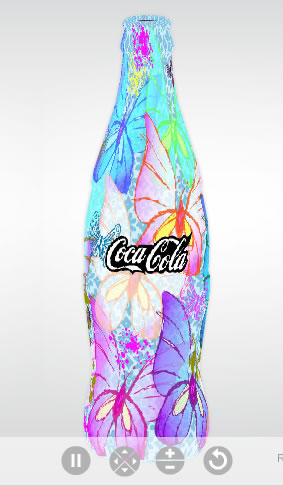
Punisher: Warzone is a film due for release Friday, December 7th and is the next film in Marvel’s the Punisher film franchise. Starring Ray Stevenson, the film follows Frank Castle, aka the Punisher, in his one-man war on the world of organized crime. If the official website for the film, http://www.punisherwarzonemovie.com/, is any indication, it should be a very cool movie as far as Punisher fans, new and old, are concerned.

A warning: due to violent content, this website may not be considered appropriate for everyone.

The website (flash based) is very dark and themed perfectly to fit with the film. The first thing I noticed upon visiting the site was the innitial loading screen: instead of the traditional left-to-right loading box, the blood seeping down from the top of the screen indicates the progress of the main site’s loading (on blazing-fast connections you barely notice it, however on my slower DSL connection at home, it’s noticeable), and the mouse changes to a rotating crosshair.

Once within the site, the loading box for each of the sections/pages is a spinning Punisher logo with the red circle indicating the load progress. There are many sections/pages, including pages for the film itself (synopsis, cast & crew, etc), video, galleries, etc. Upon rolling over on one of the links for each section, the link’s indicator, which resembles a target and bullseye, expands in a splattering animation as if it had been shot and the Punisher logo appears with an appropriate “splat” sound effect. When you hover on Enter The Warzone, flames burst into life behind the text. There is also music on every page, and you can choose the artist/song title at the bottom of the screen.

Upon clicking Enter The Warzone you are taken down to the streets where you have three possible destinations: The Police Station, The Bradstreet Hotel, and The Punisher’s Lair.

The Police Station contains two sections, one with information on the Mafia and the other on the Punisher Task Force.

The Bradstreet Hotel gives you two options: to enter the hotel or play the multi-player game. Note: entering the hotel takes you to a different website in a new browser window/tab. It contains several sections, including a downloads section with wallpapers and such, a news section with news regarding the film, a trailer section with trailers from the film, a game section, etc. If you choose multi-player game, it will load the game in a new browser window/tab.

The small multi-player game linked to from the website can contain a review all on it’s own. Long story short, you have a choice to register (so as your score and such are retained) or enter as a guest. Once you have entered, you can then play against a live player or the computer. Following the theme of the film, your character and your opponent’s character resemble the Punisher and you are both placed what looks like a hallway with branching corridors. It is then your task to punish your opponent by leaning into the hallway and shooting them. If you defeat your opponent, you score points. The more points you score the higher you will level up. As you level up, better weapons are unlocked and become usable. It’s really a violent game, but it’s still a lot of fun.

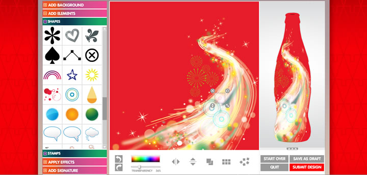
Upon entering the Punisher’s Lair, you have two sections to choose from: Mashup and Weapons Gallery. Mashup loads opens a new browsers window/tap with a new site to build your own Mashup, which is like a custom trailer for the film, using video clips, images, and music which you can drag to the timeline and preview and/or save. Weapons Gallery loads just that, a gallery of weapons. There are many weapons to choose from with information on each.


Mirror’s Edge is an innovative new first-person shooter out on the XBOX 360 and PS3 (and due out on PC in January 2009). From the website: In a city where information is heavily monitored, agile couriers called Runners transport sensitive data away from prying eyes. In this seemingly utopian paradise, a crime has been committed, your sister has been framed and now you are being hunted. Link to website:
http://www.mirrorsedge.com/ls/us/index.asp

The difference between the Mirror’s Edge website and the Punisher: Warzone website is literally night and day. Whereas the Punisher website was heavy on features, the Mirror’s Edge website is very moderate in the sense that not a lot is going on feature-wise in comparison with the Punisher: Warzone site. The use of Flash on this site seems intended mainly to deliver the site as a whole and to deliver the video content contained therein.

The interface as a whole is flash, with some interesting rollover effects on the navigation links at the top of the page. Just below the navigation is a rotating view of a city skyline. It would have been cool if the viewer had the option of changing the rotation (slowing down, stopping, or changing direction with the mouse). To the left is the main character, Faith; the hair on the left-side of her face is animated, seemingly blowing in the wind.

On the main page is a brief video of the game and the latest news.

The Wire contains information and articles on the game.

On The Mirror’s Edge gives you the following navigation options: The Game, Buy Now, Achievements, and Demo. Under The Game is a synopsis and information on how to play the game. Under Buy Now are links to retailers where you can purchase the game. Under Achievements is a list of gamer achievements and trophies, as well as gamer scores. Under Demo is the original video demo/trailer for the game, with options to download it or watch it in a large player directly on the site. One of the things I noticed, and I’m thinking it was intended, is if you don’t move the mouse constantly over the loading bar at the bottom of the player, the loading progress will pause. It follows with the theme of the game that you have to keep moving.

Videos & Downloads gives you a variety of different trailers to view, as well as screenshots, wallpapers and ringtones.

Leaderboards provides top rankings for XBOX 360 and PS3 players of the game.

As a whole, however moderate it may be, the design and interface of the Mirror’s Edge website is streamline and functional.

Holograms: Fiction or Reality?


On November 4th, an historical event occurred as many people anxiously awaited the results of the election. Obama, being the first African American to be nominated and run for office was unprecedented. In addition to this historical event, CNN also revealed some new technology that might bring every Star Wars fan’s fantasy into a reality. They managed to ‘beam’ a person on to the set as they were covering the election.

The hologram wasn’t actually a physical hologram, but a virtual hologram. CNN was able to merge two video feeds into one but needless to say, it may become possible in the near future to have physical holograms. How they managed to produce this hologram was to have around 35 cameras situated on a ring covering all different angles. But a more physical hologram was presented earlier in the year by Telstra, an Australian phone company. Telstra used a HD video camera that was able to ‘beam’ their chief technology officer to a business meeting. The video was then sent in real time across Telstra's high-speed network to an optical projector in Adelaide where the 3D life-size image appeared and interacted with the audience.

This new technology not only changes the way people communicate with each other, but also how we interact with others and how we conduct formal meetings and the like. Instead of having to meet up with the person if they are far away, they can just project the person’s image and you can interact with them; making this even more personal than talking to a video recording or a person’s image on a screen. Also holograms could be used a number of ways, giving tours, advertising, sales, etc. which allows for more flexibility for newer types of multimedia and interaction with one another.

http://gizmodo.com/5076663/how-the-cnn-holographic-interview-system-works

http://news.cnet.com/8301-10784_3-9955821-7.html

Metajive - Studio Exploration


My design studio exploration is on Metajive.com, a web development company based in Encinitas, CA that specializes in flash designs and technology. (Actually, the proprietors of Metajive are also my new neighbors who just move back here from Seattle about six months ago.) Proprietor Dave Benton has a graphics design degree, is frequently a speaker on Action Script at Flash conferences and has a background in videography. The websites make heavy use of flash and are often very photography-centric. The techniques on their websites are easily recognized as flash concepts that were introduced to us in Flash 1 which is both exciting and motivating! Their clients can be found on their website and include direct clients and clients for whom they have worked in partnership with other web development companies.

The Maven by Liquid Force website provides a great example of a media rich website which can be developed using the basic techniques we’ve learned in Flash 1. Admittedly, I really enjoy this “genre” of flash website which relies heavily on photography and “background imagery” to support the brand and marketing. The website includes photo players, video players, scrolling text on “floating” text areas and simple “animated” buttons, all of which have been introduced to us in our class. I particularly like the use of flash on the Team page and specifically the layout of the blog, about me, photos and video sections of the page. By using flash to “open” these content areas, the page content is presented in a compact manner and can be accessed without any scrolling of the entire page.

I enjoy the MackDawg productions website, a video production company that produces extreme sports videos. http://www.mackdawgproductions.com/. I’m very attracted to the basic graphic design of the website which creates a “viewing window” for content and uses angles and color shades to offers a sense of depth to the right-hand sponsor area which appears to jet out from the page. I love the flash presentation in the Movie section. Move the scroll bar to see the movie titles appear and notice especially the reflection of the titles as they scroll by.

Using a similar flash design as the Maven site, the website for Transmedia presents information about their print magazine publications. Again, I am attracted by the use of photography. I really like that the “floating text” area has an “X” in the right hand corner that allows the user to close the text window and view the underlying photograph. I also am attracted to the use of color accenting to differentiate the different magazines while maintaining the same overall page layout for site information.