Skip to Navigation | Skip to Content

Class Blog

Tuesday, November 18, 2008

Studio Exploration: AgencyNet Interactive


AgencyNet Interactive

AgencyNet Interactive is an Online Media company that was founded in 1994. They have been using Flash since the company started. AgencyNet’s tools are the Adobe Software Suites. Their philosophy is to be passionate about what you do, so you must love Digital Multimedia. They have a relatively small number of employees ranging from 11-50 and have a yearly revenue of about 50 – 100 million dollars.

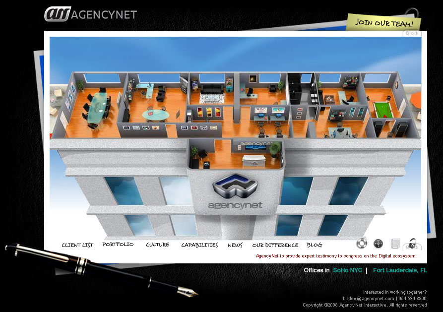
The reason that I choose this site is because they put as much effort into their own site as they do for their clients. There is one difference; they are trying to attract employees as well as customers. I think branding one’s own firm is just as important as successfully branding other companies. AgencyNet.com effectively displays the company’s overall look and feel. It shows the office of a very cool interactive web design company. Different offices can be clicked on like tabs and the site takes you inside the office and tells you more about that tab, for example the client list. The Client List is located in the Kitchen. The clients are magnets that can be rearranged on the fridge. You can also move the letters around, a nice addition for those people with short attention spans. There is a clock with the actual time and depending on the day, the food on the counter changes form Pizza to Chinese takeout. The immense detail draws you in and is very engaging making the site a truly interactive experience. Not only is the site entertaining but it is a great example of what the company is capable of.


Ford Fusion Mixer

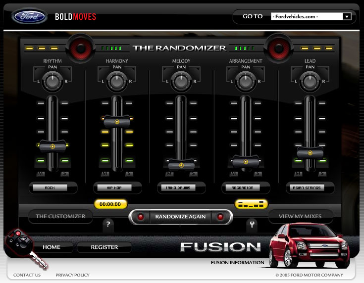
Ford Fusion Mixer is a site where you can choose up to 10 different genres of music as Mixers and create your own unique symphony. You can mix music like Rock, Hip-Hop and Asian Strings. And you can use the equalizer to make a truly unique sound.


MOJOHD

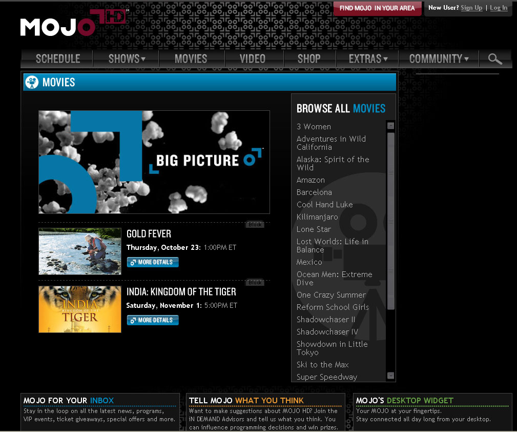
MojoHD.com shows in depth information about the television station. The site has the channels schedule, upcoming movies, as well as information on the shows. It has short video clips, as well as downloads of whole episodes. It has tons of extras, like recipes and travel info, both from the shows it airs.

Monday, November 17, 2008

Burton.com


I picked this Flash website Burton.com because it is the most frequently visited website by myself. As you enter the website you have a language menu from around the world. Once you have entered the things I really like about this website is it overwhelms you with activities. You can go to the the bottom and view some really hot snow boarding videos all featured by Burton of course. One of the cool features is you can search for gear by colors in one of the little pop-ups, or you can even enter to win free gear. It also gives you a quick overview of Burton upcoming news and events. One of the coolest things on the site is that on of the ads gives you the option to customize your board with your artwork or photos. If you come to this site looking to buy some gear, you can add it to your gear locker which is in the top right of your screen. They will store something in your locker for a week or so until removing it, so it gives you the chance to leave the website and come back later and start right where you left off. Once you click on gear you come to a menu for men's gear, women's gear etc. I really enjoyed the rollover menu's that pop up when you scroll through the screen. Something on this website that is very helpful is when you click on Tech, you can get a lot of information on useful information from ridding to setting up your boards bindings. Now if you goto teams you have a chance to kind of meat the team members and scroll through numerous photos of the team members and there daily lives. It does a great job of introducing the team members and gives some awesome information on them. The one thing i could critique on this website is that the first page, even though I know it suppose to be a little bland, it is simple just an enter page with languages on it but it really doesn't give the feel of Burton at all. If i had designed this website that would probably be one of the things I did differently. Other than that I love the site and visit it at least three times a week to check in on new things going on.
http://www.burton.com/Region.aspx?return=%2fdefault.aspx

Sunday, November 16, 2008

2nd studio exploration -TARGET SCOPE-

Dallas Advertising Agency >>TargetScope<<


Target Scope is an advertising agency based in Dallas, Texas whose current website design appeared in June of 2005. Their use of a 1950's flyboy backdrop is completely innovative because of the depth they add to what could have easily been an overused theme.

I am not a big fun of American old school designs but their unified theme of 1950s flyboy backdrop is just excellent. All music, images, texture of paper and use of texts go together very well.


Some little interactive effects are making this site more interesting and outstanding. My favorite is rollover scope effect on menu bar. Once you hit the menu button, bullet holes appear over the menu with the sound of gun shot. It is pretty neat and fun.


A shadow of combat plane fly over the page in certin amount of time. You can also choose or turn off the music from the right top corner music section.


They work for a lot of famous companies such as Jack Daniel's, Verizon, Cold Stone.


Wednesday, November 12, 2008

Design Exploration : Nissan GT-R and AMG C63

For this exploration I chose two car manufacturers. These are two micro-sites for the New Nissan GT-R and the Mercedes AMG C63. Both sites are entirely designed in Flash and feature some amazing 360º video technology to promote two high performance cars.

My first pick is the Mercedes-AMG 360º This site features some amazing footage using a revolutionary 360º video technology and using flash to allow the user to "interact" with the footage. There are a lot of nice features used in this web site and subtle elements to make it appealing and interactively fun. I like the fluidity of the navigation. I also like the contrasting colors used, it is simple but powerful which is what the car is all about.

My second pick has also to do with cars...do you see a theme here! It is the micro-site for the new Nissan GT-R.The site is also entirely built in flash. I like the blend of video and interactive elements embedded in the video. As the AMG C63 website it features some 360º technology. I also like the spinning earth with its interactive cities. Again a great site which combines interactive elements as well as informative ones.

Monday, November 10, 2008

Blog #2: Design Exploration


For this Exploration I picked www.theflagshipexperience.com. This is a website sponsored by American Airlines. The entire website is designed in flash and has a great navigation experience.

Design
This website has a variety of bright colors and suitable graphics. Small detail has been well placed throughout the site.

Navigation
The navigation for the website is easy and well design, it is simple and makes the most of promotion of competitions by having less pages. Flash animations within the page are great and so is the music on the background.

Content
The concept of on the website is to promote “the flagship experience” or in other words their business class seating. By selecting the different scenarios shows incredible sense of relaxation.

Summary
“The Flagship Experience” is an interesting and efficiently executed website with outstanding design and good use of media. It was especially good to see fast loading times and the well-thought out navigation and functionality. This is a well planned and executed website that deserves recognition in terms of design and concept.

Sunday, November 09, 2008

Design Exploration - Four Seasons Bora Bora and Idustrial Light Magic Pirates of the Carrabean

http://www.ownborabora.com/

This website was built to promote the sale of Four Seasons Private
Residences Bora Bora, 15 of the most rare and exquisite properties in the world. Fully deeded whole ownership interests. This website is visually stunning and very easy to navigate. The background of the site is video of the island and island life, while the navigation and information is laid over top the video. The flow of information on the site is fluid and seamless and the color pallette goes well with the island theme.


http://www.ilm.com/theshow/


This website provides visitors with a behind-the-scenes look at the artistry and technology used to bring the characters and environments to life in the Academy Award Winning move Pirates of the Caribbean. It was created to showcase that the best visual effects make the effort invisable and extend ILM to the web. The look of the site carries through the theme of the movie by having suddle underwater noises playing in the background. It is easy to navigate and encourages visitors to have non-linear interaction with video rather than a passive viewing experience. Flash is used to "peel apart" layered video revealing some of the special effects used to create the movie. It also engages the viewer by showing scenes from the movie and asking if it is "Real or ILM".

Software used to create ths site includes Flash 8 Professional,
Illustrator CS2, and Photoshop CS2.

Thursday, November 06, 2008

HOMESTAR RUNNER!

HomeStar Runner
http://www.Homestarrunner.com is an amazing flash website that is for pure entertainment. Launched in 2000, Mike Chapman just gathered together a few ideas for flash animation. Now the site has become so popular and successful that it has even drawn the attention of Nintendo, and they have released a homestar runner video game!
-Travis Wright

Wednesday, November 05, 2008

Blog #2: Design Exploration of Web-based journalism

Blog #2 (Design Exploration of Web-based journalism)
At a time when the newspaper industry is struggling due to economic factors and competition from the internet, the Christian Science Monitor, a century old, globally circulated newspaper, is planning a transition from it’s daily printed version to a more robust website, a daily emailed PDF version and a weekly print version. The Monitor will continue its current level of international and domestic coverage, with correspondents world wide. In this transition the Monitor hopes to achieve three goals: produce news that can be accessed and updated 24/7, focus resources on fast-growing web audience to increase reach and impact, and eliminate the major production and distribution costs of a daily newspaper. A look at the current on-line Monitor we find an exceptional example of multi-media journalism: use of webcasts, audio reports, photo journalism (Somialis in exile), daily pod-casts from reporters around the world, integration of blogs by multiple reporters on breaking news (e.g. Global Credit Crisis blog and Vote blog), regular blogs from experts, links to related stories, archives of past stories, and award winning story-telling narratives (Little Bill Clinton Hadam, the story of a 9 year old Tanzanian refugee), creation of virtual community with blogs from relevant and diverse community voices (Patchwork Nation Blog), photo galleries, and RSS feeds. Facebook provides the Monitor with an excellent opportunity to introduce its unique content to a younger audience, while Twitter, the Monitor’s experiment with social media, provides a service for friends, family, and co-workers to communicate and stay connected. Like the printed version, CSMonitor.com contains content that is straightforward, intelligent, unbiased, and non-“sensational”.

Tuesday, November 04, 2008

Interactive Sudoku Fun


I worked as a computer programmer for “decades” and ended up as a game developer, implementing educational games on Sony Playstation and Internet platforms. The company had a team of game designers, audio specialists, artists, and technical developers (of which I was one). The games were fun, engaging and taught elementary school level math and language concepts using multi-media tools. It was a very fun job and the product something I was proud of!
Since getting laid off, I have tried a number of professions, including teaching middle and high school math (an unsuccessful, but interesting experience!) and currently, tutor middle through college level math students, which helps understand specific troubles students are having in learning math concepts.
This brings me to the topic of my discussion, which is “using interactive multi-media to teach secondary math skills”.
A search of what is available on the internet came up with the following:
www.ed2go.com a text-book style instruction, with chapter quizzes and small projects. There is a teacher moderator and an on-line forum. www.learningplanet.com though most of the site requires a subscription, I did find some free examples (Math Mayhem, a Shockwave application) The problems had no instruction and limited problems with only “right/wrong” feedback. www.mathgoodies.com, offers instruction and practice problems categorized by topic. Again, the instruction was text-book style and a very limited number of practice problems. I narrowed my search to finding instruction and practice in “factoring 2nd degree polynomials” a subject algebra students encounter with varying degrees of difficulty. I found the following sites: www.factoring-polynomials.com which gave a book-like description on how to factor, but no practice problems. www.quia.com a seeminly endless supply, of multiple choice factoring problems, but with no instruction. www.glory.gc.maricopa.edu a site that explains the “bottoms up” factoring method and gives a couple of examples. The site is very basic and reads like a book without pictures, animation and no practice problems.
One point that was brought up in a sample lesson on ed2go was that learning can be fun, disputing the quote often heard by teachers "We are in school to learn, not to have fun." I think that interactive multi-media can facilitate both learning & fun. To this end I found a site that gave miscellaneous math problems embedded in a caching game www.mathbits.com The game was fun and engaging and revealed a “prize” at the end, which was a PDF certificate. But again, there was no intermediate feedback or step by step instructions on problem solving.
Finally, I found what I was looking for in the Sudoku game on the site www.learningplanet.com I love to play Sudoku, so this was a distraction and off-topic, but after investigating it further I realized it had incorporated the multi-media aspects I was looking for: interactive step-by-step instruction (see “How to Play” for I/A instructions) and pertinent player feedback during game play (time clock, sections light up when completed, interesting graphics, etc). The unlimited game play was also a bonus! This game has the elements I was looking for in teaching math skills: fun, interactivity and intermediate examples and feedback!

Monday, November 03, 2008

COCA-COLA AROUND WORLD


The thing that gets my attention is the fact that there are multiple things moving at one time, the sugar loaf gondola a parachute, cars are moving, and the lighthouse is blinking. The introduction is amazing starting from the clouds and then going down and focusing onto the world. They also give you multiple choices for where in the world you would like to find out about the greatest food and they do this in an innovative manner by not listing the names of the places, but by using landmarks. The ocean is also constantly moving, incredibly realistic, and almost give the illusion of liquid on your screen. The topography like appearance is very visually appealing,. The choice of word is also interesting as it doesn't say "next place" but "travel the world" making believe that you can actually travel the world. Even the parachutes appear to have a person inside, The attention to detail is absolutely outrageous,. This advertisement is very good: The key is a realistic look to a cartoon that almost looks like photography. In this advertisement they are using Flash animation and 3-D. Everything is interlinked making the world seem accessible. The balloons create an interactive almost game like feel to an advertisement. From this i will take the idea to use the "balloons" as an advertising idea. Not to mention that to cut the balloon and zoom into the place on earth you use scissors, which release the balloon. Some problems that the designers may have found were the fact that this advertisement required layers and layers with the clouds moving slowly while the cars zoom by on the freeway and the parachutes slowly fall to the earth. Also the illusion of depth may have been difficult to create. They used color and harsh edges to differentiate the background from the earth. Hopefully in the future we can travel like this and not have to spend money on gas and planes.

http://www.gringo.nu/projects/cokelight-worldflavours/#/world
By Patricia Brady

Design Exploration: Music, Movies, Games.

My exploration into the network took me to my favorite pastimes, Music, Movies and Games.


http://julianvelard.com/
My first site is a singer named JULIAN VELARDE, who has a very interesting Home Site, as the animation is very appealing and navigation is fun.


http://www.grindhousemovie.net/

My second is the site of a couple of films of directors Quentin Tarantino and Robert Rodriguez. This site is great fun, full of interactivity and intense visual effects.

http://www.konami.jp/mgs4/uk/top.html

My third site is an online game in which they interact with a soldier in different scenarios.

Other intresting places:
http://saizenmedia.com/zoltar/
http://suzieg.co.uk/flashindex.html
http://www.saizenmedia.com/light/
http://www.whitegoldiswhitegold.com/

Carlos Osorno