Skip to Navigation | Skip to Content

Class Blog

Saturday, October 31, 2009

Studio/Artist Exploration :: Becca Patterson

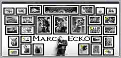
I chose to looks at Mark Ecko's artist website. He is an artist for the brand "Ecko" as well as works on many side projects for a variety of clients, including magazines, cars, sneakers, tv shows and philanthropies. This first thing that drew me to his website was the homepage. It is comprised of a background that looks like a room in an art gallery with him standing in front of his exhibition. His name is boldly written on the wall and there are plenty of framed images "hanging" on that same wall arranged very neatly. When you drag your mouse around the page the images shift to follow the direction your going. You can click on each "frame" to enter into a more specific gallery pertaining to whatever that frame's title says. When the website is changing from one gallery to the next the frames drop off the side of the page and are replaced by new ones, great animation. Once inside of that gallery, it is easy to navigate back to home, or even to keep exploring deeper into that topic. The headline is continuous and serves as the constant navigational bar no matter which page you are currently on, and gives you options to jump not only back to the home page but to any other subgroup.


The look of this website is so clean, organized, and intriguing. The usage of just black and white really makes the images pop and gives off a very professional feeling. The page is very easy to navigate. It has a wonderful way of being simple, but not boring. I really like how each subgroup's web design pertains to the topic of the group. For example, under the grafitti tab, the page is set up as a cityscape with changing the billboard fronts each time you click on a different type of grafitti. While there are differences in all of the pages, there is a very cohesive and obvious theme running throughout them all.

Monday, October 26, 2009

Studio/Artist Exploration


Studio/Artist Exploration


www.creaktif.com


The website know as "creaktiff" was created by four designers; casura, jocker, karl, and deus. These designers who created the site are all from France. Their started out with phtography and still to this day have a wide imagination to do the artistic things they do. The website has a very appealing front page which draws your attention to a house on a one way street which all appear to be sitting on a cliff. its obviously a great creation. The colors blue, orange, red, and green were used in arrows and are very appealing and stick out almost to be the main focus. These designers have caught the eye of many people and will continue to.


I liked one of their short movies they created on this website. its very simple but creative, its funny though how they drew this characters on this movie. also there's a short movie of a chair, designed by karl. its fun how these designer designed this site in a house of no where where the links are on each windows. they have everything to check out such as; links, websites, photos, streetart, design 3d and print. they don't have much information about them, but its an amazing work they have done.


http://www2.disney.fr/DisneyChannel/supersites/codespion/


I found this amazing website site of Disney, its a Disney chanel TV. show made at soleilnoirr. it has links to either watch their favorite shows or play their favorite games. I think this website was create for childrens. also on this page has tabs to click, such as TV, Film, Music, and there's a lot of options to choose where to watch videos, cartoons, or films, very nice creative for childrens.


Photos: these photos were taken in france, paris, and roma. they also have some photos in design 3D that seems they were create in very strong colors. their outlines are straights and fancy.


I think these designer came up with this amazing idea and excellent job for the people to explore their work. is fun also for the kids to check out this sites of disney to watch and click any links of disney sites to have fun.

Tuesday, October 20, 2009

Design Exploration :: Sean Ashcraft

1 :: Organic Grid - Portfolio Site


It's a pretty simple site, but what I liked immediately was the graphic appeal. And when I started mousing around, the addition of the sound took it to another level. I probably moused over the sequence of bars 10 times before actually clicking on one.


I thought it was a pretty fresh take on site navigation. Of particular interest was that each nav bar seemed to be its own little Flash movie, each with its own loading script. Pretty slick.


Once you click in, you've got a couple different options to get around the site. You can either use your arrow keys to check out the content, or the bar across the bottom that comes up when you mouse over that area.


You can even check out the older version of the site, which is in itself a pretty cool Flash exercise.

------------------------------------------------------------

2 :: Yo Gabba Gabba! - Kids TV Show Site


Where do I even start with this one?! There is so much fun stuff going on with this site, all courtesy of creative minds and our pal Flash.


First, when you come to the site, you immediately know you're getting into something fun. From the use of colors to the fonts and graphics, it all speaks to the intended audience. And is even cool for older peeps to explore.


The loading script is even fun, and the way it transitions to the home page is really nice, as if it were peeling back the cover to reveal even more good stuff. Once you're in, the layout is pretty basic, but the content is far from. You can check out videos, play games, and interact in countless ways. They even have a separate area that takes you to news and their blog.


The interactivity at the bottom that allows you to identify each of the characters is a particularly nice touch. So get in there, check it out, explore. It's pretty addicting really, and I'm way older than 10.