Skip to Navigation | Skip to Content

Class Blog

Wednesday, February 27, 2008

Artist Exploration

I've chosen a site called "The World Is My Canvas"


Check it out at

http://www.theworldismycanvas.com/


I found this site to be very interesting and entertaining. To be completely honest I wasn't sure what it was at first. After exploring for quite sometime I found that it is a clever plug by Nokia to market their products GPS devices.

The site introduces an interesting and comical host 'Stavros' as he explains the concept of "position art through GPS." The site itself includes a nice navigational system bar that's clean and easy manipulate. It interaction is simple and maneuverable. It includes fun little movie clips and intros to explain GPS tracking tools and how to make funny art. It even includes a contest for people to actually use the concept. In a separate section it allows screen saver and desktop downloads of the miniature comedian. I think it has an awesome promotional aspect because it's hilarious.

A few other interesting flash based sites that I found by Nokia are as follows

http://www.nokia.com/

This is a direct link to Nokia's main website. Here you can access area support, find and purchase various products and explore features of their company.

http://ovi.nokia.com/ovi/app/ovi/flash/
This site links to info, pictures and music options within Nokia.

These sites are equally well designed, clean and easy to navigate. Their page layout is interesting because it presents a picture slideshow that is shown over multiple turning screens (each that is seperately cued with the user mouse.) It's a nice touch to the site's interactivity..

Tuesday, February 26, 2008

Artist Exploration


http://nikefootball.nike.com/nikefootball/siteshell/index.jsp#,en,0;choose

This website has always caught my attention by all the different interaction it offers and it’s to my interest. It wasn’t until I started taking this class that I realized this website was a flash based website. I’m not exactly sure who are the creators of this flash based website are I just know it’s created by Nike and they reserved all rights.

I could honestly say that this website was obviously created to target soccer fanatics and to sale products of course!! In this case being Nike soccer products. One of the ways they do this is by making this website very easy to navigate and allowing you to see video clips relating to the subject matter.

This web site allows you to see what is going to on in the world of football or as we like to call it soccer. They do this by combining the products Nike has to offer with along with all the players it sponsors. It’s another form of marketing and another way to gain interest.

Throughout the whole first Interface in this website, with the use of flash it use a lot of rollovers to address the subject or the merchandise Nike is offering. Or whatever is they are trying to get thru to you. This make is very effective because you know right away that subject has some form of interaction another thing that comes into affect it’s the use of bright colors it uses.

One of the things that I really enjoyed was the NikeID that Nike has to offer in this website. If you click on this it allows you into the Nike Store and with some form of flash it allows you to choose from any kind of soccer shoe and make it any color with any designs that you want.

http://nikeid.nike.com/nikeid/index.jhtml?ref=http://nikefootball.com&sitesrc=eufootball#category,soccer

Another thing that I found very interesting and fun in this website was that it allows uploading your own soccer video and adding it the chain of videos it has from other users all over the world, then it plays it as one clip.


http://nikefootball.nike.com/nikefootball/siteshell/index.jsp#,en,0;shootinggallery,

Monday, February 25, 2008

Artist Exploration


Whitneybiennial.com was conceived by Miltos Manetas and Peter Lunenfeld in a clever effort to challenge the opening of the Whitney Biennial show. This website is a collaborative piece that uses the talents of over one hundred individuals to display their animated pieces integrated into a clean interactive web design.

The website allows you to stroll through an art museum like space, perusing computer generated works. By moving the mouse along a map situated at the bottom of the page, you simultaneously walk through the exhibition spaces, creating a virtual art viewing experience.

Soft background melodies enhance the airy, contemporary atmosphere. The website successfully mimics contemporary art curation and installation practices while adding an inclusive interactive element allowing the greater public to be the artist and the viewer.

The website uses Flash to create a user friendly and visually appealing experience while delivering a clever commentary on the pretentiousness of said art fair by allowing viewers to manipulate the pieces, many of which are similar to that of famous contemporary artists. The theme and layout used in this website ties the design and concept together successfully.

One of the drawbacks about this website is that it seems like a few of the artworks do not upload correctly. This may be due to the type of software that was used to create it. Also, at times, the map or guide doesn’t navigate as smoothly as it could.

Overall I think the website is a unique and creative way to mirror an environment while at the same time critiquing it.

Saturday, February 23, 2008

Artist Exploration


The studio that caught my attention was the Juxt Interactive Studio. It's an interactive marketing and design company based out of Newport Beach. I love their website because it's not too busy and not cluttered. The navigation is very clear and the "jeans-style" background gives the hole page kind of an urban feel to it. http://www.juxtinteractive.com/

The studio uses combined flash animation with game imagery for some of their projects (see http://www.lucasarts.com/games/thrillvilleofftherails/). The home page lead your into an interactive themepark with different interactive buttons with minigames, Souvenir-stand etc. and to build your own theme park.

Some of their impressive work was made for Target, Cherry Coke and their newest project Fizzix Gogurt that is an interactive web page catering to a very specific target group (boys 8-13). This project leads you into an interactive "Laboratory" world with funny feautures like flavor tasting and the "burp-interactive sound machine" etc. http://www.gogurtfizzix.com/

The BMW learn to drive integrates Video with Flash with great humor. The beginning leads you to a page where you can choose how your parents treated you when you were learning to drive and it goes from there. Very funny. http://www.relearntodrive.com/

The use of color in their project is very thought through and is used all throughout the whole page. The overall simplicity or better contemporary style of the studio is what makes it work for me. The studio has won several wards for their web pages including best of show, bronce in the 2008 Service Industry Advertising Awards etc.


Wednesday, February 20, 2008

New Media Exploration? - by Chie

As Karl and Veesh introduced web based programs in the last class, such as word processor or game which utilize Flash to provide rich and light content, I’d like to introduce an online photo editing program Picnik.com.

Picnik allows users to edit their photos online. They just need a web browser, but never need Photoshop with Picnik.com (if they are not demanding)! Some web sites or web photo albums have had online editing function but Picnik is definitely advanced and high-speed processing. Once they upload their photos from own PC or Mac, even from ANY web site, they are able to edit the photos in the web browser and then save them in their computers. Not only basic editing, such as rotate, crop, resize, color, sharpen, red-eyes, but also it has filters, text, and shapes so on.

Of c
ause it doesn’t have high editing ability as much as Photoshop does, and if you want to use advanced filters, shapes and fonts, you have to subscribe "Premium" for $24.95 for a year. Advanced users must be better to buy Photoshop, but I think free functions are enough for just regular users and even price of Premium is not too expensive.

New Technologies have cleared our limits one by one. For example, Photographers used to edit photos in a dark room. They needed different filters, chemicals, exposed time, amount of light, time and skills to create high quality arts. Since digital cameras have invented, they do not need the dark room anymore. But still, a high performance computer and enough money to buy Photoshop or so are required. Now, Flash allows all users who are online to work on creative photos whenever they are.

Actually, I was amazed its speed to upload, edit, save photos and the variety what I can do. It says "Picnik itself is a lightweight and 'download-less' experience. But it does require Flash 9 to be installed in order to have the rich, full-featured experience of photo-editing within a browser."

I guess I'm going to learn the mechanism how Flash works for those web based programs from now. It is so exciting to think what we can do with this amazing tool which could get over some obstacles we have had. We probably will have more variety of online tools like Picnik.com. Someday in the future, I might be able to work on a corporate project with my friend, a web designer in Japan, simultaneously on the Internet.

Tuesday, February 19, 2008

Design Exploration - by Chie

I show you two examples of successful design with Flash contents. Both website could be very ordinary one which just introduce information, but Flash contents make the web sites so attractive.

Michelin's web site is a great example of integrating interactive media function into ordinary web structure. The structure of the web site is very basic and simple: 4 global menu and 3 to 6 local menu on each global menu. Those local menu link to contents such as texts, graphics and movies. Instead of usual navigation by buttons and links, it navigates the audiences with interactive animation to each level of hierarchy very successfully. I analyzed what are the keys of the success. If you could, it'll be easier to understand what I say after you cruise the web site little.

  1. Hierarchy

If you notice, it has some links outside of center screen which the animation is on, such as Dealer Locator, Tire Selector, Web Shopping. Those are very important links to relate their sales directory, but they focus on a main purpose of this web site: promote the company. Links that outside of the main space is in same color scheme with background and simple and small text; They keep sales function but make them low-key. It helps the audience to focus on the main idea.

  1. Consistent

In the animation, they use same pattern from the main to reach the end level. It has many hidden button in the animation but it’s very easy to find because they use same symbol as hidden buttons in any pages. A “Back” button is always in same position in the frames and “Quick Guide” bar on the bottom tells the audience where you are now. Also each section has each theme color but main color “white” create a sense of unity through whole web site.

  1. Balance

The web site has good balance of positive and negative space. The animation has enough depth of field and proper space between each items, such as graphics or hidden buttons. It makes the web site looking simple and avoid the audience being overwhelmed.

  1. 3D Animation

It attracted me so much!! Experienced the 3D special migration, I also was wondering how they create the animation. It’s really COOL!!


I found another example of great design in Saturn. In same reasons as Michelin, I think this website is successful. Its’ clear and consistent navigation leads audiences’ eye movement and make easy to understand the hierarchy. Large, whitish negative space counterpoints the rectangular main space. Flash animation makes the website a lot more active and attractive. It’s been so exciting to learn Flash!!

For my first blog, I have two websites that use Flash in different ways.

The first website does not use Flash as its main format. Instead, it has found an interesting usage for Flash that I found to be of importance. The Website is the offical site of author Chuck Palahniuk, whom most people know through the film adaptation of his novel, Fight Club.

http://www.chuckpalahniuk.net/workshop/chucks-essays-2008-25

I would assume that most people in this class are familiar with Napster, and the RIAA's lawsuit against people downloading music for free. The Internet and the ease at which media of entertainment are available create hassles and conundrums for copyrights. The webmaster of ChuckPalahniuk.net, however, found an innovative way to ensure the copyright nature certain essays written by Palahniuk featured on the site.

By having the essay displayed in a Flash format, it secures the document. Highlighting and copying do not work. Saving the entire web page does not work. Trying to print the document will only print the small bit shown on screen. You are left to simply scroll through the Flash document, read the article, and not to maintain a copy for yourself.

The second Website I explored has its entire interface in Flash.

http://www.pandora.com

Pandora is an Internet Radio created by the Music Genome Project, which was founded by Tim Westergren. The Project seeks to catalogue all of the music in the world by its various attributes: rhythm, instrumentation, orchestration, arrangement, lyrics, singing style, syncopation, et al.

Pandora works by the User inputting the name of an Artist, Song or Composer into the search field. Pandora is then able to use that input as a basis for recommendations to the listener. Obviously, for these purposes, more popular artists are more easily found than, for example, Russian Pagan Metal or Speed Folk. However, the Project has been able to categorize an enormous selection of music, and Pandora Radio is an excellent tool to find new music. The Radio itself is free to use, with personalizations of your own select stations.

http://www.pandora.com/corporate/

Allow Pandora to speak for itself. I encourage you to explore the site, as it will undoubtedly lead you to new discoveries of musical artists and/or stylings.

Monday, February 18, 2008

Beta Testers - by Veesh

Hi Everyone!


For my two examples in flash design I chose two video game companies. I'm an avid gamer myself so in the picking, I have one thats a well established design studio with mutli-blockbusters out(Blizzard Entertainment), and the other is a fresh new face in the gaming community with a design entirely in flash (Artix Entertainment) and a very promising future. The game DragonFable (Artix) is currently past open beta and while its still currently free to play, you do have to create a login to check it out. For my presentation I'll log in to my account :) and give a short demo of actual game play!! The game itself is amazing, as far as what they were able to accomplish with a browser as the game platform. Aside from the artwork and smooth flash design there is a lot going on in the background, as far as scripting and databasing, but all well connected and well working with the flash in the foreground. Below is a flash movie made by the game creator as a promotional and a very good look in to the actual game design. The art work, movies and sound is similar to game play. DragonFable


My second studio study is the Blizzard Entertainment group. Having designed StarCraft and World of Warcraft(alone with 9 million+ members) they are definitely the leader of multi-player online games. First off, I just want to show one image - that has been "flashed" by the designers of "Blizz". This website is a perfect example of what a professional team is capable of in flash. If you don't happen to have flash the image loads like a normal picture. However, if you're flash enabled, you'll see an almost invisible flash loading bar above the picture and then ! the picture comes alive. I think this is amazing flash work and reminds me of the "moving picture frames" where there is a light behind a painting.
The above example is just one image. To fully understand what Blizzard is capable of; I recommend that you visit this website If you click on the link for the mini flash site it takes you into a world of its own! This website was created for the promotion of the first expansion for the World of Warcraft game. It was made to give potential customers a peek at the new addition to the game as well as a ton of information for it. For my presentation I will also give a small demo of this site. Stunning artwork, solid flash design, and seamless mini games built into the site; 9 million people paying $10 a month for just one of your games: this is what I would expect from a company like that!

Sunday, February 10, 2008

Interactive multimedia

Livengood/ Nowack are a full serve marketing company that has been in business for over 30 years. They specialize in branding, marketing strategy, media management and creative campaign development. They utilize media planning, print, TV and other forms of marketing disciplines to facilitate their business.

I really enjoyed their web site and other links designed by this company. I found the Get lucky in 2008 to be very funny. I also liked the page transitions, use of sound and visual graphics using flash. The company applies a lot of humor on their web site and I found this to be very refreshing. Another thing that I noticed was that some of their clients were involved with nutrition and heath, such as salmonsafe.org and organicvalley.coop. This made me think that they seem to generally care about the welfare of the clients and their marketing campaigns. Other clients consisted of wide variety of different companies in the Pacific Northwest. Overall, I liked their use of flash software, audio sound and effective rollover techniques.

Get Lucky in 2008
http://www.lngetlucky.com/

A humorous site with a great concept, clean design, and some entertaining videos. The page layout was very well done. The video offers a sneak preview into what one would expect from different cultures around the world on New Years Eve.

http://www.in-ads.com/ln.html

This is the company web site. They do a very nice job on roll-overs and very funny explanations of their business and service. By clicking on their work you will be able to view the different clientele list as well as different forms of design work that this company incorporates into its layouts.

Here is a list of the different web-sites designed by Livengood/Nowack company.

http://www.marquiscompanies.com/

http://www.salmonsafe.org/

http://www.fife.com/

http://www.organicvalley.coop/

Friday, February 08, 2008

Siska's Design Exploration: Interactive "Public Service Announcement"

Hi, how are you feeling today? :) Yay~ I'm the first one to blog in this class...
Anyway... on with my first chosen exploration blog--design. I choose to focus on PSA or Public Service Announcement in the form of interactive multimedia website.

PSA, we all have seen them or heard about them on TV, radio and prints. Most of the announcements are about the deadly effects of smoking, health issues, drugs, etc. But have you really ever pay attention to them? Sometimes they can be creative and interesting or they can be down-right boring, straight-forward and bland.

In this blog, I will explore a couple of websites which attempt to educate our young generations on the deadly effects of smoking and junk food/drink. There are many different websites that promote ways to quit smoking but this one really caught my eyes and interest: http://www.quitdoingit.com/


It is a unique and futuristic interactive website that targets 18-24 years old to quit smoking. It applies 3D experience and clean interface for easy usability. The message the site trying to convey is very straight-forward and (amazingly) easy to digest and understand by its audience. When you entered site, choose the macro selection for full experience of the site. You'll be then introduced to a sarcastic but totally hilarious host in white lab-coat; my favorite line of hers: "no lolly-gagging". She acts as the tour guide to the site so we do not have to figure it out ourselves. I am impressed and amazed at the clean interfaces of this site: user-friendly selections, clean graphics, etc.

There are three important sections in this site: Research, Development and Results. Sounds boring? In the contrary, its actually a very creative effort on their part to break down the negative effects of smoking and to counteract smokers' resistant to quitting. In the Results section they have provided us with links to: fixnixer.com and Quitline to help us quit.

Hey, actually I am not a smoker but I think this site is pretty effective in delivering the message across to its audience. What do you think (you smokers out there)? :)

Moving on, the second PSA website I choose is on the topic of junk food/drink. The site is provided by the British Heart Foundation and believe me it is something that you would not have expected from a heart foundation of any kind: http://food4thought.bhf.org.uk/

Its target audience are mainly kids and teenagers (maybe some adults like me?). The message that they are trying to deliver across to us is basically junk food is bad for you, period. But the way that they deliver it is what sets them apart from other PSA media of the same message. They utilized interactive games to motivate kids/teenagers to learn about the negative effects of junk food/drink.

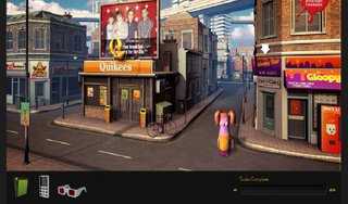
As you entered the site, you are being introduced to a 3D role-playing style game (has a Japanese game feel to it too actually). It involves a lot of user participation in every aspect of its message deliverance. Coupled with awesome graphics, we role-played as a cute little character hopping (or shuffling) across the town to complete different tasks. There is a "main site character" called Sick Rick who would show us the foulest and most disgusting videos of junk food/drink. Basically, it made me rethink twice before picking up that can of coke... :|

Overall, this site is definitely one of my favorite interactive site because it serves its purpose in providing entertainment and learning experience at the same time. A great blend of humor, education and awesome design to keep our young audiences interested--a great way to learn about the danger of too much junk food! I totally recommend this site to all kids who is chowing down a Big Mac right now...