Skip to Navigation | Skip to Content

Class Blog

Friday, November 30, 2007

Design Exploration - Nonaology


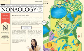
Nonaology defined simply as 'basic studies in living better' and more expansively as 'an in depth exploration into the examination and exploration of Lake Nona, a brilliantly designed 7,000 acre, master planned community located within the city limits of Orlando, Florida'.

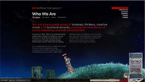
I found this site simply poking around through the links in the IMT 145 Resources section and found the design and the interactivity absolutely intriguing and unique.

Sure, it's a web site to sell homes in a master planned community, how boring is that? Not at all as it turns out.

The site design is based on their idea of taking the name of the lake the community is built around and making it sound like a scientific term, and defining it. Lake Nona - Nonaology. Cute. They then took that concept of 'defining a term' and extended it to the entire site - making it appear to as an interactive encyclopedia entry, with a slight retro flair... and just a splash of humor. This gave the site a wonderful theme to play around.

Frankly, I've never sat and looked at a website for a master planned community for more than a minute. I want to build my own custom home, which huge aspirations to incorporate sustainable design principles... but this site captured my attention and I was still playing with it a half hour later and I was pretty impressed with the concept and design of the community itself. That says a LOT for the design, it actually got me to read the information... actually really read it.

The layout is done on a grid. The primary navigation banner is horizontal on the left hand 'page' if you will (the design is reminiscent of an open book, with two pages visible). The site content is presented in a array of four vertical sliding panels. All the panels, including the navigation banner, include some interactivity... but it is all user driven. Nothing happens until you click or move your cursor over something.

The point of the site is not blared at you... but rather 'intrigued' into you... you are curious and it is clearly stated what the site is all about in the primary encyclopediac (I made up a word) entry for the word 'Nonaology'.

The site has a formal balance which is appropriate for the theme. It is structured in a grid, a horizontal series of panels move interactively to bring information into view in a variety of ways. Nothing is exactly expected, even the 'photo albums' that you run across don't go through exactly sequentially... they go forward and then float back to the beginning rather than cycle immediately to the front of the image series. Just when you adjust to the floating horizontally sliding panels, something in the panels rolls up and down or sideways. Just enough unexpected movement to be interesting.

The site is a very clean design. Despite the fact it is packed with information, it is restful to view. The color palette is neutral, background colors are a beige and a skin tone color, the text is primarily black and in an appropriately encyclopediac serif font, a darker burnt orange tone is used as a accent color. A lot of the integrated graphics are done as vintage black and white sketches like you might see in an old encyclopedia or newspaper. BUT the designers brought a lot of contrast and differentiation into the site by playing this very neutral palette off against the color in the images and graphics - it worked in exactly the right way to bring life to the pages. There are a mixture of photographs, colorized black and white sketches and color animation / graphics that are found throughout.

Consistency is maintained throughout by retaining the primary navigation banner in a stationary location, retaining the theme in the text and layout, and through the use of interspersed circular elements - in the 'first edition' emblem (which is also the pre-loader), in the symbols on the interactive map and a few other places. It was interesting that on the news page, they went to a san serif font on the news releases. This is the only place they did that and it's not really clear to me why. I'm still thinking about that. Yes, it has the characteristic of making the news release stand out from the rest of the web page but exactly why you want to do that as opposed to using a different technique that is more consistent with the theme of the site... huh, not sure.

The navigation is absolutely stellar clear, you can go directly to the information you want. I started at the main page and everything I could think of wanting to know I got to directly with a minimum of fuss... information is presented in proximity to the images and animated graphics that support it, panels slide in / out left and right to hide and reveal information that you might be interested in.

I will comment on one other minor negative element I noted in the design. The graphic interactive map of the community is interesting and a compelling visual element in the design. Like all the movement in this site, it moves and slides very smoothly. The ONLY thing I don't like is the fact that the designers chose to give you information on the sites when you click on them... good... but then you have to click OFF the information specifically to go back to the map. That is the one thing I found non-intuitive and annoying in the site presentation. I want to simply slide my cursor off and go back to the map. Try it and see what you think. No, it's not horrible but as art director I would have made them do it differently.

The image / feeling presented by the design is fascinating to me. One of the concepts behind the community was the integration of a science/technology/research center and higher education (college) into the community. This is coupled with the retention of extensive acreage for parks and hiking/biking trails... this is more than a master planned community, it's a small city in itself with employment, retail, education and recreation all incorporated. The builders were looking to attract a sophisticated buyer, particularly one that the medical / biotech companies whose corporations were part of the master plan could hire. The entire design says 'we want the best and we want to keep you'. Talk about golden chains! Here, you work for a company and your entire life is involved in the community surrounding it.

This is a much (much) more glamorous and pricey version of what has worked, for example in China, for a number of years. In China, larger companies, particularly those involved in manufacturing are surrounded by corporate housing. Employees live, eat, and work within a relatively small radius. Co-op concept.

The site says 'educational' in its tone with the encyclopediac theme, the very sophisticated, interactive sliding panel design says 'technology', and the included 'quizzes', cute 'facts' and minimally experiential interface manage to temper that with a feeling that "I'm not too stuffy". The environmental emphasis throughout adds real appeal for a higher end buyer who wants convenience but also desires to feel like they are not isolated from nature and perhaps that by spending their money on a home here they are somehow contributing to a larger cause.

The design solution, I believe, is highly effective.

Monday, November 26, 2007

Studio/Designer Exploration: 2advanced.com

They are simply cutting edge, blazing a glowing path into the future of flash and interactive websites.

They consistently use innovative and "tech" design themes while always incorporating some element of humanity so as not to produce a cold and/or sterile design that is often associated with such themes. For example their current homepage has a different color scheme and panoramic image of a distant city, yet in the foreground there is always a person incorporated into the design looking off towards the distant city.

http://www.rappcollins.com/
They also temper their designs with humor and emotion. There are often comical details and "easter eggs" hidden within their designs. Hummingbirds that react to your cursor, or "what we look like with our shirts untucked" candid photo galleries.

http://v3.2a-archive.com/flashindex.htm
A previous site they designed for themselves was named the most influential site of the decade by Adobe and set in motion a tidal wave of techo-wanna-be flash websites that still make up a disproportionate share of flash sites.

Their work takes full advantage of perceived depth and dimension with many interactive and menu items using perspective, transparency and shadow to create depth and immersion.

http://store.diesel.com/home.asp?stl=1&tskay=3FD17CD7
They create complete dimensions for their sites to exist in, for example their work on the Diesel site where they have a underwater environment with models floating in water, even the cursor moves as though through fluid and becomes murky when near clickable items.

A reliable source tells me that their founder Eric Jordan started the company and was creating some really cutting edge flash which attracted some very large clients and with them very large paychecks and explosive growth. I've since read an article on Eric and his apparent jump-start came from entering his personal portfolio site to the FlashForward contest where his work reached a wide audience.

-Peter Ochabski
http://www.ArtScientific.com

Saturday, November 24, 2007

New Media Exploration : The Google Phone

Behold, the mighty GOOGLE PHONE!
There is alot of buzz going around right now about whether the google phone will be an iPhone killer. At this point its hard to tell since many of the google phones specs have yet to be released. In fact, this image of the google phone may not even be real, there is some speculation that it is a fake photo shopped image since it was not officially released by Google. I think its real though, so we'll go with it.

One thing I really like about this phone is that it's not trying to force silly technology's on the consumer like a touch screen. Personally, I think I touch screen is completely stupid. The only plus is that you have more viewing real estate since the buttons can "disappear". Personally, I like to actually be able to feel the buttons I'm pressing. It's called tactile response. Think about it, would you want a full sized touch screen keyboard, no. Anyways, that was my rant about that.

Some facts about the phone:

-The google phone will have advertisements enabled, one thing that many other phones do not. They are doing this to lower the overall monthly phone bill of its users (It's a bit more complicated than that, but basically).

-the OS will be based on Linux, and all apps will be run using java. The OS will also have the ability to run many different multimedia apps, such as movie clips.

-The UI will have a "pan an browse" feature.

-It will have a fully qwerty keypad.

The phone will be designed by SAMSUNG and should be released some time in 2008.


Wednesday, November 21, 2007

Amon Tobin


Amon Tobin
is a musician who specializes in variety of different electronic genres. The websites he has used to represent his work have almost always used flash and are very interactive. The latest version uses a interactive game called "Field Excursion" where you explore the depths to sample sounds of strange creatures. When you located a creature you can sample it's movements and sounds and store them to your recording log to be assembled later.

Sunday, November 18, 2007

Artist Exploration : James Farr

This guy is awesome. He is an extremely talented artist specializing in animation, specifically with flash. He is most well known for his immensely popular animated series called "Xombie" which, is about zombies. SWEET!

Here's chapter 2 of Xombie (for some reason chapter 1 is hard to find):


James started Xombie in 2003, and has consistently held a top 50 spot on newgrounds.com (a very popular flash animation site) for most viewed videos. He is also ranked #3 in the artists category. When going through and watching these Xombie shorts, the main thing I noticed about the animation was how much it changed. The style remains the same, but the overall quality of the animation improves significantly throughout the chapters. (so far there are 10). When I saw this I immediately thought of South Park, and how there animation came from cardboard cut-out characters to being completely generated on a computer, while still keeping the original 2d sort of style. It really shows how an artists skill, and possibly resources, can improve over a few years.

I personally like his work because I think it has a unique style that I may be able to relate to my own style. I haven't really done enough work in graphic or web design to really be able to "define" my own style but I would tend to use the words dark and futuristic alot. Anyways, James Farr has a "dark" sort of style and it really shows in his Xombie animations. Of course zombies sort of lend themselves to dark/evil/horror type feelings, but even still, the colors and animations are very dark feeling, without knowing what the content is.

James Farr is also currently working on a comic book, other animated shorts, and various interactive websites.


Design Exploration 2 : quitdoingit.com

For my second design exploration I took a look at quitdoingit.com. Quitdoingit is a site which is supposed to be an interactive way for smokers to learn about the many different reasons to quit smoking. (Just for the record, I could really care less if a person smokes. I don't like smoking, but I won't negatively judge a person if they do.) This site is entirely driven by flash, and gives a real sense of "depth".

The interactivity of the site revolves around you, probably a smoker, visiting a research lab dedicated to learning about the ill-effects of smoking. The lab itself is designed to look very futuristic, with a very plain, white environment. It almost feels like the inside of a Rebal Alliance ship from Starwars. The navigation is within a floating robot ball thing that displays the navigation options on a screen once you click on it.

The designer definitely took advantage of flash's transparency ability. The site uses video of real people to present the information to you as they walk across the futuristic environment. Out of the many sites I've seen do this, this is by far done the best, with the most seamless transitions.

I liked this site alot because it truly gives the user/viewer a great interactive experience. This site is not easy to find something specific, it's not about that, its strictly experience design, and it does it well. Whether or not it actually helps a person to quit smoking is another story.

Thursday, November 15, 2007

Mark Fiore | Flash Animated Political Cartoons


Mark Fiore's web site is insightful humorous and an excellent example of flash animated political cartooning. His work is definitely a reflection of dry single frame static political cartoons, as he got his start at the San Jose Mercury News working as a traditional political cartoonist. In 2001 he left to devote himself full time to creating animated work using flash. His site www.markfiore.com receives millions of hits per day and he was awarded a Robert F. Kennedy Journalism Award, and an Online Journalism Award from the Online News Association and the Columbia Graduate School of Journalism.

His political views are astute and thoughtful though mildly predictable.


Labels:

Donnie Darko

Rather than find a website that impresses the average joe, I decided to share what I thought was once of the most confusing websites that I've ever seen, the website for the movie Donnie Darko: http://www.donniedarkofilm.com/
Most sites for movies give you a straight ahead page with a synopsis, trailer, cast bios, etc. In the case of this movie however, they decided to take a different approach, by creating more of a suppliment to the film. The whole idea of the website is set up as sort of a game making you click everywhere and try to find where to go next. Occasionally it will ask for passwords based upon the random information from the movie in order to access different portions of the sight as well.
Though informative to the person who has seen the movie, the website makes anyone who hasn't confused beyond belief.

Wednesday, November 14, 2007

Design Exploration

Red Interactive Agency: http://www.ff0000.com/. Okay, this site is really worth checking out! Red Interactive is a marketing agency specializing in interactive media. To prove their worth, their site itself is interactive to an extent that I have never seen before.


Normally, "interactive" means "click here and the site will do something/go somewhere, etc." This site takes it to the next level (as much as I now hate that phrase), by placing you (or at least an alter ego) in the website.
Once the site is loaded, you are asked if you want to enable chat with other visitors. Pressing "yes" creates a moving, exploring, talking avitar, which is dropped into the the site's quirky, stylized environment. You have the option, via a customize panel, to change the look of this character (you may pick from 10 different characters). Then, you just talk. The words appear in little snippets above your head, as if cut from a newspaper.
The whole site has a specific artistic theme, reminiscent of early 1900's newspapers, vaudeville posters or tarot cards. While the scenery is a bit eerie and definitely quirky, the user is really drawn into it and begged to interact. While the live chatting is what really amazed me, the user is actually able to "walk" his or her character back and forth across the page. When you reach the edge, the page scrolls, leaving the menu and home page information behind.


Once the charm and wonder if the layout becomes old hat, the user can explore the menu itself and learn about Red Interactive. Clicking on the menu simply changes the text on the page, so you never leave the interactive environment. The company specializes, of course, in online marketing and web development, "providing the ultimate experience for their target audience." They count among their clients MTV2, Comedy Central, HBO, Sony Pictures, and Paramount.
This site serves to illustrate Red Interactives ability and commitment to providing an true "experience" for their visitors to their sites. The site is very unusual, and uniquely interactive. It promises an immersive experience for prospective clients, while suggesting Red Interactive's ability to provide unique marketing tools for clients.
I really enjoyed this site. Aside from being interactive, artistic and unusual, it was clean, logical to use and concise. The main menu was short and never strayed from it's position in the top right corner. Clicking to different sections, offered the appropriate sub-menus, listed at just below the section title. The content was well stated and concise, not to mention that it did little to interfere with the interactive environment. In fact, it seemed part of the environment, allowing the user to walk and jump the avitar in front of the content, as if the content were part of the background.
Overall, the site managed to state a lot about the company and it's goals, while creating an enviroment that a user would actually want to explore (even users not necessarily looking for a marketing agency). Despite all of the impressive clients and accolades, the best that could be said about the quality of Red Interactive's work was the uniqueness of the site itself. It promised a company that could create a truly unique experience to market their clients wares.


Springs Preserve, Las Vegas. For the Second of 2 my two explorations, I’d like to look at the website for the Springs Preserve, a new gardens, museum and cultural exhibit in Las Vegas, NV (http://www.springspreserve.org/). I can’t remember exactly how I found this site, it certainly was not while I was looking for interesting multimedia sites; but I was fairly impressed when I found it.

The Springs Preserve appears to be a rather unique natural exhibit. Aside from being a desert preserve, it is has gardens, historical parks and well as a cultural and art museum spread across its acreage. Beyond being the small tourist attraction that so many preserves are, this park aims to be an experience of the life in Vegas that goes on beyond the flashy casinos. However, competing with the adult Disneyland that is LV is a difficult task at best. To drag tourists away from the big lights takes a big offering, which is exactly what I think this website promises.

Like the preserve, the website that represents it is a true experience. Not for the faint of bandwidth, this site uses Flash to display an impressive interactive interface utilizing both animation and movie clips to make the experience come to life. From the initial load of the side, even the pre-loader is different. A silhouette of native plants grows from a central point as the pre-loader counts up. The first screen animates in pieces away from white to reveal a photograph of the preserve overlaid with a main navigation menu. The Nav menu, like the pre-loader is made of silhouettes of native plants. Individual clumps of silhouettes are strung together with a thin line to make up the menu. Hovering over each clump makes them bounce just enough to invite you in. Clicking on one of the menu choices will take you, literally, to that part of the website and that part of the park via a video clip of travel over the land to that part of the park. Once there, you are invited to explore the area, which takes you to yet another menu and a slightly differently designed page: the information section at the bottom becomes larger, which the menu, which now has sub-menu choices, becomes smaller vertically.

The design and Flash use of this site are impressive and interactive. They manage to offer a taste of a visit to the park, without giving too much away. While navigating, the main menu is reflected in a static bar at the top of the site frame. This allows the animated menu (the silhouettes) to change as needed, becoming sub-menus for different areas. Information about the different sections is listed at the bottom in an easily accessed format. The design themes of desert flora and fauna remain consistent across the page, as does the art style, which employs many low detail images (silhouettes and outlines) overlaid on full detail photographs. The site, while impressive, is fairly easy to use, once you get used to how it’s laid out. I was, initially, more impressed with the action of the website than the product that it was advertising. It took me a few minutes before the site became second nature, and I was able to concentrate on the details of the part.

One of the things that I most felt this site was missing was a true introduction page. From exploring that site, I know that the part includes a preserve, gardens, a cultural center and a museum, but there is little in the way of a “home page” that really tells you this. I feel this would be a good addition, since the park itself is so unique. I guess it could be argued that this forces the user to explore the site, thereby virtually exploring the park. I also felt that the site almost had “too much” to it. While it was visually and functionally impressive, certain pages almost seemed cluttered and overwhelming, especially when the sub-menus started to drop down from the static top menu onto the flash main menu.

Overall, this is a beautiful site, although it could seem visually overwhelming at times. Once I opened the site on another computer (which had not yet been cookied), I noticed that there was an option for a "low bandwidth site". This, I felt, was an important option for this particular site. While Vegas has become a popular destination with the Generation X,Y,Whatever crowd, it still attracts seniors and less “techy” folks. These people may be interested in the park as a detour from the gawdy glitter of the casinos, so it is important that they have a more leisurly bandwidth option to visit the site than those of us who use the cable company to hitch a ride onto the “information superhighway”.

Wednesday, November 07, 2007

Artist Exploration: Randall Christopher


Randall Christopher is the writer and illustrator for his online comic strip Kleeman and Mike. The long awaited animation was recently released and is now online for your viewing pleasure. The animation is light and humorous and leaves the viewer wanting to see more of the two main characters Kleeman and Mike and the supporting cast which includes their talking cat named October and Jaques a wolf who speaks in prose. They all surf, skate and sometimes rock. Very different from most comics out on the market today i find the comics and animation very refreshing.

The animation entitled "Jaime's Taco Shop" includes a behind the scenes look at the making of the cartoon. Rotoscoping is taught in the intro to Flash class and was used in the making of this animation as well. Rotoscoping is used for all of the skateboarding scenes and thus gives it a more realistic feel. Randall makes the cartoons with frame by frame drawings. Very few tweens are used. The blend of analog and digital can definatly be seen in each scene. Many of the scenes look like paintings. Check the hot sauce scene and try not to laugh out loud...it is hillarious.

More of Randall's work can be seen on Andy Davis' website. He took a simple drawing and made it into a surfing loop that goes on forever.

Monday, November 05, 2007

Studio/Design Exploration #1

I have chosen to research the multimedia design studio entitled, Sandstrom Design. Their website is www.sandstromdesign.com I found this studio by way of the Tazo Tea website www.tazo.com. Sandstrom is responsible for the branding, identity, package design, advertising, and the website. I have known about this site for a long time, but it still pops into my mind as an amazing interactive site.
Sandstrom Design is based in Portland, Oregon. They have an extense client list that reveal many big name companies. This design studio has won many design awards and is well respected in the design community. Although, trying to find examples of what they have done, or making sense out of your first time on their website is very frustrating! Their website, or his website (depending on how many people other than Jack Peterson work there) is very simple and easy to navigate, but the content is setup to toy with the viewer. It will make you play little games and leave with not much more information than you came their with. And this is a very interesting point; some of the biggest and most prestigious design studios do not reveal their work, or publically promote it; they leave it up to you to have already seen their work, or for clients to already know what they are capable of. Kind of a word of mouth approach or a trail of bread crumbs; letting the clients find Sandstrom by researching something they like.
The Tazo site is really cool. There are so many different types of movements going on; the site holds my curiosity for fairly long time considering it is just promoting tea. You can go from researching the tea flavors to getting your fortune read. Check it out.

- Jesse Kerr -

The Simpsons

The first website I choose to explore was an easy choice. My sister and I were musing about what movie we were going to go see. She suggested that we go see the Simpsons movie and proceeded to pull up the simpsons movie website on her laptop. I was really impressed by the level of thought put into the design of the website. When you first enter the site the loader is cleverly designed as introduction to Springfield. When the site is fully loaded you have a bird’s eye view of Springfield from the top of a hill. There are many interactive elements available at this point. At the top there is a navigation panel that allows you to select from three main themes. The first theme is a Simpson’s avatar creator, second is a games section, third is a index of places in Springfield you can visit. In the foreground we are presented with an overview map of Springfield. Many of the shops or buildings on the map are interactive buttons that allow you go inside and explore them. In the middle right there is a welcome sign that doubles as a second navigation panel. This panel is simpler and would be much more visually appealing and easier to use for a child. There is also an animation of Bart that you can control to knock the birds off of the welcome sign to Springfield. On the bottom there is a bar of menu item that will allow you access the more advanced features of the site such as picture and video gallery.

Accessing the individual aspects of the site we can see the depth of the content you can create with flash. The first aspect I was drawn to where the tours of Springfield which allows you to navigate around Springfield and explore shops and the Simpsons home. Once you select a location you would like to explore you simply click and loads giving you close up view of the location and many interactive buttons that link to relevant content or games. Some of these games include the Simpsons Ball O’ Death and Simpson Naked Skate. The later of which was my favorite. The part of the site I most liked and that surprised me most was the avatar creator. If you do not know an avatar it is a internet user's representation of himself or herself as a picture or icon for use as visual reference during online communications. I didn’t think that it was going to be as much fun as it was to create my own. You can log in to the site create your own Simpsons character this is done by giving a choice of body styles, facial features, and clothes. Flash was used in almost every aspect of animation and games to the avatar creator and video player. The animated world that is the Simpsons are best recreated with flash especially since many of the characters and backgrounds are shaped based and easily manipulated in flash. In my opinion I don’t believe designers could have used any other medium other than flash to create and display such a complex environment inside a browser.

Studio/Design Exploration #1

I have chosen to research the multimedia design studio entitled, Sandstrom Design. Their website is www.sandstromdesign.com I found this studio by way of the Tazo Tea website www.tazo.com. Sandstrom is responsible for the branding, identity, package design, advertising, and the website. I have known about this site for a long time, but it still pops into my mind as an amazing interactive site.
Sandstrom Design is based in Portland, Oregon. They have an extense client list that reveal many big name companies. This design studio has won many design awards and is well respected in the design community. Although, trying to find examples of what they have done, or making sense out of your first time on their website is very frustrating! Their website, or his website (depending on how many people other than Jack Peterson work there) is very simple and easy to navigate, but the content is setup to toy with the viewer. It will make you play little games and leave with not much more information than you came their with. And this is a very interesting point; some of the biggest and most prestigious design studios do not reveal their work, or publically promote it; they leave it up to you to have already seen their work, or for clients to already know what they are capable of. Kind of a word of mouth approach or a trail of bread crumbs; letting the clients find Sandstrom by researching something they like.
The Tazo site is really cool. There are so many different types of movements going on; the site holds my curiosity for fairly long time considering it is just promoting tea. You can go from researching the tea flavors to getting your fortune read. Check it out.

- Jesse Kerr -

Friday, November 02, 2007

Design Exploration : Netdisaster.com

Well, somehow I thought I had posted this exploration about 2 weeks ago, but apparently it was still in "edit mode". Well here it is:


I decided to do my design exploration on something I thought was pretty fun and clever, though I don't think its technically complicated, I could be wrong. Its a site called netdisaster.com. Basically, you can go to this site, type in the URL of any site on the internet and superficially destroy it. For example, I can type www.myspace.com into the field for the URL, and click "GO" and myspace will open, but now you have the ability to destroy it and deface it in many different ways.

Some methods of destruction include: METEORS, NUKE, GUN, CHAINSAW, DINOSAURS, SCRIBBLING BABY, GOD ALMIGHTY, ACID PEE, and quite a few more. There are a few options for all the methods of destruction as well. You can choose whether the "damage" self repairs, or if it layers on top of previous damage. You can also choose whether or not you want to point where the damage will occur using your mouse, or if you want to just sit back and watch the carnage. Their is also an option for sound or no sound.

Here's an example of what myspace might look like after a DINOSAUR attack or CHAINSAW MASSACRE:

These pictures are pretty small, but if you notice the flash elements on the page (the black box that overlaps the dino and the chainsaw) you can see that netdisaster.com does not work perfectly on pages with other flash elements, because netdisaster.com itself is created using flash. If you try to destroy an entirely flash based page it doesn't work so well, if at all. It usually just keeps reseting itself.

I'm not exactly sure how the site works. I would imagine that netdisaster uses the ablility of flash to seemingly make a person walk across your computer screen, and apply it to there interactive animations. As for the animations themselves, they're mainly very well drawn and animated. Some are more complex than others, like "demonstration" where a crowd of demonstrators holding picket signs walk across the site being destroyed.

I think this site works well because it is so simple, yet effective. The idea is to be able to "destroy" a website that has been annoying you or just to do it for fun. This site was created in 2005, which means the flash technology back then wasn't quite where it is today, I'd like to see a new version of this site up and running with some really cool new ways to destroy some stupid websites.

Thursday, November 01, 2007

Design Exploration Part 2

I decided to resubmit my entry for my Design Exploration topic and instead focus on an European website from focusing on Sony's Bravia television brand.

Obliviously, the site is geared toward hyping and extolling the features and qualities of the Bravia brand. The site is structured to provide several different "avenues" that visitors to the site can explore and be exposed to Sony’s choice of promotion methods. One of the more obvious means of getting across their message is via providing traditional television media on the site and allowing the user to access any of them at his/her leisure. Definitely take a look at some of their TV ads. I personally found them to be very cool and invocative in how they utilize colors. In addition to the commercials, supplemental material is also offered such as a quick bio on the artist behind the music used in the TV ad campaign. Such supplemental material helps lend a “behind the scenes” feel behind their ad campaigns and is definitely interesting for those that are into such things.

Another method used to highlight Bravia’s features and qualities is through the section of the site that is designed to “evoke” visual and aural stimulation on the part of the user with the insinuation that Bravia sets are indicative of and able to replicate these visual and aural experiences. This is achieved through Flash interactions using the mouse in one of four areas for the section of the site dubbed “The BRAVIA Experience.” Each section in “The BRAVIA Experience” focuses on different elements which are Resolution, Sound, Clarity, and Colour. Entering any one of these elements opens a user interaction area that prompts the user to use the mouse button. My personal favorites are Sound and Colour. These elements of “The BRAVIA Experience” are very cool and do help instill and promote a very calming and pleasant vibe.

What first struck me about their site was how its presentation was really slick and cool looking. Their usage of Flash is put to great effect. My only real issue with the site was with how one is able to navigate through the site. They utilized a method of using the cursor screen position as the means to “cycle” through their menu systems. On paper this functionality sounds really neat, but given how it was implemented it actually proved not to be as intuitive as one would like it and really more of a hassle.

Another thing that struck me that I found ironic and funny was the fact that though the site is obviously geared towards highlighting Bravia TVs, nearly all of the users will more than likely be experiencing the website and all of its content through PC monitors. I suppose the intent of the site is to somehow conjure up a vibe connected with more abstract feelings and/or sensations with the hopes of somehow having those feelings/sensations residually be associated with the Bravia brand.

I can’t say how successful that goal will ultimately be or if its possible, but I can say that they definitely succeeded in getting across a very intriguing and compelling content and vibe through their site.

I am still on my quest to finding an amazing online photography portfolio. I found 2 more that I like but still am hoping to find something less commercial and more social documentary.
This site design is really simple but I still like it. Her name is Irina Rozovsky
http://www.irinar.com/main.html

His work is much more commercial, and his site is very proffesional. I particularly like his philanthropy section so check that out.
http://www.davidsacks.com/

Studio Design Blog

www.joshuadavis.com is the website of a web designer by the name of Joshua Davis that uses flash to create his website. In his website he provides links to works he has done in New York in addition to works he has done in Amsterdam and Colorado.

I chose Joshua Davis's site because of how he's made his website very interactive by providing links to other sites that are related to his work. In particular, I also like the overall simplicity of his links to other sites (even if there are extra links on his website).

One particular work that I like in his website is the one where he's showing his art work in New York using flash content. When you click on the link he provides to his art work that was displayed in New York (if you can't find it it's the click here link within his statement: "I also have some work on display here in New York at the Cooper-Hewitt National Design Museum. The show is the Museums National Design Triennial, "Design Life Now", which will be on display until the end of July. click here for more info.") Basic components of it is similar to what we have worked on in class. But some of the advanced things I notice with it is how he's making it change to the next picture after a certain amount of time has expired and allow the viewer to look at the pictures at their own pace without the use of a button.

Last but not least, the fact that Apple has written a profile about his work gives him some sort of credibility in case a viewer of his site questions about his work. His biography can be found at http://en.wikipedia.org/wiki/Joshua_Davis_%28web_designer%29

Flash Artist: Billy Blob

This site billyblob.com is a website that provides the work of a flash artist by the name of Billy.
He has very unique creativity and uses a lot of colorful, wacky characters in his work. On his site he displays his paintings along with short cartoons he produced and some random buzzes about his life.

The reason I chose Billy's site is because I like his style and concepts. My two favorite cartoons are Karma Ghost and Bumble Beeing the butterfly effect part 1. Karma Ghost is brilliant because the entire video is a revolving circle of karma. It kind of reminds me of the animated Radiohead music video. The entire time these bugs? or bacteria follow this man who is constantly confronted by karma. Billy does a good job at making the video simple, but interesting. There's no real detail and everything is very simplistic, but it seems to make the video more effective. I love the audio he chooses for this video, I think it fits perfectly.

In the Bumble Beeing the butterfly effect part 1, he uses more upbeat music with vocals. The characters speak, so it adds more to the scene. I love the colors he combines in this video, it gives the video more of wacky feel. This video is short, but simple and funny. In the end it is a little similar concept to Karma Ghost.

Billy's overall use of flash in his site is interesting and creative. When you first enter the site a black blob appears and inside are grey eggs that turn white which are the buttons you use to navigate through the site. His characters throughout his site really give it his personal touch. Overall I think this is a wonderful site and if you want to check it out go to www.billyblob.com