Skip to Navigation | Skip to Content

Class Blog

Tuesday, March 31, 2009

Design Exploration - Lancer Evolution

For my design exploration post I decided to showcase this website featured at The FWA. The FWA is a website the name every day a favorite website award and they are recognized as one of the top award website in the world. Check it out their site and you will see a lot of cool sites. They have so far awarded more than 2770 websites since 2000.


The site that I like the best from their recents awarded website was Lancer Evolution Website. This website was created to market the Mitsubishi Lancer Sportback. What I like the most about this design is how it flows very nice throughot your experience inside the site. Also one of aspect that also impressed me was the interection offered by the website, which made me continue to browse and explore the remainning pages and interesting facts about the car and the website itself.

I liked also how clean the design is and the very nice flash elements to many sections of the site. Check it out and you will see:

Monday, March 30, 2009

FranFou.com

Studio Exploration:
FranFou Studio’s work ranges from illustration, to flash animation to graphic design. He is a Canadian Artist specializing in children’s books, logos, graphic design, newspapers, magazines and web sites. FranFou has also done t-shirt designs and 4 years of daily comic strips and games. This is a photo of box art for a NINTENDO DS game made for Say Design. The interface of FranFou is a collage of animals that wiggle and blink when rolled over. His techniques utilize rollover and sound affects to engage the audience. There is also playful background music on his site. “I combine traditional illustration with digital coloring for a unique modern style with an artistic feel.” He uses bright colors and cheerful characters in his work. Some of his flash videos are also games. FranFou client list is found in Canada, the United States and Asia. His site notes he is currently working with the Canadian Olympic Committee. FranFou encourages emailing him a project description for a free quote. He offers communication via email, phone, fax, AIM, and webcam. I was attacked to his cheerful design and repetition of character style through out his work.

AgencyNet Interactive

AgencyNet Interactive is a flash design and development studio that creates cutting edge websites and projects for industry leading companies. They have numerous major clients including Ford, Motorola, Nokia, Pepsi, Bacardi and dozens of other major corporations and associations.


The AgencyNet website itself is an interactive flash website that displays their clients, portfolio, company info and other relevant content in a fun, interactive way. When you initially land on the website, you are able to navigate by moving through their virtual building. The various rooms represent the categorical sections of the website. Each section has its own interactivity to it, including mini games in most of the rooms.

One of their client sites I explored and enjoyed was the Ford Fusion music mixer website. This website has the ability to mix a number of categories of music together with a variety of controls for the sound. You can log into the website and save your own mixes, or you can just play around without the need to log in. While the mini site itself does not hard-sell Ford or the Fusion, it does a nice job of supporting the Ford brand and the feel they are going after with the Ford Fusion. There are numerous links on the site that can take you to the actual Ford website as well.


Another AgencyNet Interactive website that I was impressed with was the OwnYourC website. This flash based website is dedicated to helping people quit smoking. The main part of the website is a very interesting question and answer area where you answer questions and then see how others responded to the same question. You can sort the data by a variety of filters including gender, age, geographic location and other data. You can also post comments, images and other content related to the questions and answers.


Also on the website are a number of television channels with video content, informational tools and links and user contributions. The site has a very interactive feel to it and is very easy to navigate with the levels of navigation that slide out from the main categories.

Sunday, March 29, 2009

New Media Exploration: MediaFLO System Overview

For my new media exploration blog entry I thought that the MediaFLO system would be a good choice since it combines existing technology with a lot of new technology.

So what makes this new design?

Well, it combines:
  • Wireless technology (satellite)
  • Broadband technology (3G cellular)
  • Internet TV (each device is a network "node")
  • Real time (stocks) and non-real time (music, pictures) content
  • User interactivity for channel selection
It combines a "traditional" wireless technology, satellite, with wireless broadband cellular coverage to get real and non-real time content (Internet TV and other services) to mobile devices based on the user's subscription.


Here's how it works. The user indicates through their FLO device what kind of content they're interested in. Depending on the content type it will travel to the National Operations Center via satellite or the Internet. From there it gets routed to FLO transmitters that process the content for transmission. From there it's sent to send to the FLO device. Pretty cool, huh?

However, there's another cool thing about the FLO device's insides. Its cellular technology is kind of dual usage. One side, for the multimedia content, uses the Forward Link Only (or FLO) for content going to the mobile device. It uses the reverse link (from the mobile device) for subscription information, billing, etc.

Its other side allows MediaFLO phones to be used for voice calls (remember what those are?). So you have two (at least) devices in one.

BTW, it's not the future, it's now. Verizon and ATT have alrady commercially deployed MediaFLO.

Thursday, March 26, 2009

The Oven Reinvented

After looking around for a flash site to blog about, I came across theovenreinvented.com. The website is about the TurboChef, a revolutionary oven. It is made with Adobe flash and is interactive with many different options to choose from.

The first thing you'll see is the preloader, which has degrees instead of percentage.
When the preloader finishes, there is an intro to watch. You can choose to skip the intro if you want to. The intro contains streaming audio. When the intro is over, you are given the option to explore or cook.
If you choose explore, you can pick and choose the different parts of the oven you want to look at. You can click on a floating piece of the oven or use the navigator on the bottom right corner to choose what part of the oven you want to look at. Each piece gives a small description of what it does.
If you click on the door of the oven, you can choose what color you want it to be by clicking on a color to the right of the screen.

If you click on cook, from the beginning, you're given the option to choose how much time you want to spend cooking. You can choose by rotating the dial around and clicking on the time you want. When you click on a time, a video begins with a chef that explains how the food is prepared.
If you right click, you can choose to pause or resume the video. When the video finishes, you are given the option to watch the oven in action or to see the finished dish. Clicking on "watch it in action" is the same as clicking on explore from the first two options. To choose a different dish, click on the dial in the bottom left corner of the screen. You can also choose to return to the main menu.

The TurboChef logo is in the top left corner of the screen at all times. It is actually a button you can click on if you want to replay the intro.

Design Exploration

Ecodazoo.com is a website I found through thefwa.com. It is a 3D setting that utilizes storytelling to encourage a young audience to live environmentally friendly. The layout of the site is simple, playful and is visually similar to a video game. The uncluttered categories make it easy to explore each character. The 3D setting pivots according to how you control it. The colors and background sounds makes you feel like you’re outdoors. The site includes animal animations which engage the audience with a funny story. Each character has an individual pop-up book. Through the biographies you can find tips for living efficiently. The stories make is easy and enjoyable to learn about contributing to keeping the earth clean and healthy. Its purpose is to raise attention to how easily we can make a difference in the environment. The site is set up to educate even a young audience. It communicates how easy it is to make a difference with good values and being resourceful.


Another site I found really interesting was nikonusa.com I really enjoyed skimming through the photos on this site. In the upper right corner has a filter panel. This filter panel has settings like random selection and refresh selection. Nikon USA makes it easy to experience what you can do with their product. When you choose another photo it wisps you away and loads the next photo. The photos hang in space waiting for you to click on them. There is also a setting to choose the subject or type of camera used while viewing photos. There are links to learn more about each product at the bottom of the screen. Those panels can be minimized while exploring the photos. I liked this site because design elements are strong and intriguing, allowing the viewer to be captivated by how powerful the product actually is.

Tuesday, March 24, 2009

Tokyoplastic

I was browsing for random japanese flash animations/animators when I came across a flash animation called "Drum Machine" made by Tokyoplastic. Tokyoplastic was founded in 2002 when a person called "DC." I guess that he "abandoned all worldly ties to follow the path of digital enlightenment", which I suppose means that he left his job to start Tokyoplastic. He soon signed up with a photographer/artist " LJ" to work with him on Tokyoplastic. I tried finding information on Tokyoplastic but it seemed nearly impossible to actually find out who they are. The thing that I like which made me post about Tokyoplastic is that they use lots of music with their flash animations, the way the flash animation plays as it moves along with the rythym.

Site-1 Drum Machine http://www.albinoblacksheep.com/flash/drum


Site-2 Tokyoplastic main page http://www.tokyoplastic.com/menu.html

2nd Blog


I got hungry the other night and wanted noodles! I remembered a place called noodles but was not sure where the closest one was to my house. I went to Noodles.comto see if I could find a locator.  To my surprise  found an awesome flash site!  Its interactive and tells you all about Noodles using animation and interaction.  I found where the location was that was near my house and went and got some Noodles!  

2010 Ford Fusion + Hybrid design exploration

My studio/website design exploration is about the website for the new 2010 Ford Fushion + Hybrid car. I found this website through The FWA: Favorite Website Awards website. The two companies that created the 2010 Ford Fushion website are Wunderman Team Detroit and Soleil Noir.


Team Detroit consists of five legendary agencies. The agencies that they consist of are JWT, Y&R, Wunderman, Ogilvy, Mindshare, and the Park. Some of these companies have produced designs for companies such as Microsoft, Electronic Arts, Intel, Nintendo, etc. Soleil Noir is a company based in Paris, France. I couldn't understand the information on the website for their specific company because everything is in the French language.


This website caught my eye because of the use of bitmap images and how they incorporated it into
the Flash website. I was very impressed with how interative the navigation was by making you feel
like you were a part of the car or actually in the car and how easy it was to navigate through the
website in general.


www.teamdetroit.com

http://2010fusion.soleilnoir.net

http://www.yr.com/

http://www.jwt.com/cet/

Design Exploration ~ Interactive Instruction


I am interested in utilizing the web to teach secondary math skills. I searched for examples and found the following: www.mathbits.com/caching/opencache1.html (a caching game with multiple choice answers and a "certificate" at the end) http://www.factoring-polynomials.com/ (gives a book like description on how to factor, no practice problems) http://www.quia.com/rr/36611.html (a seeminly endless supply, of multiple choice factoring problems, but with no instruction), and finally http://glory.gc.maricopa.edu/~amckinto/Bottoms%20up.htm (a site that explains the “bottoms up” factoring method and gives a couple of examples.) These sites use a book-like format for instruction and give sample problems with "right/wrong" as the only feedback.

I think it would be really cool to go a step further by using the multi-media and interactive capabilities of the web to make learning math skills interesting and fun, and, more importantly, give interactive initial & intermediate instruction and hints to help when they get stuck. A perfect example of this in the on-line Sudoku game on http://www.learningplanet.com/. This Sudoku game incorporates many multi-media aspects to make the game fun (time clock, interesting graphics, theme) but most importantly, the game gives interactive instruction (see "how to play") and provides intermediate feedback throughout game play. And, there is unlimited number of games to play. The elements of this Sudoku game could be applied to teaching math skills on-line.

Monday, March 23, 2009

Munchy Media

So I was browsing around the web, and I came across this website called munchymedia.com.

http://www.munchymedia.com/TOFA08/about.html

It seems that they held some sort of tournament for animations. All of the animations on this website are built in flash, and all of them are totally awesome.

I've watched a few of them already. I think they're all really cool in their own respects.

-Jeff

New Media Exploration - Technology Max5/MSP/Jitter


Max/MSP/Jitter (MMJ) is an object-based visual programming tool for developing interactive multimedia systems. MMJ was developed and is maintained by San Francisco based Cycling ’74. MMJ technologies can be used to control and interface with several types of media systems including; audio, graphics, lights, movies, CD/DVD players and just about any other electronically controlled interactive device or interface.


Programs/systems developed using MMJ, referred to as patches, are created by arranging and connecting self contained programmed objects which have inlets and outlets. These objects communicated with each other by passing messages from their outlets to the inlets of connected objects. The resulting applications, called patchers, can be distributed free or sold commercially.
-

Jitter extends Max/MSP to support real time manipulation of video, 3D graphics and other data sets within a unified processing architecture. The true creative power of Jitter stems from its use of a single generalized matrix data format for video, 3D geometry, audio, text, or any other kind of data. This shared format allows for the transcoding of different media types. The transcoding process can produce dramatic effects by turning audio into a particle system, playing video data as audio, or converting video images to 3D geometry.


Max/MSP/Jitter is a powerful and proven technology for merging a vast array of multimedia systems to produce provocative performance scenarios and interactive installations. Its transcoding capabilities invite artistic exploration of how we perceive the world around us. Even in the brief exploration of this programming tool it is clear that its potential is truly limitless

Cycling ’74 offers a free 30 day trial and special educational rates on Max/MSP/Jitter


Great Flash site

Andy Foulds is an Flash artist living in New Zealand who has created a very creative (and fun) website that features many innovative Flash techniques. Here is the link.

A lot of Foulds' magic is in cursor interactivity. In addition to his portfolio projects he offers a dozen or more "amusements" in which your screen cursor bounces balls, shoots lawyers, morphs photos or paints images.
It's a very clever site with many surprises. For example, when your cursor hovers over a link the image below might fold like an accordion.

If you're not a fan of former President Bush there are several amusements on the site that allow you to manipulate 'W's' facial features to comical extremes and thereby hasten your rehabilitation.

Studio Explorations – 4 Degrees of Separation

I saw these on TV the other night, stopped me mid-chapter of the book I was reading to watch it, very amazing work. What I like about this spot is it’s isometric approach, the attention to every little detail, the colors, the music, the mix of live production and animation. I was immediately curious about who did them, how they were done and set out to find out. Along the way I discovered a trail that led right back to Goodby, Silverstein & Partners, numerous amazing sites, and work that goes around comes around. Each studio listed below has their own creative flash website that I'll leave you to discover on your own.


Goodby, Silverstein & Partners www.goodbysilverstein.com
Comcast turned to the Creative Agency of Goodby, Silverstein & Partners located in San Francisco. Some of you may be familiar with Goodby, Silverstein & Partners, they are the agency for a number of the explorations on this blog, Adobe (House of Cards), California, Fluid Milk Processors, (Got Milk) are just a few of their clients, along with Comcast.


Nexus Productions
www.nexusproductions.com
Goodby, Silverstein & Partners then turned to Nexus Productions’ directing duo of Smith & Foulkes located in London, for the 3D Animation & Compositing.


Chris Martin www.mrchrismartin.co.uk
Smith & Foulkes of Nexus Productions then turned to illustrator/character-designer Chris Martin to bring this spot to life.


Unit 9www.unit9.com
Smith & Foulkes along with Chris Martin gave Unit 9 endless possibilities for developing Comcast’s companion website (www.comcasttown.com). This is not the first time that Unit 9 has worked with Goodby, Silverstein & Partners, they teamed up on the California Milk Processors Board, (Got Milk) to come up with the interactive production below.


California Milk Processors Boardwww.gotmilk.com
So there you have it! The 4 Degrees of Separation in the Ad Biz. Comcast turned to Goodby, Silverstein & Partners, they turn to Smith & Foulkes at Nexus Productions who turns to Chris Martin for illustrations who provides Unit 9 with content for the Comcast 's companion website, Unit 9 has worked previously with Goodby, Silverstein & Partners.


Thursday, March 19, 2009

Studio/Artist Exploration

Alright.. I finally found something worth writing about, well I believe I think. Let see here, I believe this maybe a New Media Exploration, but some people may think otherwise. I found this site to be interest because really mainly of the music and the way it transfer from page to page. There are some interesting things on this website. The managers and developers of this website(Eric Jordan, Tony Novak, John Carroll) strive to exceed the boundaries of design and technology. There company is called 2Advanced Studios LLC. Since 1999 2Advanced Studios has been exploring new and creative design technology. They have clients that range from cell companies like T-mobile to automobiles like Ford. There services range from 3D design to branding of a company.


Now I'm going to talk about one of there clients which is T-mobile. 2Advance Studios did a project for them. What they did for this particular project was the design, development, 3D design and Audio. This project is very interest because it helps you to find out who you want on your faves meaning the 5 people that you call the most.
This website was kind of hard to get around because of the information that they put on the site. I had to really pay attention to detail and how to get back to a spot or a previous page I was on.
If you have sometime, take a look at this website its very interesting. Also check out this website its another one of there http://v2.2a-archive.com/ this is also located on there home page go to 2A website Archives

Monday, March 16, 2009

Design Exploration: Leo Burnett & Square Circle


Okay here is really cool website as far as it's interactive approach. It's different and very multi-dimensional. I will say though it is really frustrating to navigate through cause I have no idea what the whole purpose of this website is about. It is not arranged in any intuitive logical order. Nevertheless it does some cool things on it that is worth mentioning. The designer is named Leo Burnett. His site is http://www.leoburnett.ca/FLASH/index.htm

What's interesting about this is the tip of the pencil is the basically the mouse and as you move it...it traces a line on the wall paper. This get's very annoying actually but I thought it was kind of cool that you could do that. But when you figure it out and navigate through it just has a cool way to link to another section.
I thought the ingenuity was cool however, I think Flash Sites tend to over do it sometimes and its get's really frustrating Navigating some of these sights. Some times the text time is too small and things are not in universal order. However, I like the design aspect of this site cause it creates a non-standard dimensionality to the user. It is hard to write in words but what I mean but if you click on the link above, you will know what I mean.


Another cool design site is www.sqcircle.com
This is not too elaborate but the use of bright colors works really well. It has a dazzling affect to it. I think it has a lot of attractive color schemes make the user really curious to what the site is about. Everything about it looks like it there is something to click on. The navigation is really cool tool using a lot of panning the screen and so forth.

This site is really cool and how it incorporates different ways of displaying content.

Thursday, March 12, 2009

New Media Exploration – INDG and Dutch Air Force


For my New Media exploration I have chosen a firm from the Netherlands called INDG. They create websites and web applications in Flash to deliver Architecture Visualization, 3D Applications, 3D Animation and Visualization and Online Experiences to their clients.

Their goal for their clients is to present animated clips and photo-realistic impressions. They create virtual online worlds constructed in 3D and their internally-developed Flash Engine “for optimum performance.” Their clients are architects, real estate firms, and the Dutch Air Force.


The Dutch Air Force has a 3D animation and virtual world that includes video clips, an active base including F-16 and various helicopter squadrons, Flash dogfight video games, and many other features that are targeted to recruit the next generation. The Flash pages include a moody background music theme that is advanced and cool at the same time, darker film noir-type futuristic visualizations. It includes other audio effects like helicopter and jet noises, clicking and navigation sounds, etc. The website behaves like a video game with highlighted areas to click on, using virtual reality for the person to explore how they could be a part of their Air Force and what they would experience on base.

The users participate in this experience instead of observing it by choosing which buildings and structures they want to click on, which parts of the F-16s they want to learn more about, playing a dogfight or radar video game, and exploring various service members and their gear/uniforms/equipment that they use for their jobs. Users can navigate anywhere and at any time. The graphics are very clear and the non-conventional UI design make this site very appealing and futuristic, especially for recruiting a younger generation.

Monday, March 09, 2009

Design Exploration


For my design exploration I chose Puma.com  The shoe and clothing company has a terrific site built completely in flash.  The whole site is interactive with the user, from turning a page on the main screen to unveil even more content; to the completely interactive shoe designer.  One thing that made Puma's site really stand out to me is their "Mongolian Shoe BBQ."


It allows the user to design three different styles of shoes by choosing small sections of the shoe and selecting the color and material. Not only can you design the shoe through an entire flash site, but you can buy the custom shoe as well, or even share the design on their site and others can actually purchase a shoe you've designed.

Design Exploration: Agency Net


While endlessly searching for a cool site for this exploration, I happened to stumble upon an impressive and inspiring find. What I found is an interactive agency showcasing a vast array of work. The website is called Agency Net- It is basically like an online ad agency featuring a portfolio, blog, news feed, client list, history, and mission.


What impressed me about this website is that you get the feel of actually being at the agency. You can move around the office and click the areas that are of interest to you. I personally enjoy their portfolio! Take a look! Above is a Bacardi Ad they have created. it uses great colors and graphics. They have also created interactive websites and features for websites. I like this one:


Here, they have created the option for you to build your own Virtual Sandcastle. This is a great way to advertise for the Beaches website. It is fun, easy to navigate, and fun for all ages! Another cool feature to their website lays within each individual navigation. For example, when you click on their capabilities tab, you get the option to do a word search. By doing this, not only are they making their website more interesting, they are causing the viewer to be more engaged.


Another beneficial feature they add is a link to their blog, which is pretty cool.It has some interesting pointers, articles, and imagery on there. Overall, this interactive flash design studio is a very effective, inspiring, professional, and well put together site that does an excellent job of featuring many different talents and skills. If I ever need some inspiration or want a place to go to look for some ideas or even possibly a job, the Agency Net is the place to go!

Design exploration: Newseum

The site http://www.newseum.org chronicing the history of, as well as present-day news, looks traditional enough with its navigation buttons on top and and side navigation at the right. But four Flash features on the site make it really pop: Viewing Today's Front pages in Map form, and Virtual Tour, Newsmania and The News Comes to Life, all in the Fun and Games section. These interactive features strive to inform, educate and entertain the user.

First: The site is updated daily with images and PDF versions of newspaper front pages from around the world. But then click on Map version (http://www.newseum.org/todaysfrontpages/flash/default.asp) and you'll have the option to click on cities and see those same front pages. What's the top news in San Diego? What is Phoenix's banner compared to Tucson's? What do newspapers look like in England, or the Middle East? Mouse over the city on the map and the front page appears on the right. This feature is similar to http://www.tenbyten.org/info.html in that it can show us common stories around the world and give us a general idea of the world's current status.

Second: The virtual tour lets you explore all seven floors of the Newseum in 3-D. Click on one floor to see wireframes of exhibits pop up and then with a click, the wireframe turns into a photo. This feature is both engaging and informative.

Third: Newsmania is a colorful news quiz show starring you! All done in Flash, the current-events quiz is flashy and colorful itself. Animations of questions and answers keep the user moving right along. An audience either applauding or booing is also effective audio. At the end, print out a Press Pass to celebrate your general news knowledge.

Lastly and easily one of the more popular features is probably The News Comes to Life. This interactive collage of major world events literally comes to life when, for example, the site rattles when the user clicks on Mount St. Helens. A satirical video moves the mouths of Winston Churchill, FDR and Joseph Stalin at the Yalta Conference in 1945 discussing Europe's postwar reorganization.

After exploring the Newseum, the museum that bills itself as an interactive museum of news and journalism, it's easy to see that the site's design promotes function, and that ease of function makes it feel like play not work. There are no drop-down menus to clutter the home page and the navigation tabs are well-defined. On a site that knows its topic is informatiion, there is ironically no information overload. Categories like Events and Education are organized and logically displayed. Multimedia pieces enhance interest and make the site feel bold. And metaphorically, the choice of blue in the banner and footer is perceived as trustworthy.

Design exploration: Microsoft Office for Mac 2008

In the workplace, some of the common expressions you hear are "run the numbers," "take it to the next level, "deliver the goods" and/or "on the ball."

These idioms are expressed visually in frame-by frame animations dominating the Microsoft Office for Mac 2008 Web site, http://www.firstbornmultimedia.com/websites/150_mac_office/index.html. The experience is playful as the moving illustrations guide the user to the Office suite of programs. For example, a boy chasing numerals is literally "running the numbers" as he leads the user to Excel for Mac's new chart-building tools. A girl holding up the giant word "it" is literally "taking it to the next level" and ushers the user to Powerpoint for Mac's New SmartArt Graphics. A man pushing a dolly carrying boxes labeled "goods" actually "delivers the goods" by hopping in a delivery truck guiding us to Word for Mac's New Publishing Layout View. And a boy standing on a ball is "on the ball" and bounces the user over to Entourage for Mac's My Day Tool, an organizer which lets you map your day and manage your appointments.

Upon arrival of each new application, the user can choose to view a demonstration or movie. A Demo shows the new software at work. For example, click on Demo to see New SmartArt Graphics: a list becomes a colorful sequence array, a roster becomes an organization chart, or a numbered list awakens as a simple process diagram. Or click on the movie and be enterained by another playful illustration.

Firstborn Multimedia http://www.firstbornmultimedia.com/ partnered with ad agency McCann San Francisco, http://www.mccann.com/ to create the site, whose animations were drawn by British illustrator Mr. Bingo http://www.mr-bingo.org.uk/index.php?/latest/microsoft/. Through his animations, the concept of commonly used workplace phrases in transformed into a clever, non-linear digital experience.

There is energy in the site as shown by the bustling characters. They are all deliberate in their efficiency, just like the product they are selling, Microsoft Office for Mac. The fact that they are cartoons demonstrating the expressions in a corny, but clever way immediately engage the user to interact with the site. The typography is casual and receptive and the bright color palette, copying the Office-colored applications to give recognition, is breezy. Lastly, the realistic sound effects continue to make the site come alive.

Saturday, March 07, 2009

Studio/artist Exploration

I came across a studio of French artists, graphic designers, and web designers that were rated on the Top 10 flash website designs for 2009 on ebizMBA. The website that they use as their online portfolio is so original and good looking, creaktif. It is trendy, innovative and its ease of use is fantastic.
The website is very easy to use. They use a combination of vector graphics and bitmap graphics to create interest and depth. The website offers a view to all the different art forms they have worked in. They have websites, print work, design in 3d, street art, and movies. I love how modern it is, but it is not so over done that you can not figure out how to use it.

Some of the other work I enjoyed was a website that allows people to post their pictures from around the world for others to enjoy. This website is sleek and quite simple. It simplicity allows the pictures to be the focal point. Let's Take a Picture shares the information about the picture, such as the location of the site, the camera that was used and other details about the picture. The pictures are beautiful, and the website makes sure that the pictures are the center piece. The navigation is easy to use. It is also customizable, the user can change the colors. The website is clean, easy to use, modern and really puts emphasis on the pictures. I think it is really nice.

Another site that I really liked was a2Studio. Right now, it seems to be a template or is yet to be filled with actual content. Again, just as the others it is very easy to use. What is eye catching is the action of moving from page to page. It is innovative and unique. Though, the site offers something I have never seen before, they do not lose the practical aspects of easy navigation. The graphics are interesting, crisp and very nice to look at. They used a combination of photographs and bits of vector graphics, like the silhouettes. None of it is overdone, it is creative and practical.
I really like there work, it is very creative.

Links:

Labels:

Thursday, March 05, 2009

Zoomquilt and the Infinite O.Z.


Zoomquilt is a collaborative art project that was created by Nikolaus Baumgarten, an art and communications design student at the Braunschweig University of Art, Germany. Baumgarten brought together 14 artists and students who contributed painted illustrations, while Pau Hinze, a Computer Science graduate of Marquette University in Milwaukee, created the flash animation.The flash animation consists of 46 separate illustrations that were combined seamlessly with each other into one continuous image. I like Zoomquilt’s artsy flair and its objective to combine the paintings of different artists into one continuous surreal fantasy world. The flash file allows the viewer to zoom in and out of the image at his/her own choice of speed. Zoomquilt’s introductory web page also provides links to contributing artists and the specific illustrations they submitted to the project: www.zoomquilt.org


Zoomquilt II came into existence in 2007 as a collaboration between Nikolaus Baumgarten, Markus Neidel, and 31 other artists. The flash file was designed by Christian Zachau (unfortunately, Zachau does not have an informative website) and includes a “slider button” that makes it more comfortable for the viewer to zoom in and out of the animation: http://zoomquilt2.madmindworx.com/zoomquilt2.swf


Inspired by the Zoomquilt project, the Infinite O.Z. features a more professional flash animation that was put together by nine international artists. The project was created for the SCI FI Channel’s miniseries Tin Man and illustrates the fantasy world described in the children’s book The Wonderful Wizard of Oz by L. Frank Baum. The Infinite O.Z. animation offers more navigation tools as well as information on individual scenes. However, there are also harder transitions between individual scenes and the images have a more computer-generated look than zoomquilt’s fabulous paintings. All together, the project’s implementation looks very professional, so check it out: http://www.scifi.com/tinman/oz

Mexico Pepsi AD

i like this website because is simple to navigate and has all the magic of Flash and it just shows me that flash is catching on world wide and more and more companies are ob ting for a flash base advertisement rather then the TV media,

Design Exploration: Persepolis


Persepolis is a 2007 Animated movie based on the life of Marijane Satrapi. It was first a set of two autobiographical Graphic novels, telling the story of her life during the Islamic Revolution in Iran. I can go on for day about how great the story is, but this is more about the films website and the style the fil was made.

The site is done in a simple time line format. You basically drag your mouse either left of right to move the site around. It's neat because the site follows the same theme of the movie where it's all kind of a memory, so things in the back ground are blurry at first and then eventually come into focus.


The site itself is pretty simple in practice, but the designers did a great job is keeping with the mood of the film. One of those simple ideas is the movement of the back ground gradually moving slower as the "thoughts" are further away. It just sticks out to me more, because we were talking about that in class a couple of weeks ago.
The music in the background is not as annoying as some sites tends to be at times, and if it is you can always turn it off. All in all the site is pretty easy to navigate, and give you a lot of insight into the film.
http://www.sonypictures.com/classics/persepolis/main.html


The site was created by Halo Media, which has done a couple of other movie websites which are fun to look at as well. I'm pretty sure they are a newer company, as their homepage is still in the process of being completed.

I'm not positive but it looks like the film was made in Flash or at least another program very similar to it. The animation is very true to the graphic novel style, so it seems that making this in flash would be pretty "easy" for a team with a lot of talent. You can check out a the trailer over here

thanks
Eric


Design Exploration

This website NEWGROUNDS.COM might not seem to be a good design example, but, some of what is available on the site is helpful, although bewares of some twisted content. Just like Joe had mentioned last week it was not that easy for me to find sites I really could say I liked because of being either too gory or just dumb and a waste of my time; I also seemed to find sites that while entertaining might be offensive to some individual’s morals (I’m not sure so I didn’t want to push it for now; maybe on a different post though).

A teenager Tom Fulp started this site on July 6, 1995, originally hosting it on free web space provided by his local ISP. He admitted the site was full of web games that were point and click gorefests which actually looked pretty tame by modern standards and inspired a lot of hate mail. He eventually started using Flash in 1998 and then the site turned into a huge showcase of his Flash work. He started to get a lot of traffic, and his on-line buddies started sending him their work to showcase in front of his audience. The site snowballed out of control which led to the first-ever automated Flash Portal, which, was launched on April 6, 2000. The system allows anyone anywhere to submit Flash and have it appear on the site instantly.
-
-
The thing I found nice for a newbie like myself is all the helpful tutorial type submittals that are free to look at and download. There are a lot of cartoon characters to see as examples for the older and less naturally talented types like myself. There are interactive examples as well as short clips that download fairly fast, lots of games like Killego. There is pretty much anything you could think of on this site, but, again be forewarned of potentially sick & twisted content.

Some other work posted at this site includes:


Tuesday, March 03, 2009

Design Exploration


Get The Glass


As I was exploring the web looking for flash websites, I came across this fun board game, which is advertising "got milk?". I thought it was a brilliant idea having an online board game. What a great way to advertise or just create something fun.


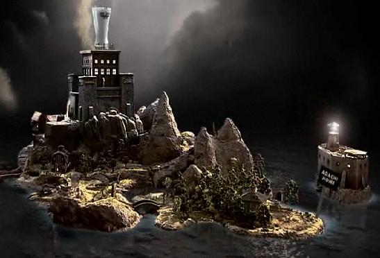
It begins by asking you to launch into a full screen browser, it loads with a cool looking pre-loader and the "got milk?" logo with audio saying "got milk"?. Then it proceeds play a movie about the "Adachi" family. A family who has a milk deficiency and plans on breaking into "Fort Fridge" to get a glass of milk.


It then loads a screen where you can either choose to explore the map or play the game right away. To the left is a picture of the map. When you click explore it shows you are 360 degree view of the island, with little signs popping up telling you the different locations on the island.

When you click play the game it takes you to the board game where introduces the characters and they jump into a van and head to the start square. You are then prompted to roll the dice, which I find to be genius! I love this dice, it is actually like rolling a real dice. You pick it up and throw it with your mouse and it rolls around and bounces off the sides of the screen(if you throw it toward the side that is) and then settles on a number. It's so much fun! Depending on what you roll you will land a fortune square or a misfortune square. Cards rotate up to the front of the sreen and you can read them and it tells you a either to go ahead of few steps(fortune) or go back a few steps(misfortune) with a little story line of why.


There are mini games every so often for each character of the Adachi family. The picture below is the father's mini-game. You have to drive around a course and not crash into the sides and he is lacking milk, so it's difficult. :0)


There are cops chasing you, they roll a black dice after you take your turn. If they catch you due to you failing a mini game or a misfortune card, they will send you to "Milkatraz". You can then choose to serve your sentence, risk escape, or have a friend post bail, each with their own set of consequences.
Once you choose one of the options it plays a little video and then takes you back to the board where you continue rolling the dice, getting new cards, and avoiding the cops. After you reach the end of the board game you will be at the "Fort Fridge".


As you were playing the game you collect chips with numbers on them, these are the combination numbers for the safe. So you enter them in and then it opens up to the glass room.

You then have one last trial and I won't spoil it for you. So after the game is over you can look at the leader board, a list of people with the highest scores. You can look at the crime files a fun interactive part of the site, where you can read case files on each character.


The site is so well designed. It flows together well. The colors are mostly dark colors going with the "crime" theme. The board game looks so great with the squares like an actual board game has. While also having 3D buildings and land making it more exciting than just a boring board game. The animation is very good, the characters are goofy and fun. I encourage you to play around with it and see how good of a score you can get. And don't forget the moral of the site, DRINK MILK!

Sunday, March 01, 2009

New Media Exploration: Optimus Maximus

It was a few months ago that a friend showed me the Optimus Maximus keyboard. Designed by the Russian studio Art. Lebedev, the Optimus Maximus is designed with absolute user customizability in mind.


So what sets this keyboard apart from the ordinary $10 office variety? Well, every single key has a tiny OLED screen inside of it (48 x 48 pixels, about the size of a Win XP icon). This means that you can customize not only the functionality of any key you want, but its appearance as well. You can change your keys' font and color, or you can use pictures taken from the internet or drawn yourself. From what I can tell, the keyboard comes with a micro SD chip to save your configurations to, so you can take your layout with you to the office (provided that "the office" has an Optimus Maximus, which isn't highly likely at this point).

Art. Lebedev has put up a pretty sweet basic simulator/demo of the product here, which is definitely worth checking out. As you can see, when you press and hold shift, all of the keys would dynamically update to show new symbols. Additional configurations are previewed as well; you can see alternate letter-based schemes for languages such as French and Spanish, as well as a layout with asian characters and even sample image-based control layouts for Photoshop and Counter-strike. The photoshop layout in particular looks like it would be awfully useful in MAT classes at MCC, as it would almost entirely remove the need to memorize hotkeys.

As cool as this keyboard sounds, it does have some flaws.

Firstly, it's expensive. Depending on where you get it, the high-end model costs between $1,000 and $1,800. There is an alternative plan: you can buy a cheap version of the keyboard for $450 that has only a single OLED key, and then replace the other "static" keys for $10 apiece as you need them; still, this is a lot of money for a novelty keyboard.

Secondly, according to several reviewers the keys just don't feel right. Complaints include that they're too large, high resistance makes typing tiring, and that the lack of space between keys cause too many mistypes.

I liked this video review because it gives the viewer a good idea of what the keyboard can do, but it also talks about the keyboard's shortcomings.


Even with its noticeable drawbacks, the concept is very appealing, both to geeks and to users that want to make their computers easier to use. If Art. Lebedev can find a way to make their product cheaper and improve the issues with their keys, a revised version of the Optimus Maximus could become a dominant figure in tomorrow's technological market.

Labels: , , ,