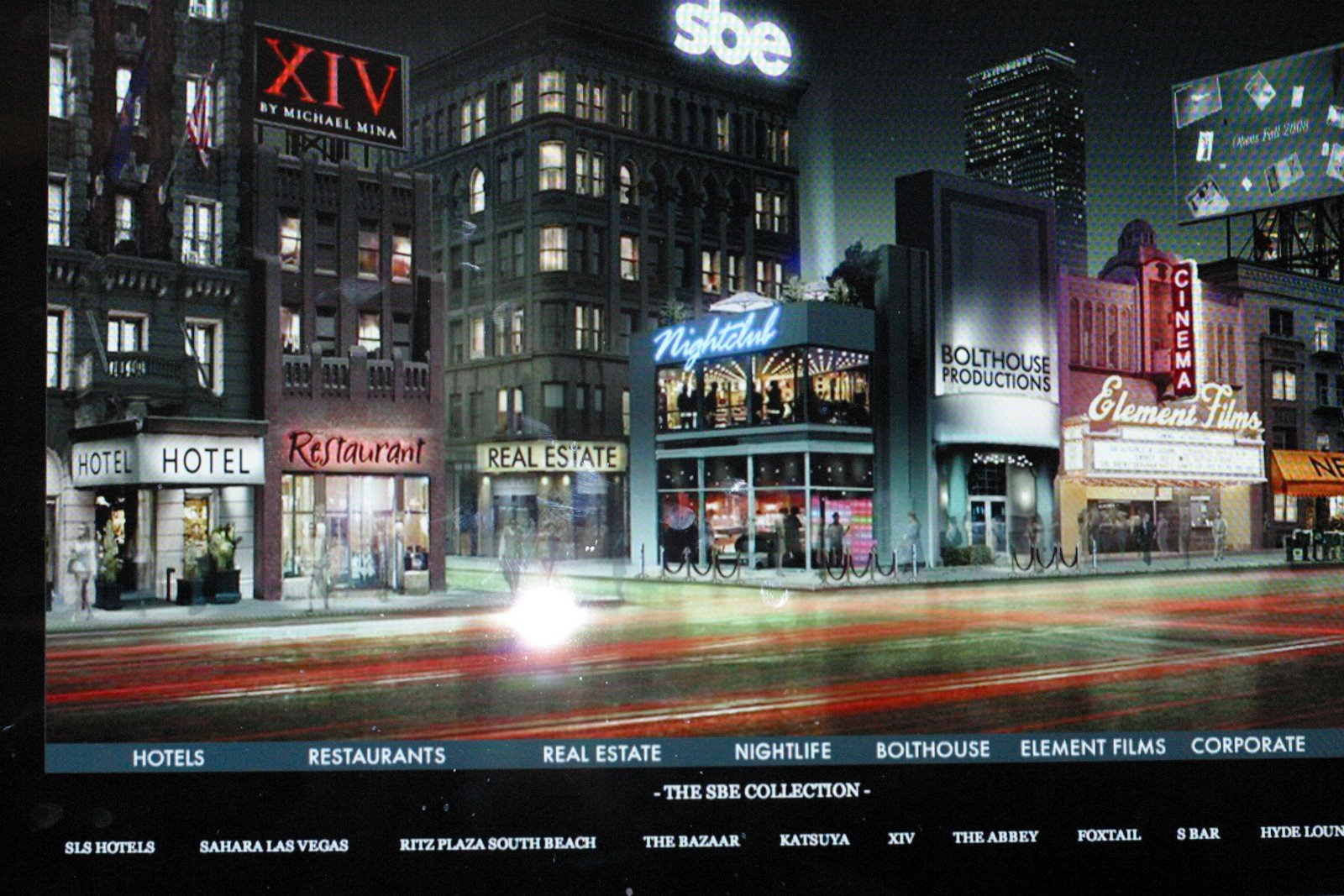
Lights, Camera, Action! At least for film (and still photography as well), this philosophy still holds. I became a photographer because I couldn't draw my way out of a paper bag. So cameras, photo equipment became my medium of choice.
Now that I'm learning Flash, I'm back in the 'motion picture' realm once again. Thing is, I'm quite attached to my cameras, and quite used to the concept of still images. Imagine my surprise and delight, stumbling upon these great examples whilst recently pursuing my voluminous stack of emails: Animation that uses photography as its drawing tool (with a little help from Photoshop)!
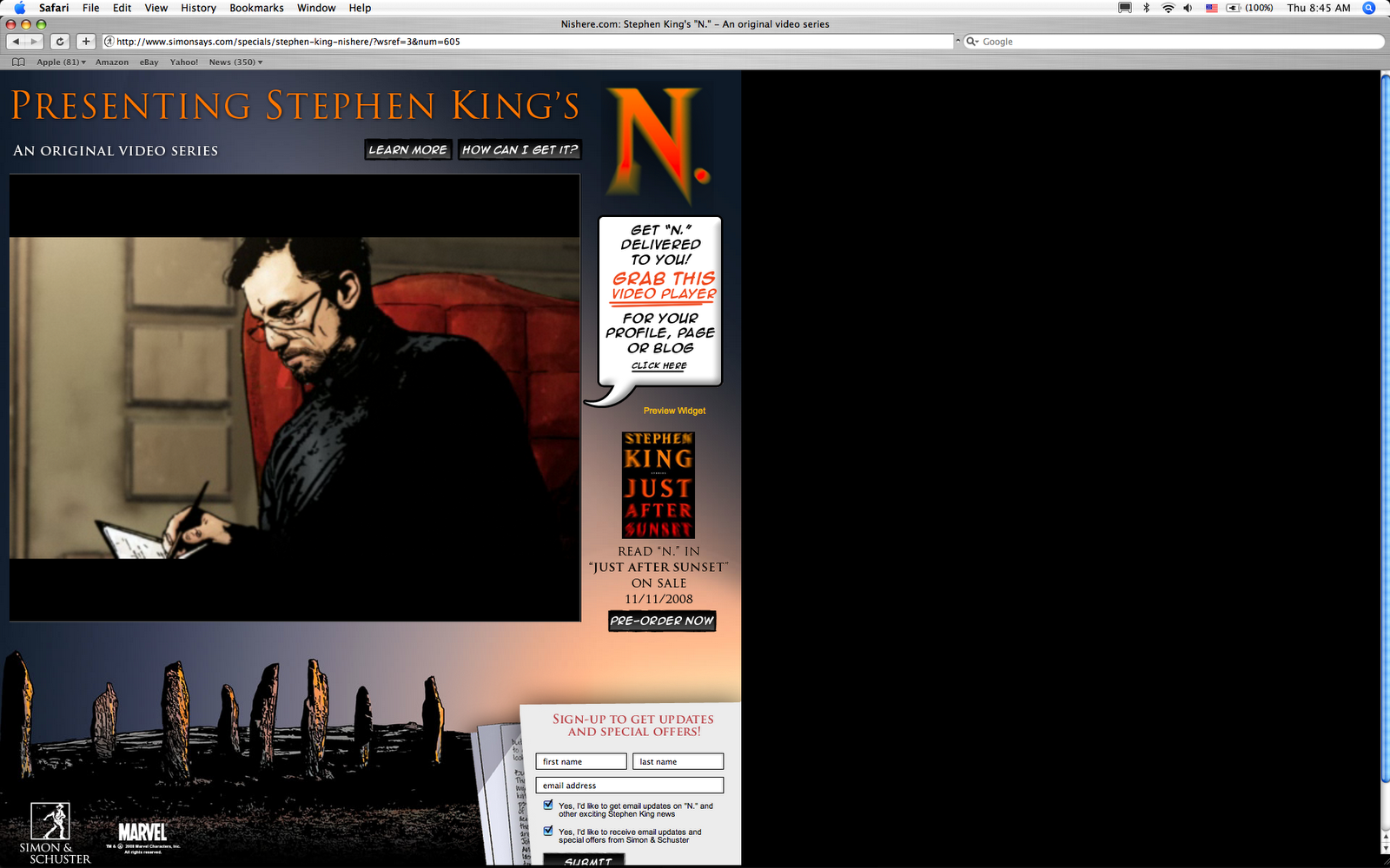
A series of artworks illustrated that you are about to see, is Stephen King's "N is Here," a graphic novel comes to life, complete with an interesting soundtrack. Stephen King is a wordsmith extraordinaire-- he creates unusual stories that preys on the fears we all share, and brings them to life (pun intended)! What's notable is that this erstwhile author of horror stories is actually experimenting with new ways, rather, new methodologies to deliver his material.
What makes this series unique and challenging is this: Each episode is less than 2 minutes long, and ends with a rather dramatic closure. The soundtrack enhances the experience, which doesn't usually exist with a graphic novel, adding dimension and mood to the illustrated scenes. I like to call this still frame animation. It's retro approach with restrained motion, lends itself a certain charm-- not usually in seen in current graphic novel adaptation.
In addition, the graphic novella has built in marketing, to better encourage the viewer to be on the lookout for the next chapter. This viral marketing campaign conducted via the web, is a form of 'branding,' a way of preselling Stephen King's upcoming book, "Just After The Sunset," coming out in November 11, 2008, with other stories, including the current presentation.
What makes this series work, is the attention lavished on details. For example, the ability to give a photograph a 3-D feel: there must be a foreground, middle ground, and lastly, a background of sorts. There's an aura of believability that also comes into play with the use of selective focus. The character in the middle ground is sharp, whereas the background is softened, much like that of viewing the scene in reality.
Stephen King's Animated Graphic Novel: "N Is Here"Labels: 'N is Here', Design Exploration, Graphic Novel, New Graphic Methods, Stephen King
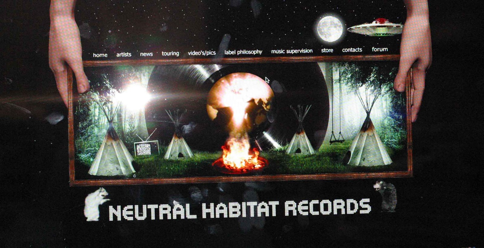 Neutral Habitat Records has a very edgy intro page using 3D flash animation.