Design Exploration: F1.com and Thnlizzyonline.com
F1.com
 The Formula One website was the first example I looked at for my Design Exploration. The site is a combination of both HTML and Flash. The overall look of the site is sleek and strait forward with menus being easily identifiable and readable. The site is made to sell the brand that is Formula One, though F1 is a racing series it has the image of being the pinnacle of racing around the world. It is the most expensive, luxurious and competitive racing series around and so the site tries to sell this idea. The site design is geared toward people already slightly familiar with Formula One to some extent but there is a section for introducing newcomers to the sport. There are data bases for statistics about individual races, teams, drivers, seasons, and tracks. Another big part of the site is the pictures it hosts. Because Formula One is just as much about performance as it is looks there are hundreds of picture galleries and thousands of pictures as well as videos a visitor can go through. The only problem I have with the design of the site is the complete lack of color. though there are color highlights the site is 90% gray scale and so sometimes feels drab especially when looking at sections where there is little color highlighting.
Thinlizzyonline.com
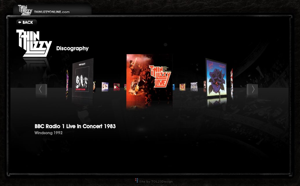 I was listening to Thin Lizzy on Youtube while writing the first part of this Exploration so as a joke I decided it would be fun to look at their website. I was presently surprised at what I found. I was expecting to find some botched FrontPage job. What I found was a well designed, sleek, easily navigable website that showed off all you wanted to know and did so through an extremely interactive Flash 10 design. The site uses the new 3D elements incorporated into Flash to have many turning menus and rotating scenes. The color choices are indicative of both the time Thin Lizzy came up in during the 70's and 80's and even of today. The site has a bit of the iTunes look with primary colors and the bubble feel that do make it feel a bit too cute for a band like Thin Lizzy though. Overall the design is very well thought out and there is really nothing that is glaringly wrong with the design.
posted by Florian @ 7:38 PM
0 comments
![]()

0 Comments:
Post a Comment
<< Home