Design Exploration: Disney.com
 The Disney channel website, Disney.com, is home to all of the Disney Channel shows. After watching my little sister (who is 10) check out this website almost every day, I thought it worth writing an exploration on.
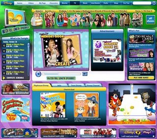
On first loading the page, there’s plenty to look at and plenty of choices on where your next click will be. In addition to Disney.com’s own navigation, there is graphical navigation across the top of the page for some of Disney’s top shows and movies. I find it cool that when you hover on each one, they “pop” forward in an animation and their scheduled air-time/more information is displayed across the bottom of the graphic. Also, clicking on each will take you to the home page for its respective show or movie.
Despite so many small areas containing some kind of information or other, the website is very well organized and easy to navigate. After all, they had to make it easy to navigate considering that children would primarily be visiting the site.
The home page for each show contains it’s own specific content, information about the show’s characters, games, and videos, as well as photo and download pages. It’s all very eye-catching and very, pardon the pun, “flashy.”
I can see how the designer(s) were surely challenged in making the Disney.com website and make it so appealing for its target audience, namely kids. With a plethora of mini-games, videos, and a near-endless amount of odds-and-ends to click on, you never have the chance to get bored while visiting the Disney.com website.
posted by Tony M. @ 11:55 PM
0 comments
![]()

0 Comments:
Post a Comment
<< Home