Design Exploration
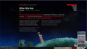
 Red Interactive Agency: http://www.ff0000.com/. Okay, this site is really worth checking out! Red Interactive is a marketing agency specializing in interactive media. To prove their worth, their site itself is interactive to an extent that I have never seen before.
 Red Interactive Agency: http://www.ff0000.com/. Okay, this site is really worth checking out! Red Interactive is a marketing agency specializing in interactive media. To prove their worth, their site itself is interactive to an extent that I have never seen before.
 Normally, "interactive" means "click here and the site will do something/go somewhere, etc." This site takes it to the next level (as much as I now hate that phrase), by placing you (or at least an alter ego) in the website.
Once the site is loaded, you are asked if you want to enable chat with other visitors. Pressing "yes" creates a moving, exploring, talking avitar, which is dropped into the the site's quirky, stylized environment. You have the option, via a customize panel, to change the look of this character (you may pick from 10 different characters). Then, you just talk. The words appear in little snippets above your head, as if cut from a newspaper.
The whole site has a specific artistic theme, reminiscent of early 1900's newspapers, vaudeville posters or tarot cards. While the scenery is a bit eerie and definitely quirky, the user is really drawn into it and begged to interact. While the live chatting is what really amazed me, the user is actually able to "walk" his or her character back and forth across the page. When you reach the edge, the page scrolls, leaving the menu and home page information behind.
Once the charm and wonder if the layout becomes old hat, the user can explore the menu itself and learn about Red Interactive. Clicking on the menu simply changes the text on the page, so you never leave the interactive environment. The company specializes, of course, in online marketing and web development, "providing the ultimate experience for their target audience." They count among their clients MTV2, Comedy Central, HBO, Sony Pictures, and Paramount.
This site serves to illustrate Red Interactives ability and commitment to providing an true "experience" for their visitors to their sites. The site is very unusual, and uniquely interactive. It promises an immersive experience for prospective clients, while suggesting Red Interactive's ability to provide unique marketing tools for clients.
I really enjoyed this site. Aside from being interactive, artistic and unusual, it was clean, logical to use and concise. The main menu was short and never strayed from it's position in the top right corner. Clicking to different sections, offered the appropriate sub-menus, listed at just below the section title. The content was well stated and concise, not to mention that it did little to interfere with the interactive environment. In fact, it seemed part of the environment, allowing the user to walk and jump the avitar in front of the content, as if the content were part of the background.
Overall, the site managed to state a lot about the company and it's goals, while creating an enviroment that a user would actually want to explore (even users not necessarily looking for a marketing agency). Despite all of the impressive clients and accolades, the best that could be said about the quality of Red Interactive's work was the uniqueness of the site itself. It promised a company that could create a truly unique experience to market their clients wares.
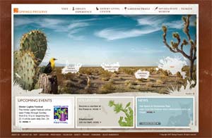 Springs Preserve, Las Vegas. For the Second of 2 my two explorations, I’d like to look at the website for the Springs Preserve, a new gardens, museum and cultural exhibit in Las Vegas, NV (http://www.springspreserve.org/). I can’t remember exactly how I found this site, it certainly was not while I was looking for interesting multimedia sites; but I was fairly impressed when I found it.
The Springs Preserve appears to be a rather unique natural exhibit. Aside from being a desert preserve, it is has gardens, historical parks and well as a cultural and art museum spread across its acreage. Beyond being the small tourist attraction that so many preserves are, this park aims to be an experience of the life in Vegas that goes on beyond the flashy casinos. However, competing with the adult Disneyland that is LV is a difficult task at best. To drag tourists away from the big lights takes a big offering, which is exactly what I think this website promises.
Like the preserve, the website that represents it is a true experience. Not for the faint of bandwidth, this site uses Flash to display an impressive interactive interface utilizing both animation and movie clips to make the experience come to life. From the initial load of the side, even the pre-loader is different. A silhouette of native plants grows from a central point as the pre-loader counts up. The first screen animates in pieces away from white to reveal a photograph of the preserve overlaid with a main navigation menu. The Nav menu, like the pre-loader is made of silhouettes of native plants. Individual clumps of silhouettes are strung together with a thin line to make up the menu. Hovering over each clump makes them bounce just enough to invite you in. Clicking on one of the menu choices will take you, literally, to that part of the website and that part of the park via a video clip of travel over the land to that part of the park. Once there, you are invited to explore the area, which takes you to yet another menu and a slightly differently designed page: the information section at the bottom becomes larger, which the menu, which now has sub-menu choices, becomes smaller vertically.
The design and Flash use of this site are impressive and interactive. They manage to offer a taste of a visit to the park, without giving too much away. While navigating, the main menu is reflected in a static bar at the top of the site frame. This allows the animated menu (the silhouettes) to change as needed, becoming sub-menus for different areas. Information about the different sections is listed at the bottom in an easily accessed format. The design themes of
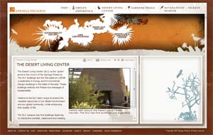 desert flora and fauna remain consistent across the page, as does the art style, which employs many low detail images (silhouettes and outlines) overlaid on full detail photographs. The site, while impressive, is fairly easy to use, once you get used to how it’s laid out. I was, initially, more impressed with the action of the website than the product that it was advertising. It took me a few minutes before the site became second nature, and I was able to concentrate on the details of the part.
One of the things that I most felt this site was missing was a true introduction page. From exploring that site, I know that the part includes a preserve, gardens, a cultural center and a museum, but there is little in the way of a “home page” that really tells you this. I feel this would be a good addition, since the park itself is so unique. I guess it could be argued that this forces the user to explore the site, thereby virtually exploring the park. I also felt that the site almost had “too much” to it. While it was visually and functionally impressive, certain pages almost seemed cluttered and overwhelming, especially when the sub-menus started to drop down from the static top menu onto the flash main menu.
Overall, this is a beautiful site, although it could seem visually overwhelming at times. Once I opened the site on another computer (which had not yet been cookied), I noticed that there was an option for a "low bandwidth site". This, I felt, was an important option for this particular site. While Vegas has become a popular destination with the Generation X,Y,Whatever crowd, it still attracts seniors and less “techy” folks. These people may be interested in the park as a detour from the gawdy glitter of the casinos, so it is important that they have a more leisurly bandwidth option to visit the site than those of us who use the cable company to hitch a ride onto the “information superhighway”.
posted by Juliette Veenstra @ 6:11 PM
0 comments
![]()

0 Comments:
Post a Comment
<< Home