Design Exploration Part 2
I decided to resubmit my entry for my Design Exploration topic and instead focus on an European website from focusing on Sony's Bravia television brand.
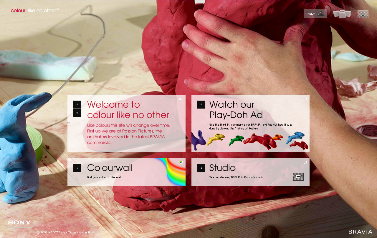
Obliviously, the site is geared toward hyping and extolling the features and qualities of the Bravia brand. The site is structured to provide several different "avenues" that visitors to the site can explore and be exposed to Sony’s choice of promotion methods. One of the more obvious means of getting across their message is via providing traditional television media on the site and allowing the user to access any of them at his/her leisure. Definitely take a look at some of their TV ads. I personally found them to be very cool and invocative in how they utilize colors. In addition to the commercials, supplemental material is also offered such as a quick bio on the artist behind the music used in the TV ad campaign. Such supplemental material helps lend a “behind the scenes” feel behind their ad campaigns and is definitely interesting for those that are into such things.
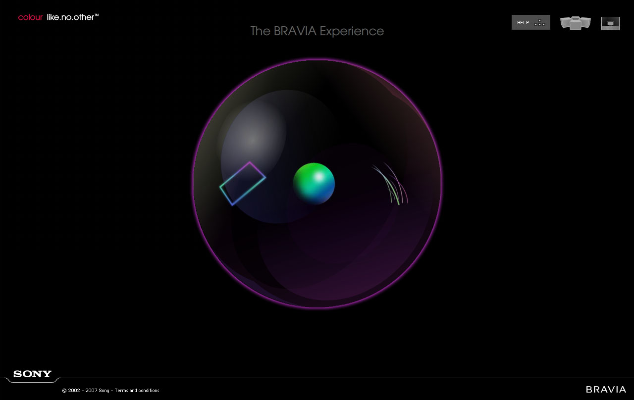
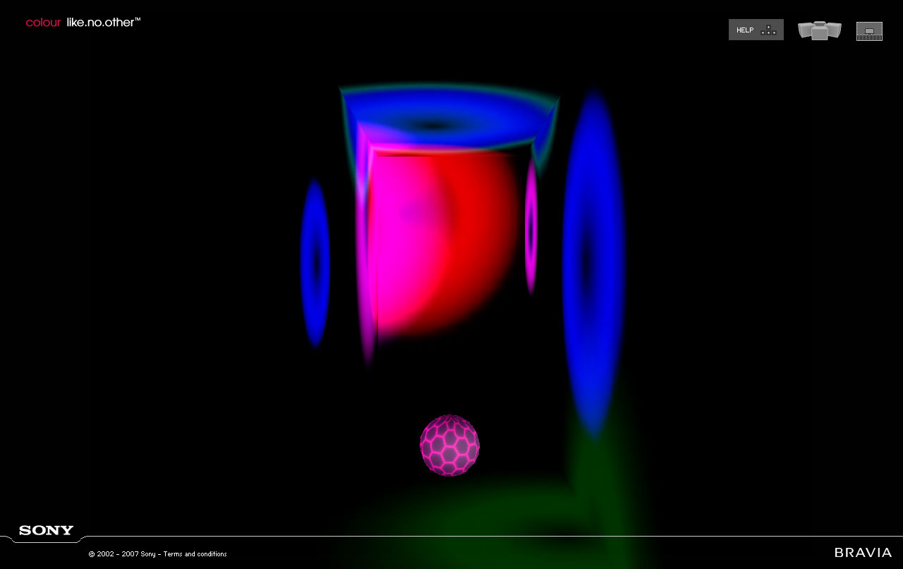
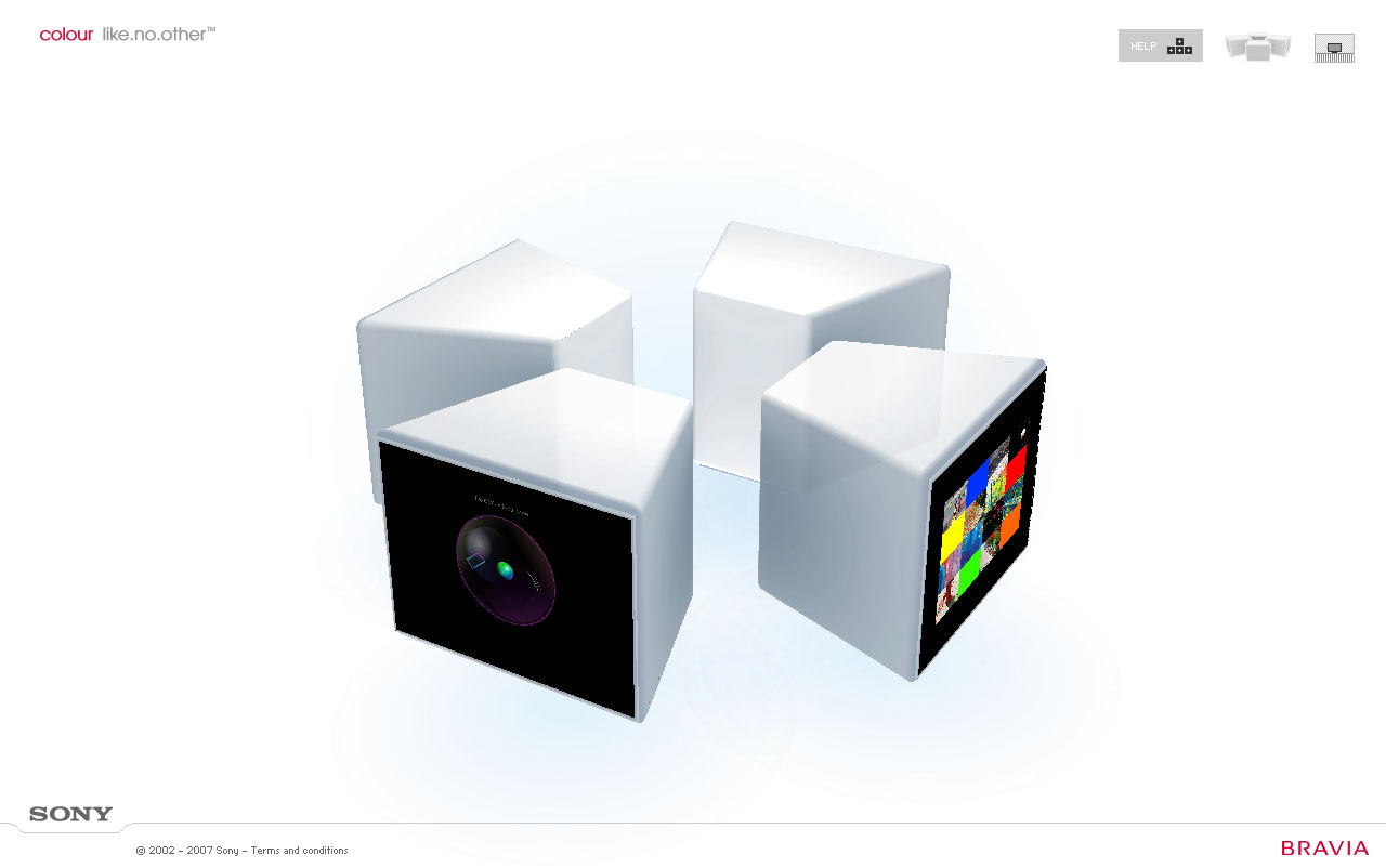
Another method used to highlight Bravia’s features and qualities is through the section of the site that is designed to “evoke” visual and aural stimulation on the part of the user with the insinuation that Bravia sets are indicative of and able to replicate these visual and aural experiences. This is achieved through Flash interactions using the mouse in one of four areas for the section of the site dubbed “The BRAVIA Experience.” Each section in “The BRAVIA Experience” focuses on different elements which are Resolution, Sound, Clarity, and Colour. Entering any one of these elements opens a user interaction area that prompts the user to use the mouse button. My personal favorites are Sound and Colour. These elements of “The BRAVIA Experience” are very cool and do help instill and promote a very calming and pleasant vibe.
What first struck me about their site was how its presentation was really slick and cool looking. Their usage of Flash is put to great effect. My only real issue with the site was with how one is able to navigate through the site. They utilized a method of using the cursor screen position as the means to “cycle” through their menu systems. On paper this functionality sounds really neat, but given how it was implemented it actually proved not to be as intuitive as one would like it and really more of a hassle.
Another thing that struck me that I found ironic and funny was the fact that though the site is obviously geared towards highlighting Bravia TVs, nearly all of the users will more than likely be experiencing the website and all of its content through PC monitors. I suppose the intent of the site is to somehow conjure up a vibe connected with more abstract feelings and/or sensations with the hopes of somehow having those feelings/sensations residually be associated with the Bravia brand.
I can’t say how successful that goal will ultimately be or if its possible, but I can say that they definitely succeeded in getting across a very intriguing and compelling content and vibe through their site.
posted by J 2 Da F @ 4:18 PM
0 comments
![]()

0 Comments:
Post a Comment
<< Home